The worst box art of 2014
41. Fantasy Life
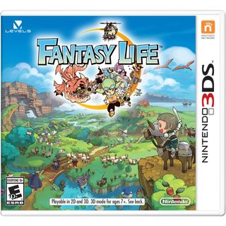
Close up, the Fantasy Life box art has a lot going for it - cool character designs framing the title, hanging above a gorgeous, peaceful countryside populated by hard-working adventurers. Yet from a distance, all I can see is a stick figure on a horse admiring an unintelligible green mess while a dragon barfs out people beneath the game logo.
40. FIFA 15 (Australia)

Tim Cahill and Lionel Messi would like to take a break from all the football to show you their carefully choreographed synchronized dance routine. And-one-and-two-and-three-and-four!
39. FIFA 15 (North America)

One look at Clint Dempsey's face, and it's clear that he's just realized something profoundly disturbing mid-football match. Either A) he's suddenly struck by the insignificance of his existence as it pertains to the giant tapestry that is the universe, and how death is a cold inevitability that comes for us all no matter how successful and talented we are in life. Or B) he forgot to turn the stove off before he left the house. Meanwhile, Messi's right eye has moved ever so slightly from where it was on the previous box art. He's like a chameleon in that way.
38. Natural Doctrine
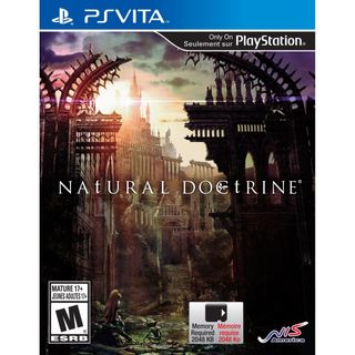
Here's another piece of box art that's not offensively bad - it's just that it would never, ever, ever grab your attention sitting on a store shelf. I think I dozed off somewhere between reading the 'Natural' and 'Doctrine' bits.
37. Holy Avatar vs Maidens of the Dead
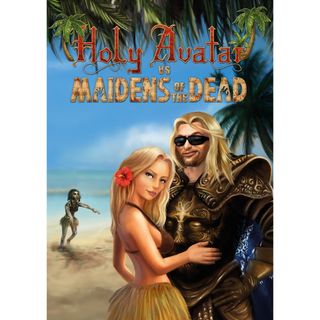
He's part Duke Nukem, part Thor, all completely idiotic character design. Would you believe me if I told you that this is actually a turn-based tactical RPG? Because it is.
36. Crash & Burn Racing

You've got a hot rod zooming through the air at high speeds with some kind of advanced-tech shield protecting it from the fiery explosion that it just launched over. Yet somehow, despite everything I just mentioned, this is one of the most visually boring scenes imaginable.
35. 9 Clues: The Ward

Judging by the facial expressions on these two men, I'm guessing that the asylum patient has just firmly grabbed the inspector's right butt cheek with no intention of letting go. From the looks of it, Mr. Muttonchops is more startled than aroused by this unexpected advance. So how does that swirly-eyed wooden scarecrow fit into all this? Beats the heck outta me!
Sign up to the 12DOVE Newsletter
Weekly digests, tales from the communities you love, and more
34. Mugen Souls Z
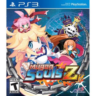
Yes, I'll admit it - chintzy anime covers got off easy in 2014's batch of bad box art. But Mugen Souls Z is worthy of a special dishonor for its main character design, which looks like someone taped two Easter-decorated ostrich eggs to a middle-school student's shirt. As for the tiny girl sprouting out of her head, well - I have no qualms with that.
33. Sacred 3

You know, I actually like this box art's style - these five heroes look pretty awesome, and the composition is totally fine. There's just one problem: that dude in the top right, Malakhim, is actually a DLC character who isn't included in the base game. How in THE HELL are you gonna put a [expletives deleted due to wildly offensive use of profanity - Ed.] DLC CHARACTER on your GOSH DARN BOX ART, SACRED 3?!? HAVE YOU NO SHAME?!
32. Just Dance 2015
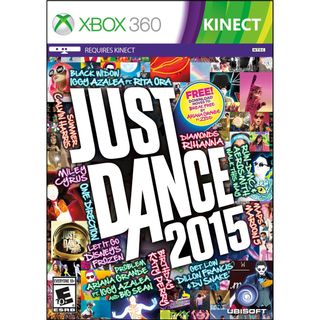
Another year, another garish, indecipherable Just Dance game cover. Moving on.
Lucas Sullivan is the former US Managing Editor of 12DOVE. Lucas spent seven years working for GR, starting as an Associate Editor in 2012 before climbing the ranks. He left us in 2019 to pursue a career path on the other side of the fence, joining 2K Games as a Global Content Manager. Lucas doesn't get to write about games like Borderlands and Mafia anymore, but he does get to help make and market them.
Most Popular


