The worst box art of 2013
15. Fuse
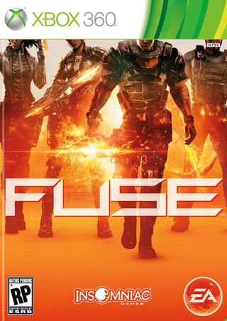
You'd be forgiven for thinking this is a new production run of Valve's Orange Box. Alternatively, it looks like four people wearing way too much leather decided to pose in front of the Sunkist factory as it exploded. And of course, someone slapped an NTSC sticker over the black guy's mouth. Freakin' racists.
14. Realms of Arkania: Blades of Destiny
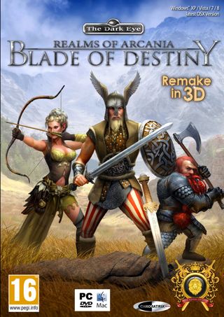
Gaze at these three brave warriors, who are about to engage in deadly combat withwhatever your imagination conjures up outside the frame. I'm personally going to go with "nothing." Instead of the sweet fighting stances, I find my eyes drawn to the viking's circus pants, and the way the archer's nocked arrow is resting on thin air. These three adventurers seemed to have stopped to investigate a rock, one which resembles an elephant turd that somebody stabbed with a sword.
13. Fighter Within
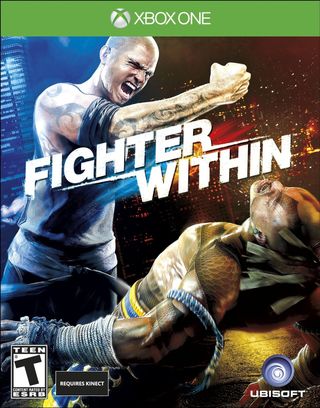
"NYAH! Look at my new ARM TATTOO! Isn't it GREAT? Why is there a fist growing out of my LOWER BACK?! Why does your hair look like STRIPS OF DUCT TAPE?" If I had a friend who talked like that, I'd probably sneeze myself into unconsciousness too.
12. Saint Seiya: Brave Soldiers
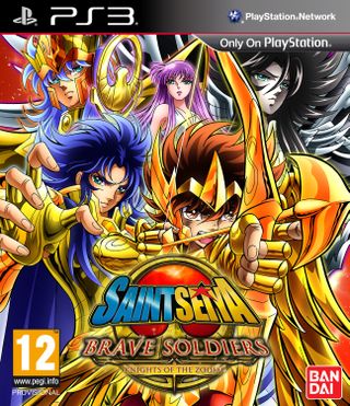
I like anime as much as the next person; probably more. But this much gold armor in one picture is inarguably an eyesore. Four of the five people on this cover have the exact same face, not counting the lady's awkward-looking, wall-eyed gaze.
11. Rise of Venice
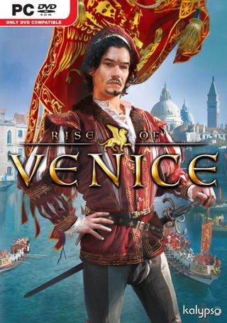
Look, I don't presume to know what kind of garb was appropriate during the Renaissance era. But will somebody please explain to me: what is happening with this dude's crotch? Is that a zebra-striped codpiece? A 14th century camel toe? Two gigantic spider fangs? Tell me, damn you!
10. Secret Files Franchise Pack

I'll admit, that's a very alluring drawing of a foxy, red-haired lady. But no amount of physical attraction justifies the "DUH HUEEE" expression on that guy's dumb-looking face.
9. The Inquisitor Book I: The Plague
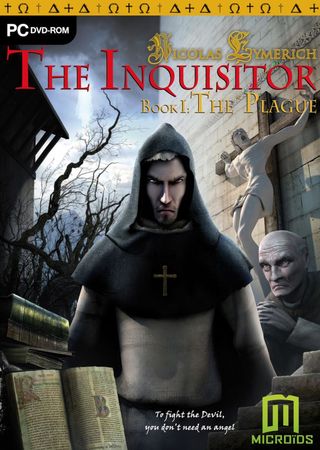
If my face were that freakishly long, I'd probably be grimacing like an angry sourpuss too. And call me sacrilegious, but I've never seen a crucifixion statue with such a hilariously pained facial expression.
Sign up to the 12DOVE Newsletter
Weekly digests, tales from the communities you love, and more
8. The Croods: Prehistoric Party!
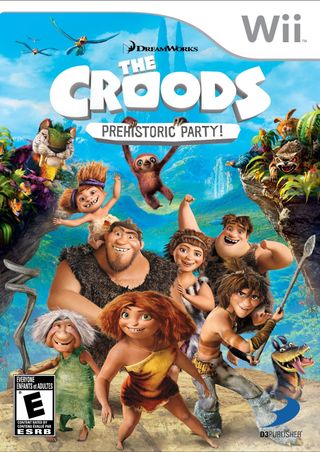
Not since Shrek have CGI characters been so hideously unappealing. If it wasn't for that adorable sloth on the cover, I'd send a letter to a Member of Congress requesting that those involved in the making of this movie (and game) all be rounded up and shot. Yes, even Nicholas Cage.
7. Family Tales: The Sisters
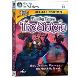
Another hidden object game, another shoddy, vaguely paranormal game cover. But that tagline suggests something far more unsettling and cerebral than a virtual I Spy. "Share childhood memoriesand grown up fears!" That sounds like the basis for group therapy, where deep-seated anxieties are traced back to awful, formative experiences. Some of these memories, apparently, involve a hooded man pointing at you while a pterodactyl rests on a crystal ball.
6. Puzzler Brain Games

Oh dear God. The cold, unfeeling stare this professor's giving me strikes more fear in my heart than Jigsaw ever could. His lobotomized grin suggests that my brain isn't about to be strengthened--it's about to be destroyed. This rollercoaster ride leads straight to depravity, and it's far too late to escape. And, as if this imagery wasn't disturbing enough, someone saw fit to add a clown in the background. It's a nightmare from which there's no waking up.
Lucas Sullivan is the former US Managing Editor of 12DOVE. Lucas spent seven years working for GR, starting as an Associate Editor in 2012 before climbing the ranks. He left us in 2019 to pursue a career path on the other side of the fence, joining 2K Games as a Global Content Manager. Lucas doesn't get to write about games like Borderlands and Mafia anymore, but he does get to help make and market them.

