The worst box art of 2011
35 of the year's ugliest attempts at game packaging
21-22. Fantastic Pets/Petz Fantasy 3D
Released: Apr. 12/June 21
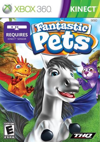
Ugh. We know kids aren’t the most discerning consumers when it comes to the artistic quality with which their dopey-looking cartoon animals are rendered, but this is lazy and boring to an almost cynical degree. Is it too much to ask that boxes like this try just a little har-
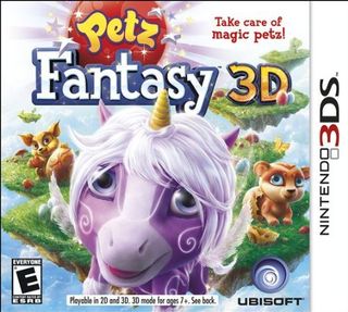
AAAAAAAAAGH! TRY LESS HARD! TRY LESS HARD!
23. Aladdin Magic Racer
Released: Dec. 27

Aside from the fact that Aladdin there is all bro’d out and sporting a Jedi braid, and aside from the fact that his lady friend has a face that could plane wood, and aside from the fact that this thing is just a mess of blues and yellows and pinks… that lamp is a teapot.
THAT LAMP IS A TEAPOT.
24. Battlefield 3
Released: Oct. 25
Sign up to the 12DOVE Newsletter
Weekly digests, tales from the communities you love, and more
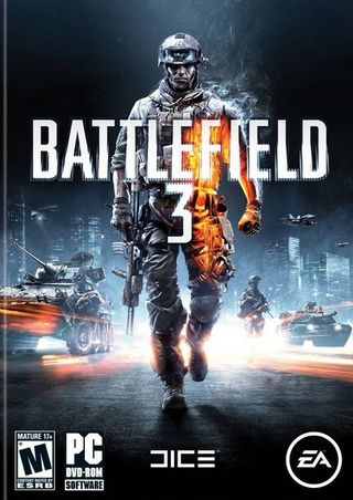
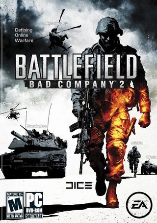
What’s that, you say? “Battlefield 3’s box, with its oddly orange-lit soldier, isn’t bad or ugly?” Well, you’re right. It isn’t. In fact, Battlefield 3’s box art is well-composed, nicely rendered and perfectly suited to the series. But it was also all of those things when a near-identical version of it was used on Battlefield: Bad Company 2’s box last year.
SPECIAL DOWNLOADABLE GAMES SECTION
Calling the next few items “box art” is a stretch, seeing as (to the best of our knowledge) they’ve never adorned an actual, physical box. They are, however, some of the most hideous images used to sell downloadable games on Amazon, and as such they deserve to be hauled out and vigorously clubbed.
25. Redneck Racers
Released: Jan. 5
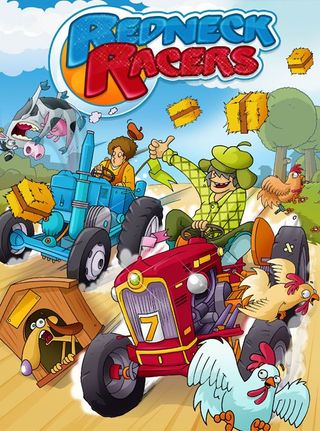
We’re not entirely sure which country the developers of Redneck Racers are from, but it’s safe to say their concept of a “redneck” is worlds away from our own. For starters, both of these guys are wearing shirts. Preposterous!

Above: Also, a beret? A BERET? Is he, like, the token snooty redneck who spent that year in community college and later gets beaten to death out behind the Citgo?
26. Pride of Nations: The Spanish-American War 1898 DLC
Released: Jul 12

This cover looks vaguely like an actual, historical painting, which might be a decent cover story – but closer examination reveals that it very likely isn’t, and therefore has no excuse to bring so many oppressively drab browns and grays to a game cover. There’s also the question of the figure at the center of the image, who may or may not be Teddy Roosevelt. It’s kind of hard to tell, really.
27. Mystery Novel
Released: Apr. 13
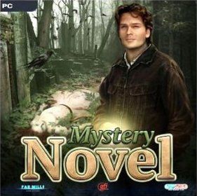
Honestly, Patrick Swayze’s ghost deserves better than to adorn a game with so unimaginative a title.
28. Dream Mysteries: Case of the Red Fox
Released: Feb. 18
29. Behind the Reflection
Released: March 8
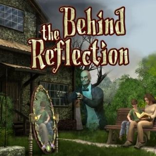
As concepts go, a ghost floating, unseen, near a couple of readers isn't such a bad one, assuming you can get past the idea of a full-length mirror just sort of sitting on someone's overgrown lawn and the homeowner's association not shitting bricks over it. But when you execute that concept with a Sims screenshot and a layout for your title that makes us think it's about someone admiring their own ass in a mirror, well, you've kind of messed it up, haven't you?
Most Popular
