The worst box art of 2011
35 of the year's ugliest attempts at game packaging
As 2011 finally, inexorably grinds to a close, it's time to revive one of our favorite annual GamesRadar traditions – specifically the one that involves rounding up as many of the year's most insultingly hideous or wrong-headed game boxes as we can find and making fun of them.
As time rolls on and the videogame industry gradually matures, it might seem as though bad box art is becoming a thing of the past. Finding choice candidates this year was particularly difficult, partly because game companies seem to be wising up, but mainly because shovelware publishers haven't been jumping onto the Wii/DS bandwagon quite so eagerly over the last 12 months. Even with 2011's surprising dearth of shelf-clogging ugliness, though, we still managed to find a whopping 35 boxes to work with. Get ready for the awful.
(And as we point out every year, we're not making any judgments about the games themselves in this article – just the boxes they're sold in.)
1. Zombies Seeker
Released: Feb. 8

This one starts out kind of mediocre and ugly, but gets worse the more you look at it. Aside from the inherent dorkiness of the amateurishly drawn leads, closer examination makes it impossible to ignore things like the sickly green outlines, the girl’s awkward posture and the fact that the guns are drawn with a weird combination of slavish attention to detail and a seeming ignorance of what those details actually look like.
Then there’s the title. Why not “Zombie Seekers?” Why on earth would you start with a plural noun and then follow up with a singular one? That’s like naming a website something like, I don’t know, GamesRa... you know what? Never mind.
2. Breach
Released: Feb. 8
Sign up to the 12DOVE Newsletter
Weekly digests, tales from the communities you love, and more

This one’s all in the eyes. Look closely at them – are those the hardened, focused eyes of a commando here to kill some terrorists? No. They are the exasperated eyes of a peace officer who breached a wall thinking he was going to kill some terrorists, only to be confronted by the sight of an office worker frantically trying to loosen the belt around his neck while watching extremely loud pornography.
3. Tin Can Escape
Released: Feb. 22
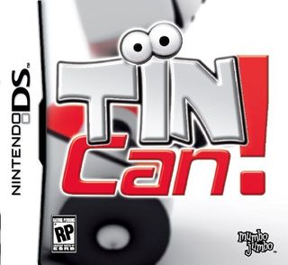
Everything about this box redefines lack of effort, from the unappealing title and giant, difficult-to-parse logo (Is it “Tin Can!”? “Tin! Can!”?) to the indiscernible mass floating behind said logo. It’s ugly, it’s drab and it tells us absolutely nothing about the game, other than that it involves tin and possibly a can, and is very excited about both of these things.
Luckily, the publishers seem to have felt the same way, and completely overhauled the box prior to the game’s release:

4. Secret Files 2: Puritas Cordas
Released: Mar. 29

To be fair, these faces are only moderately ugly. However, they are so moderately ugly that we didn’t even notice that tidal wave about to flatten New York until it was too late.
5. Knights Contract
Released: Feb. 22
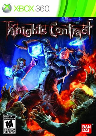
God, where to even begin? While the art for Knights Contract at first seems to exhibit a high degree of artistic competence, there’s no getting past that color scheme, which blends deep blue and bright orange into an eye-stranglingly garish neon yin-yang. Factor in that that monster – whose pose more closely resembles “helpless civilian” than “terrifying beast,” but whatever – has clearly just been duplicated, flipped and resized in Photoshop, and you’ve got a needlessly ugly mess that looks like a club fire somehow broke out at a Renaissance Faire.
6. Cabela’s Survival: Shadows of Katmai
Released: Nov. 1
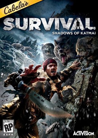
“Oh my god, Carl! Caaaaaarrrrl! Just hang on, my wolf brothers and I need to figure out how to dial 911!”
7. Kung Fu High Impact
Released: Nov. 15

Oh, come on. Really? You expect us to believe that guy’s reacting to being lightly toed in his rock-hard abs? No. That’s a clear nut-shot if we’ve ever seen one, repositioned slightly so as not to offend the old ladies who’ll cluelessly buy this for their ungrateful grandchildren.
Also? Good luck pulling off that jump-kick pose without going outside of Kinect’s field of view and/or destroying your living room. Just saying.
8. Face Racers: Photo Finish
Released: Dec. 6
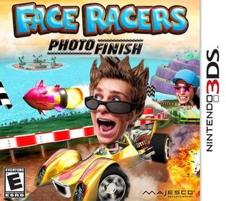
We don't care if this is what the game looks like - we don't even care if it's an actual screenshot. There's something intrinsically unsettling about giant photo heads, and it doesn't get any less unsettling when you add douchebag spikes or halfhearted, half-offscreen explosions to the mix.
9. Carnival Games: Monkey See, Monkey Do!
Released: Apr. 15
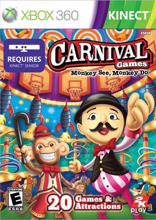
Ever since we started making fun of Carnival Games’ leering, pear-shaped carny mascot and his circular grotto of horrors, first in 2007 and again in 2010, he’s been haunting our dreams with increasing regularity. In these dreams, he continually reaches for our faces, for our souls, and murmurs something that, when repeated into a microphone and played backwards, sounds like “not much longer now.”
Now he’s got some kind of monkey with him and that is just all kinds of terrifying.
10. Carnival Island
Released: Nov. 15

And yet, as horrible as Carnival Games’ mascot is, he continues to inspire a depressing number of flash-in-the-pan imitators. This one apparently thinks putting a tie on a panda makes it an acceptable substitute for a monkey! Can you imagine?
Oh, but apparently that shit doesn’t fly in Europe, where it was decided that the best way to sell Carnival Island would be to slap a pair of stunted, bowlegged kids on the box.

Most Popular


