Why I Love: the gooey textures of claymation graphics
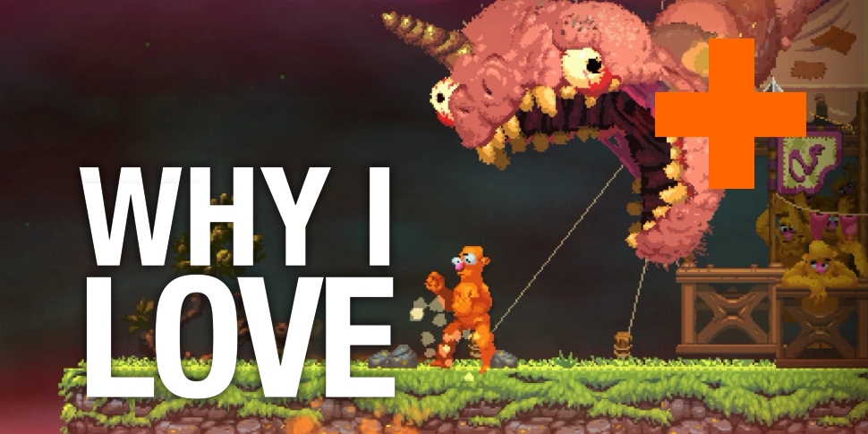
Nidhogg 2's new art direction seems to split opinion like a sword through its combatants' pudgy stomachs. The original cult-favorite fighting game depicted its dueling fencers as nondescript, Atari-esque sprites - but besides retaining their yellow and orange complexions, those two opponents are unrecognizable in the sequel. Nidhogg 2's aesthetic takes a hard left by emulating classic claymation via chunky, soft-edged pixel art, done up by "pixels and plasticine" artist Toby Dixon. And everywhere I look within a page-scroll radius of the Nidhogg 2 teaser trailer, someone is vehemently complaining about these gawkish character models, going on at length about how repulsive they find these unfamiliar graphics. To create some empathic balance in the universe (and obey my latent contrarian impulses), I'd like to officially state: I'm a huge fan of Nidhogg 2's look, and I commend its callback to claymation graphics.
I've always loved claymation visuals, but only now am I taking the time to ponder why. As a kid, I pored over Nintendo Power's coverage of ClayFighter 63 1/3, entranced by the freakishly proportioned, brightly colored maquettes that made up the N64 fighter's roster. And gazing at them again decades later, I think I've nailed down their appeal: texture. Just looking at those clay models instantly conveys a tactile sensation: Taffy's smooth, shiny candy limbs, The Blob's goopy, amorphous sliminess, Bad Mr. Frosty's pockmarked coating replicating the look of densely packed snow. Sadly, the digitized in-game sprites don't come close to capturing these precise details; also, the game pretty much plays like garbage. But to see these cartoonish pugilists up close in NP's pages had me captivated, and all these years later, I'm delighted to see higher-resolution test shots of the game (like the one you see below) that illustrate just how wild ClayFighter would've looked if it was made with the technology we have now.

Besides the palpable textures, I think some inherent imperfection bolsters the charm of claymation. Even beloved, high-budget productions like Chicken Run or ParaNorman don't move with the perfect smoothness of a CG world; you can practically see the hand-crafted effort that went into constructing and animating the models with every frame. Similarly, the animations and cutscenes of classics like point-and-click adventure The Neverhood and its platformer sequel Skullmonkeys capture that same sense of painstaking authorship. And I think that art style still holds up better than most PS1-era graphics because of a willingness to go with weird, bumpy, carefully assembled sculptures rather than blocky, lifeless polygons.
Claymation graphics have always been a rarity, so I applaud modern games that take a chance on the uncommon aesthetic. Kirby and the Rainbow Curse beautifully imitates the squishiness of clay with its rendered visuals, and part of what makes The Swapper feel so alien yet so lifelike is its desolate space station constructed from clay and real-life refuse. The Dream Machine is a contemporary point-and-click that uses the muddy consistency of claymation to heighten the eeriness of its characters and world. And hey, claymation can even work its way into mainstream gaming on occasion - just look at the models that would go on to become Doom's demons, or the inspiration for the original Diablo's visual design.
Claymation appreciation seems to put me in the minority, if the Nidhogg 2 backlash is any indication. Perhaps I'm just an outlier who watched Pee-wee's Playhouse more often than most growing up. But then, for every five comments ragging on Nidhogg 2's new look, you'll see someone professing their love for the way this sequel boldly embraces such an undervalued art style. And if you've read this far, well, maybe I've helped another claymation enthusiast not feel so alone in this gaming ecosystem where conventional visuals get all the glory.
Why I Love encapsulates all the little details of gaming life that sometimes get ignored. It arrives every Friday at 0900 PST / 1700 GMT. Follow @12DOVE on Twitter for updates.
Sign up to the 12DOVE Newsletter
Weekly digests, tales from the communities you love, and more
Lucas Sullivan is the former US Managing Editor of 12DOVE. Lucas spent seven years working for GR, starting as an Associate Editor in 2012 before climbing the ranks. He left us in 2019 to pursue a career path on the other side of the fence, joining 2K Games as a Global Content Manager. Lucas doesn't get to write about games like Borderlands and Mafia anymore, but he does get to help make and market them.
