Building better worlds: Why detail is king in Alien: Isolation
You know how the original Alien in the original Alien has a human skull visible underneath the front of its transparent exo-head? No, don’t worry, hardly anyone does. Due to the way that Ridley Scott lit the beast in the first film, it never showed up. Backlighting = silhouettes = no visible sign of the costume makers’--or even designer H.R. Giger’s--original intent. Thus, the human skull was written out of later Alien visual canon, replaced by the standard black, eyeless, penis-dome we all know today. Until that is, Creative Assembly started designing their xenomorph for Alien: Isolation.
Look very closely--I’m talking about a level of closeness that you’ll almost never see in-game, as it requires the kind of proximity that means that you’re probably already dead--and you’ll notice some distinct indentations in the front of the Alien’s head. Two sunken eye sockets. A couple of shallow grooves that look very much like a nose. When I noticed this myself, when shown Creative Assembly’s Alien model up-close for the first time, as a long-time series fan I immediately had to suppress a knee-jerk instinct to hug the nearest developer.

You see I’d earlier found myself with a vague suspicion--in truth more of a desperate, flailing hope--that the original Alien design might make an appearance when my eyes had uncontrollably wandered across the walls of Creative Assembly’s huge development studio. On one of the walls nearest to Isolation’s character and narrative designers rested--among the many, many other pieces of source material accrued from 20th Century Fox--an original visual design document adorned with large, detailed, colour photographs of the first film’s principle cast in full costume. That included a shot of the Alien, standing up straight and fully lit from head to toe. Just like you never see it. I quietly freaked out at the possibility churning excitedly in my head. I then looked very closely at the in-game model and involuntarily yelped out my observation
Lead Artist Jude Bond acknowledged the design decision matter-of-factly, but with a large, knowing grin. Immediately I knew that I was among friends. I had already played the current demo of Alien: Isolation at that point. I knew that it played well. I knew that it was terrifying. You can read all about that elsewhere on the site, where I explain why it's the first Alien game to really matter and why you need to stop worrying about Colonial Marines right now. But it was the following studio tour and resulting day spent hanging out with the game’s developers, artists, composers and AI technicians that really convinced me of this project’s potential. Simply, it seems that they all just get it.
The more I saw of Isolation’s production over the course of that day, the more it became clear that Creative Assembly is attacking this thing as if it was making a new Alien movie rather than a video game spin-off from the original. The level of detail, research, purism, and good old fashioned thoughtful design on show is staggering. Take, for instance, the human costume design also inspired by that same poster.
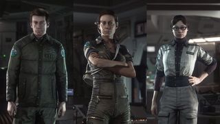
You know that small corset-tie section on the back of Ripley’s jumpsuit in the first film? Again, you probably don’t. I didn’t, and I’ve seen Alien around 84 times. But it is there. It’s a subtle, imperceptible bit of costume design, but one that nevertheless makes Ripley’s character silhouette utterly unique among the film’s cast. That’s the level of detail that Creative Assembly is working on when recreating and expanding Alien’s world in Isolation. As Bond tells me:
“Faces, likeness and costume were really important to us. We were all really big fans of the movie. We thought we knew what Dallas wore, etc. But then we got hold of the archive material from Fox. They dug it out of the basement, we blew off the dust and we started to look through all of this production material, and we were amazed by what we found. We just did not know that this was what was going on with these costumes.”
Sign up to the 12DOVE Newsletter
Weekly digests, tales from the communities you love, and more
The word “deconstruction” comes up many times during the day. That seems to be the approach that the team is taking in all elements of the game’s design. Whether it’s costume, characterisation, environmental structures or music, they’re devouring every single piece of movie source material imaginable, disassembling it into its tiniest constituent bits, and then using those bits as a Lego kit to build their own, indistinguishably consistent patches of the Alien universe. And they’re not cutting corners anywhere.
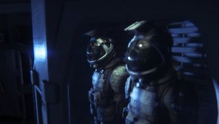
For example, character design. Ordinarily a game will present its principle cast (ie. ‘the ones they bothered to design’) and then everyone else (ie. ‘the same handful of faces mixed and matched with the same three bodies’). Not so in Alien: Isolation. In order to preserve the grounded, lived-in, “rebellious and characterful” feel of the universe, CA has created hundreds of items of clothing and accessories based on the style of the first film, to ensure that everyone in the game feels like a real, legitimate person in their own right, regardless of their place in the narrative hierarchy.
“We did that initially for practical reasons”, explain Bond, “Just because we want to get as much variety as we can by shuffling elements. But it's kind of become apparent subsequently that that's a really good fit for the IP. It's not Star Trek, where everyone's wearing a very formal uniform. By virtue of us creating all of these disparate uniform elements and shuffling them, we're actually getting something that looks like it should… We've got enough so that every character you meet in the game is unique. That's nice for ensuring believable, grounded characters."
But surely all of that will be for naught if we’re talking to the same handful of recycled faces every time, a la every game ever? Well yes it would. But that’s not going to happen in Alien: Isolation either. There will be no “CaucasianMaleFace5 + BlondeShortHair2” characterisation here. None of that mix-and-match photofit design that makes character generation easy but devastates any sense of individual personality. Alien: Isolation’s character creation is an affecting combination of startling, bleeding-edge technology and utterly mundane normality. In short, they’ve got hold of the best facial capture kit in the business (apparently it comes from a one-man company in the UK, and captures at a resolution no game could handle) and used it on a raft of the most normal faces in the business. As Bond explains:
“So we had the pipeline sorted for taking the scan data. We had the kit knocking around, so it seemed weird not to capitalise on that by scanning everyone in the office. So our supporting cast of extras are the development team. Any bodies and anyone you meet in the game is us. It's nice for the team, but also from a practical perspective, once we'd established what we were doing with the main cast, we'd set ourselves a high bar and we needed to carry on with that. We can't just deform some spheres and slap a face on it”
That main cast looks impressive indeed. Well not ‘impressive’. Not in the Hollywood action-hero sense. But that’s the point. Think about the main cast of any Alien film. They’re not traditional, chiseled space-heroes. They’re worn-out, slightly odd-looking, utterly normal people, forced together out of necessity and not necessarily particularly heroic in any sense. That characterisation runs right through the main cast models Bond shows me. "You probably wouldn't design a character like that”, he admits, “but truth is stranger than fiction".
‘Truth’ is the operative word in Isolation’s design. The obsessive, almost scientific research and understanding of the movie’s world is one thing, but that methodology is all to the end of building and expanding the first film’s reality in a way that is not only consistent, but which also feels real and justifiable in itself, in the same way that the film’s design philosophy drove its final, on-screen form. As a starting point, the game’s user interface teams are going back to the very same seed that spawned the film’s utilitarian, industrial look and feel. The work of production artist Ron Cobb. Says UI Art and Design Lead Jon McKellan:
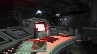
“There are quite a lot of assets that Ron Cobb created that didn't make it into the film, which we've dissected. We're even looking at the colour palettes of pale blues and yellows and beige, and we've incorporated those into ours too. Obviously we're going to extreme lengths to make sure that the detail is correct, and it's very important to us to make sure that this stuff is accurate.”
But this isn’t just a case of copying and pasting Cobb’s original work. The Isolation team are even following his methods. Cobb described himself as “a frustrated engineer”, and as such his production work came from a perspective as industrial as it was artistic. He used pen-and-ink techniques and architectural methods when designing Alien’s environments, and CA is doing the same. McKellan shows me some of the team’s design work next to Cobb’s original. It’s indistinguishable in style.
“Fox have been amazing throughout this whole process”, enthuses McKellan. “They've given us three terabytes worth of assets that have never been released to the public, stuff that we're really privileged to see, including things like actual blueprints for set designs from Shepperton studios. We got to see not only what it looked like but how they built it, what the metrics were, cross-sections of props... We got everything we could get, and that helped inform gameplay space and making sure that while we were creating claustrophobic tunnels and large open spaces that they felt the right size. That they not just look right, but feel right"
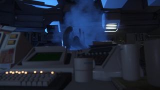
Feel is all important in Alien: Isolation. Take, for instance, Seegsen, the new interstellar conglomerate created by Creative Assembly, and owner of the space station on which the game takes place. With protagonist Amanda Ripley hunting for the Nostromo’s black box recorder on behalf of the franchise’s notorious Weyland-Yutani Corporation, a new company was needed to populate the game’s setting, and CA has gone all out to present it as a living, breathing entity.
"We've treated Seegsen like they're a real company”, says McKellen. “What does their logo look like on a t-shirt? What does it look like on a mug? We make sure that we do the groundwork so that it feels like something that could exist.
“We wanted that company and that presence to feel grounded and feel believable, and also have some backstory, so we went to huge lengths to really explore everything this company could have done, how they would have presented it, what their approach is to life; it gives the station a personality of its own that will hopefully come through in the final game. That goes through to things like personal mementos and badges. Instead of digital photo frames you've got polaroids. You have really roughed up bits of paper instead of datapads”
The same, authentic, low-fi sci-fi approach is being applied to any and all new elements of the universe designed by Creative Assembly. Again, it comes down to a kind of ‘method designing’, creating ideas and objects with the enforced mindset of the original film’s creative team to ensure that nothing, however big or small, looks or feels out of place.
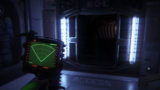
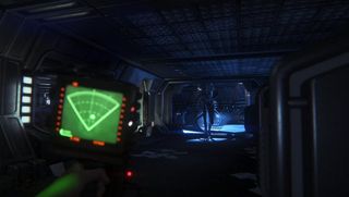
“We've set ourselves a rule that if they couldn't have built it in 1979, then we won't build it either. So we'll only reference other technology that was made before the release of the film. It's kind of a difficult rule to place on yourself, but it makes for some really interesting stuff. So our hacking tool, instead of being some holographic thing, it ends up being referenced from war radios and portable televisions. You know, the very early stages of these video devices.
“…the motion-tracker could have been an overlay on the screen, it could have been a HUD element like other games have, but by being low-fi and grounded, we wanted the player to kind of hunker over it and have the character use this thing as a tool. Everything has a function and a tangible nature to it. That low-fi aesthetic is informing the gameplay as much as it is the visuals”
That dedication to creating contemporary, late-‘70s design, 35 years later, leads on to my favourite anecdote from my first day with Alien: Isolation. The creation of the Seegsen station’s video graphics. So dedicated is Creative Assembly to making the game feel like the high-def product of a distinctly low-res time that it has gone to insane--and brilliant--lengths to ensure that anything that comes out of their in-game CRT monitors is 100% authentic.
“So we went through a lot of different approaches to get this VHS feel”, McKellan tells me, “and despite any amount of money or any amount of plug-ins you could buy, the best approach was to take game footage and UI elements and record them onto tape. And then to play that back through a terrible portable TV, and hold magnets up against the tapes, and sit in a darkened room and wiggle around SCART cables until they break--we've managed to break two TVs so far. And then we recorded it all onto old Alien VHS tapes, so that if anything bled through, it would be the film. And the effects, they speak for themselves.”
They do. They really, really do. Beyond the fear, beyond the panic, beyond the punishing, second-to-second horror of facing the Alien itself, Alien: Isolation is--much like the film that inspired it--a startling, affecting experience because of the sheer, effortless sense of matter-of-fact reality encasing the nightmare. Though it’s now apparent that ‘effortless’ takes one Hell of a lot of work and dedication to achieve. It seems that Weyland-Yutani isn’t the only one building better worlds these days.




After 2 years of silence, the next mainline Silent Hill game is getting a dedicated stream this week with "the latest news"

This survival horror Steam Next Fest demo doesn't care that its puzzles are breaking me because it knows I'll stay for the immaculate Silent Hill vibes

