What video game box art would look like if it hadn't changed in 30 years
The craptacular box art of yesteryear, applied to the games of today
Wipeout 2048 | Old box art taken from Gridrunner (1982)
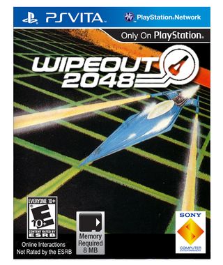
By today's standard of box-art this could justifiably be described as 'a bit ropey'. It's not glossy or polished or dynamic or exciting or even particularly well drawn. But there's still *something* about this 30 year old image that has endured and inexplicably makes it not completely crap when parading as a Wipeout cover. In fact I quite like it. The parallel lines of the ship (which could easily be a vintage Feisar) from the lasers to the vapour trail give it a satisfying sense of perspective depth and as a composition it all fits together nicely.
It would also be the ultimate reverse psychology box-art. With such lo-fi artistry, the modern consumer would expect a product of equally primitive standards. But they'd get super sexy Wipeout and be all like 'Holy shit amazing' and tell all their friends and then they'd go and buy a copy and then they'd tell all their friends and it would go on like that for a while and then eventually everyone would be millionaires for some reason and get swimming pools and have gorgeous wives who were 20 years younger than them and go horse-riding on the beach at sunset.
Mass Effect 3 | Old box art taken from Space War (1978)
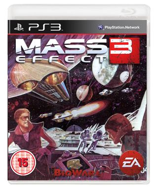
Man, this is so funky. Sure when you look at it there's not really anything happening in this picture at all - it looks like there is but it's just some dudes messing with buttons and levers, a few space ships, a bunch of planets and a couple of astronauts leaning a bit - but it's still got way more charm and character and excitement than the actual Mass Effect 3 cover with its moody-faced Shepard looking moody-faced.
Thinking about it, BioWare missed a trick by not setting Mass Effect in a funky 1970s version of futuristic outer space. They should definitely change it. Maybe I'll start a petition.
FIFA 12 | Old box art taken from Kick Off (1989)
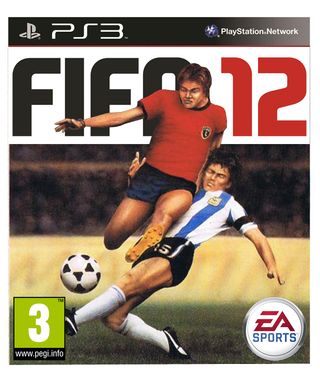
Rubbish drawing of football is way better than annual updates of Wayne Rooney and his stupid wide open mouth.
Rainbow 6 | Old box art taken from Hostages (1988)
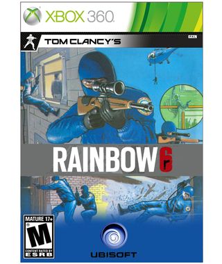
Fair enough the gun pointing out of the cover looks a bit wrong and out of proportion and the end appears to be a bit bent, but at least they had a go. That's what matters. As we learnt earlier - perspective drawing is hard.
But still, with all the men in balaclavas and crash helmets dangling from ropes and smashing through windows and looking through sniper scopes, this is a perfect bit of artwork for Rainbow Six. The men have even got little rainbow patches for their uniforms. Which is sweet. I expect they are patches you iron on as I doubt special forces would have time to do much sewing.
L.A. Noire | Old box art taken from The Detective (1986)
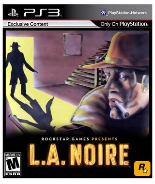
Intrigue. Shadowy figures. Hats. This cover ticks all the noir boxes and is 100% pertinent for a game called L.A. Noire. It's also got a cigarette that can best be described as 'large'.
I know at first it's easy to look at and say 'Holy crap that is some crap looking box-art right there' but the more I look at it the more I think it actually looks OK and wonder if something hand drawn and a bit rough-around-the-edges that bucks the modern trend of hyper-polished box-art compositions would really be such a terrible thing. And then I think that maybe I'm suffering from prolonged exposure to this feature and it is seriously impairing my artistic judgement.
Dead Space | Old box art taken from Demon Attack (1982)
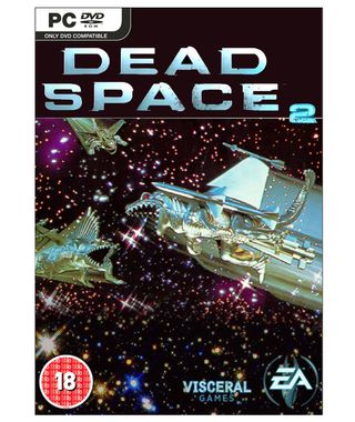
You might be wondering what a photo of some plastic dinosaurs with rockets glued to their backs and sprayed silver have to do with Dead Space (beside the fact they are clearly meant to be in space). The answer is they have absolutely nothing to do with Dead Space. But that's the point.
Back in 1982 a photo of some plastic dinosaurs with rockets glued to their backs and sprayed silver had absolutely nothing to do with Demon Attack either. But it didn't matter. When your art budget could only stretch as far as some extinct toy lizards and a can of spray paint, worrying about whether or not it made perfect sense didn't exactly factor into the artistic process.
Skate 3 | Old box art taken from Metro Cross (1987)
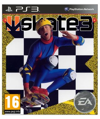
The only rational explanation for this cover is that it was a joke. Somebody was joking. Having a funny. The 80s weren't really this messed up. Skaters didn't really wear one-piece polyester skin-tight superhero unitards (sans cape) like this doofus. Not even in the decade renowned for its epic sartorial misfirings could such an abomination of decency happen unless it was a joke.
That said, it does rather nicely buck the trend of skating being portrayed as edgystreeturbancool in a self-deprecating way that skaters would probably find totally ironic and therefore laud it as being edgystreeturbancool anyway, paradoxically turning this box-art into the very thing that it most definitely is not.
Sign up to the 12DOVE Newsletter
Weekly digests, tales from the communities you love, and more
Uncharted: Drake's Fortune | Old box art taken from Rick Dangerous (1989)
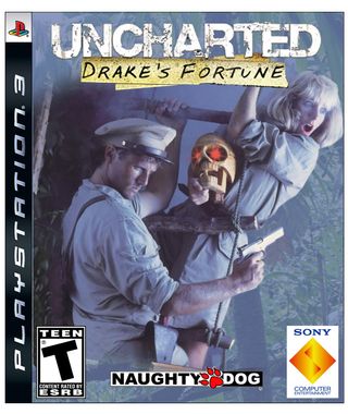
The character model photo-shoot is truly a relic of video game box-art that we hardly see any more. This particular one from Indiana Jones wannabe and platform-based adventurer, Rick Dangerous (love that name), really captures the adventuring spirit of Uncharted. It's also a bit cheesy and is in absolutely no danger of taking itself too seriously - two other endearing traits I'd associate with Naughty Dog's game.
Fun fact: Rick Dangerous was made by Core Design - the UK developer that eventually went on to create the Tomb Raider series.
And that's it. We are at journey's end. I hope you enjoyed this whimsical little feature. Do you like old box-art - do you think it has a certain charm or je ne sais quoi that is absent from modern game packaging? Or do you think it's all shit? Either way, if there is something you would like to comment on, please direct yourselves to the aptly-named 'comments' section below...

This new indie D&D campaign setting brings Studio Ghibli and Zelda: Breath of the Wild aesthetics and worldbuilding to the tabletop RPG, and I'm already scheming hard as a DM
I've seen enough: Assassin's Creed Shadows will beat Black Flag as my favorite AC game as Ubisoft says it lets you "Naruto run" as the "fastest Assassin" it's ever made
Most Popular
