The meanings you missed in Final Fantasy logos
Paint me a picture

Final Fantasy can be goddamn impenetrable. It may not be as hard to grasp as Kingdom Hearts or Metal Gear Solid in terms of continuity and broken-slinky plot twists, but the sheer amount of content contained in each story feels overwhelming. Summing them up in their full glory - all the fantastical places, warring factions, mythicism, and unpronounceable names - seems like an impossible task. Unless, of course, you're a Square-Enix logo designer.
In the late days of its development, each Final Fantasy in the series gets its own ornate logo, like a right of passage for stories about swords and spiky hair. These logos are all centered on some important part of that game, with plenty of visual symbolism so it can contain as much of the game's spirit as possible. Even the simplest Final Fantasy logo can have a lot going on, and as a fan it can be hard to decipher what every dark line and curlicue is supposed to mean. So we put our minds to it (plus hundreds of hours of playtime, the Final Fantasy fan's struggle), and have here an explanation of what each of these fanciful logos are getting at. It all makes sense, once you get your mind into magic-and-belts mode.
WARNING: This articles involves deep story explanations, so expect spoilers throughout.
Final Fantasy 1 - 3
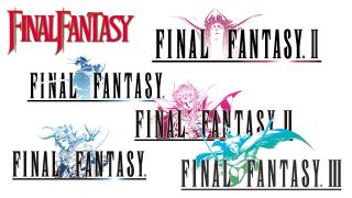
After Square saved itself from bankruptcy by the width of one eccentrically dyed hair with the first Final Fantasy, valiant efforts were made to bring the franchise to North America and Europe. That lasted for all of one game before hands were thrown up and FF2 and FF3 were abandoned to the wind. It was only in the early 2000's that the numbering was ironed out and Final Fantasies 1 - 3 finally got proper releases (in the FFOrigins bundle and FF3 DS release, respectively), with lovely new logos to boot.
Admittedly, they're all pretty simple: the original has an image of the nameless Warrior of Light protagonist, FF2 is set with a picture of its nefarious villain, The Emperor, and FF3 features hero Luneth brandishing two swords in attractive but highly inefficient fashion (seriously Luneth, you've cut your range of movement in half and lost your ability to defend most points of contact - get your shit together). That didn't change with the logos for the 20th Anniversary edition of FFOrigins, which are the same subjects made to look more ornate. But really, that captures the spirit of all of these games perfectly, because they're pretty simple themselves. The official beginning of Square's RPG dynasty, they lack both bells and whistles, but act as a solid foundation that started the series chugging. Basic, but effective.
Final Fantasy 4

This is where things start getting elaborate. Originally, Square didnt release FF2 or 3 in the US, so when it decided to bring FF4 to the Super NES, it did so with a bare-bones text logo that read Final Fantasy 2. Oh, theres a sword standing in for the T. Very cute. Meanwhile, Japan used the true logo, seen here with one of the games coolest characters, Kain Highwind. His actions move a great deal of the story along, easily earning his top-billing status on the front of the package.
Years later, when the 2008 DS remake hit the West, Square opted to showcase the villainous Golbez instead - a worthwhile swap as he was responsible for most of Kains misdeeds (let's just say there was brainwashing involved). In a fine fashion that would become common practice for the series later on, Golbez actually affects the game more than any one of its individual heroes. The story of FF4 is, in many ways, his story, so it only feels right that he grace the cover.
Sign up to the 12DOVE Newsletter
Weekly digests, tales from the communities you love, and more
Final Fantasy 4: The After Years

After FF10-2 broke the series' cardinal rule and paved the way for direct sequels (good lord, I may faint), Final Fantasy 4: The After Years snuck past the naysayers in 2008, and brought a big 'ol spoiler of a logo with it. Thankfully, it's such a vague spoiler that you won't get it unless you know the ending of FF4, so I guess that's okay.
For those who don't know and don't really care about being spoiled, the two spherical objects behind the title are moons. Specifically, theyre the Red and True moons, both driving forces of FF4 whose true importance aren't fully realized until late in the game, when the Red moon departs with one of the heroes. The return of the Red moon in After Years means the return of mysterious and dark forces, and the logo revolves around them as much as the story does.
Final Fantasy 5
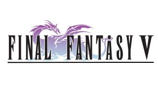
Okay, phew, this one's a fair bit easier to explain than FF4. The dragon in the background is simply a wind drake, which youre able to ride around the planet for quick and easy travel. Theyre sort of an endangered species in the FF5 world, and carry the main cast to and from a few key plot points.
Theyre not exactly the backbone of the story, but are important to several of the main characters, namely the two princesses Lenna and Krile. They also make frequent appearances throughout the story, since a whole lot of people seem to need saving and wind drakes are pivotal to those rescue missions, like scaly lifeguards. The drakes therefore have a huge impact on the cast, and are responsible for keeping the heroes' journey from ending too soon. Plus, one turns into a phoenix later, which is pretty damn sweet.
Final Fantasy 6
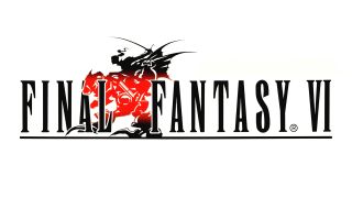
FF6 first launched in the US as FF3, and the logo once again didn't really gel with the Final Fantasy spirit. It did match up with the US FF2 though meaning it's just a logo with a swordy T", but this time there's a moogle and a spooky shadow!
The original FF6 logo seen above features Terra, arguably the star of the games ensemble cast, riding atop a hulking Magitek Armor. The games memorable opening sees Terra trudging through the snow in said iconic armor, though shortly after her inherent magical powers begin to cut loose and her true nature is exposed. It's revealed that Terra is half-esper, a sort of mythical being with innate magic powers, and that the Empire that controls her has enslaved several espers to steal their magic and power the Armor. It's the Empire's lust for esper power (the very sort that Terra carries) that creates the main conflict of the story, and the machine she's riding that represents the enemy to be defeated.
Final Fantasy 7
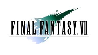
For those who have played FF7, this ones way easy - and for those who haven't, keep your voice down, they might hear you. Behind the familiar Final Fantasy text (notably standardized across regions for the first time, with IV and V still in transit) is Meteor, the world-ending spell that infamous villain and shampoo model Sephiroth summons to smash into the planet.
Sephiroth plans on bringing Meteor down, injuring the planet so badly that its regenerative powers (called the Lifestream, which is first seen being harvested by the giant Mako Reactor in Midgar) seep through the crust and attempt to repair the damage. Once its exposed, Sephiroth plans to absorb that energy and become a god. To pull it off, he needs the Black Materia that will summon Meteor, and manipulates Cloud and company throughout the entire game to bring it to him. Effectively, Meteor is what lies at the end of the heroes' path, the result of all of Sephiroth's machinations, and the real bringer of destruction hiding behind the scenes. Basically, kind of a big deal.
Final Fantasy 7 Compilation
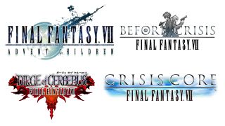
The logos for FF7's many sequels vary from ultra-detailed to incredibly basic. The Advent Children logo, for instance, is far cleverer than a first glance lets on. That may just look like the meteor from VII with a futuristic makeover. But it's really it's a detailed blueprint of the now-destroyed Midgar, with the smattering of polygons to the right representing Edge, the city built in the wake of Meteor's destruction.
The rest of the Compilation's logos are fairly elementary. Before Crisis, a game that centers on the special ops force known as the Turks, features a picture of two Turk trainees as its symbol. Dirge of Cerberus has a set of three stylized dog heads (in protagonist Vincent's signature colors) set around its text. And the cloudy Crisis Core logo is easily the simplest of all, to the point that it looks like barely any thought went into it. However, I'd bet my last gil that simplicity is a deception, and it's actually a reference to this unacceptable scene. I'm not crying, you're crying.
Final Fantasy 8
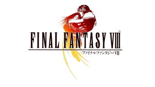
This one's pretty simple, and purposefully so its hero Squall Leonhart holding heroine Rinoa Heartilly. Square made it clear early on that FF8 would flip the series script by being a straight-up romance with fantasy elements attached, rather than the other way around. They kept their word on that one, and though opinions on the quality of the game's romance plot vary widely, theres no denying that Squall and Rinoa are at the heart of it all. Ahem.
While this isn't a rendering of any specific scene (they start hugging quite a bit once Squall shakes off that inch-thick layer of teen angst), it closely matches two scenes in particular: the couple's first genuine moment of intimacy, and the sequence where Squall chooses to save Rinoa rather than fulfilling his military duty to cryo-freeze her for eternity.
Final Fantasy 9
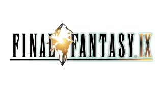
FF9 was advertised with the slogan The Crystal Comes Back, a knowing wink to fans who cherished the days before Final Fantasy meant drilling for mystical oil and boarding schools that teach Magic 101. In the first six games, high fantasy was the order of the day, and enchanted crystals played an important role in each of their stories as world-saving devices or MacGuffins the villains could use for the exact opposite.
In FF9 - the last of the PlayStation era and a love letter to the age it was leaving behind - all life comes from the crystals. The entire lifecycle of the planet Gaia and its inhabitants revolves around the health of the crystals people are born from them, and when they die their memories and essence return to the crystal, refreshing it for another batch of spirits. The problem is that another worlds crystal is withering away, and the people of that planet found a way to move its fading crystals souls into Gaias. Cue the grand battle for the crystals, and the journey of the last old-soul Final Fantasy.
Final Fantasy 10
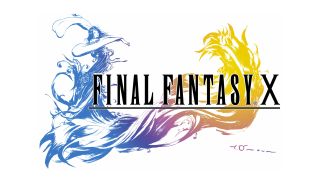
Don't let the bizarre outfits and teenagers making out in lakes fool you: FF10 deals with some heavy stuff about the nature of loss, tragedy, and religious dogma, and all that comes together in its ornate logo. It recreates an image from one of the game's most famous scenes, where protagonist Yuna performs a ceremony to guide a group of tragically deceased souls to the afterlife as part of her summoner duties.
While that does seem damn decent of her, it eventually becomes clear that the teachings Yuna abides by as a summoner come with an awful lot of baggage, and the religion she devoted her life to may have more to do with killing people than it does saving them. Eventually rituals like the summoning start to lose their meaning, and the logo captures that struggle, putting a beautiful face over the dark secrets a few skeptical questions away.
Final Fantasy 10-2
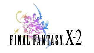
This one isn't too mentally demanding: that's the game's three main characters Yuna, Rikku, and Paine in the midst of battle, and/or a stylized version of their Charlie's Angels pose. It highlights the all-female cast, the unchanging three-person battle team, and the sexier edge it had compared to its predecessor, the triple threat that the recently merged Square-Enix wanted to put front and center for the series' very first sequel. Go big or go home.
While this logo gets the job done efficiently on its own, putting it alongside the FF10 logo (which Square did for the cover of the HD Remaster collection) makes it a lot more interesting through comparison. FF10-2 was meant to be departure from the epic but tragic storyline of FF10, giving the world of Spira a more light-hearted feel; the way this logo's sharp edges and kinetic energy contrast with FF10's flowy look makes the distinction even more obvious. Did Square expect a remaster, or did they just hope we'd push the covers together? I'll admit to doing the latter.
Final Fantasy 11
A big ol collection of soldiers, representing the hundreds of real life people you could play with in FF11's MMO world. A first for the series, Square really wanted to drive home that angle of togetherness while assuring that you, dear player, are the real hero of this story.
The front five characters in the crowd therefore represent whomever happens to be picking up the box at that moment, along with a pack of their closest friends to play with (set slightly further back, of course). Also, those five do double-duty as members of each of the five playable races in the game (Hume, Tarutaru, Galka, Mithra and Elvaan), showing off the variety of customization options available. Basically, this logo bangs the MMO gong as long and loud as it can, and hopes that the horde of soldiers in the background will be enough to take on the forces of WoW.
Final Fantasy 12
Amano has some serious confidence handing an unwieldy vertical logo over to Square's marketing team, but the man knows what he's doing: the size and shape alone accurately convey the commanding presence of Judge Gabranth. Though he may not be the star of the show or the big bad, he remains a constant in the story (from orchestrating the events that brought down the Kingdom, to leading the charge against Ashe and Basch's efforts to return self-rule to Dalmasca) and represents the imposing might of the Arcadian Empire which he serves.
Of course, Gabranth isn't all bad, which parallels the nature of the story itself. There are of course big bad imperialists and their magical sponsors to defeat, but many folks on the 'other side' turn out to not be half bad, and the heroes themselves don't exactly have spotless records. Less a moral tale than previous Final Fantasies, FF12 is all about politics and the often ambiguous figures on all sides. Who better to represent that than the conflicted and misunderstood Gabranth?
Final Fantasy 12: Revenant Wings
Two vertical logos! A DS-only sequel, Revenant Wings reaches for the sky with this crescent-shaped image of the airship Galbana, which Vaan and Penelo use to explore the floating continent of Lemures. Hidden from the rest of the world for centuries, the nation's regarded as a legendary treasure by Ivalice's sky pirates, making it an ultimate goal for these teenage explorers. Plus, it's the home of a winged race of humanoids called the aegyl, which the logo also sort of depicts if you tilt your eyes and squint. See, there's a head right there!
Of course, it's not all shanties and pirate booty: the Galbana and Lemures were created long ago by the god Feolthanos, who threw up a barrier around Lemures to keep his people safe and secluded. However, the barrier is knocked down during the events of FF12, and with his newfound freedom Feolthanos plans on destroying the world. Of course he does.
Final Fantasy 13
It takes a lot of nerve to put the ending of a game right on the cover, and that's what Square did with FF13. You don't really notice until you see the end yourself, so it doesn't matter too much. You might be able to figure out what the sphere at its center stands for pretty early on though: that's Cocoon, the hollow moon that most of the game's protagonists hail from. At the bottom, the logo morphs into a pendant worn by Serah, Lightning's sister and Snow's fianc, who acts as an emotional center for the cast and pushes them to continue their journey.
All the frills on top, meanwhile, take a full playthrough to understand. After our heroes win a climactic battle against their homicidal god, Cocoon begins to slip out of the sky, dooming the millions inside. Refusing to let it fall, heroes Fang and Vanille merge into a beast called Ragnarok, and stop the moon's descent with an impressive mix of icework and pyrotechnics. They then prop it up with a tower made of crystal and freeze themselves inside, as pictured in logo. They remain there to hold Cocoon in place forever. Or at least, until
Final Fantasy 13-2
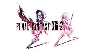
Much like its box art, the logo for FF13-2 is curiously free of protagonists Serah and Noel. But it does put one of its main conflicts and overarching themes front and center, so I suppose that's good too. Behind the title are Caius Ballad, the villain who wants to destroy time itself, and Lightning, a hero of the goddess Etro given the task of stopping Caius and protecting the timeline. Both are nicely color-coded for reference, with Caius' dark shade contrasting Lightning's brightness.
While this may look like a marketing ploy to get another version of Lightning on the cover, it actually perfectly symbolizes the deeper conflict that drives FF13-2's action. Noel and Serah might be the player characters, but they're really just Lightning's agents on the ground, undoing Caius efforts to disrupt the flow of time while he and Lightning battle on an otherworldly plane. Players may spend 95% of the game completely blind to that conflict, but everything about the game leads into it, and this logo sums it all up nicely.
Lightning Returns: Final Fantasy 13
This one's pretty simple, both visually and symbolically, but it gets the point across with pinpoint efficiency. Lightning Returns is, as you would expect, a game that focuses a whole lot on Lightning, her search for redemption, and her last-ditch efforts to save her sister and deliver the souls of a dying world.
In keeping with that very character-centric focus, the logo for Lightning Returns is all about the titular hero: the emblem above the title matches the necklace Lightning wears throughout her journey, and has sparks of electricity shooting through it. Get it? Plus, it also looks like an abstract version of a crystal, which could symbolize the crystal stasis that Lightning awakens from at the beginning of the game. Maybe that little bit of electricity inside is meant to be the last vestiges of hope that brought her back to this world, to try and save it one more time. I guess Lightning does strike twice. I'll see myself out.
Final Fantasy 14
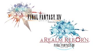
Now here's a fun one: how many battle-charging heroes do you count in this piece of art? The answer is, naturally, 14, a nice little a-ha added to an otherwise familiar concept. FF14 was meant to be the series' next big MMO as FF11 started to really show its age, and like FF11, FF14's logo relies on crowds to get its message across. It's a lot more stylized and visually interesting (that'll happen when a sword is coming straight at you off the box) but the concept is still all about showing off the huge community you'll get to play alongside.
Well, theoretically anyway - FFXIV's failure is legendary, with a launch so bad that it almost killed the game right there. Thankfully, Square stayed classy about the whole situation, owned up to its failures, and turned out a significantly better game three years later in A Realm Reborn. Reborn's 'new' logo reflects that change well: it's still the same piece of art, but recolored and glowing with new life, and that feels like a true rebirth.
Final Fantasy 14: Heavensward
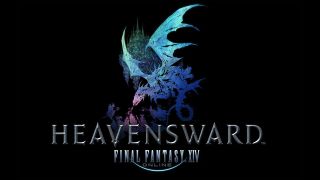
Well isn't that smart - Heavensward's logo manages to capture both its main story beats and biggest new gameplay mechanic in one image. Specifically, the dragon on the cover and the tiny soldiers putting up a valiant poking effort reference the Dragonsong War, a conflict between humans and dragons that sets up the plot of Heavensward. The floating island in the background depicts the expansions new areas, including the floating Sea of Clouds and its neighboring nation of Ishgard, where the game's campaign is centered.
And of course, what do wings bring to mind better than soaring among the clouds, which is one of the biggest new additions Heavenward brings to FF14: flying mounts. Whether it's a dragon, an airship, or an adorably plump chocobo you use to take to the skies, it opens up the world of FF14 and defines the expansion. Really, it'd be a crime if they didn't work some wings in somewhere.
Final Fantasy 15

And that brings us to FF15, ten long years in the making and finally gracing our world next year (by process of elimination anyway). That means it's too early to actually know what the logo is supposed to represent, but what's wrong with a little theorizing?
It consists of a sleeping woman with what appears to be a sun rising behind her, as serpent-like creatures surround her on the left. Apparently she's a great goddess of sorts in the FF15 mythology, who's lying down on the job. That parallels a creature mentioned in the FF15 Duscae demo, who's been dormant for ages. The protagonists are going to visit him, so could they be on a mission to wake up this mystery goddess too? Are they the sun rising in the background? And seriously, what's with the snakes? Help me out here, Tabata.
Former Associate Editor at GamesRadar, Ashley is now Lead Writer at Respawn working on Apex Legends. She's a lover of FPS titles, horror games, and stealth games. If you can see her, you're already dead.
Final Fantasy 14 patch makes an effort to combat mods that can enable harassment, but players report it's "very easy" to reverse newly hidden account IDs
28 years after Final Fantasy 7 introduced a generation to the concept of waifus, Tetsuya Nomura says Tifa's popularity is "not just about appearance"

