What all devs should learn from the Castle of Illusion remake
Sega Studios Australia aren't taking the Mickey
The original 1990 Castle of Illusion is considered a classic, probably because everybody who had a Mega Drive or Genesis either owned it or knew someone who owned it. But it aged very quickly. By the time Sonic 2 was out in 1992, loading up Castle of Illusion was laughable. It had ideas, certainly, but they were hamstrung by a predictably weak early grasp of the hardware. However, underneath the creaky implementation, the concept was pure gold. In fact, the make-believe world and the characters within it were so good, it's only now, 23 years later, that a modern-day redux has finally delivered the real Castle of Illusion.
Before we go further, watch this comparison video we made to show you the two versions' handling of the same situations:
This is the yardstick by which all future remakes should be judged. And I'll tell you why. For starters, there's the fact that the original game's 2D-only gameplay is embraced for the most-part, but it is occasionally (and effortlessly) cast aside, allowing Mickey to roam around these amazing locales in full 3D. It may not happen very often, but moments like the macaroon whirlpool finally allow you to explore the background--something that 2D games in 1990 always made us wish we could do. In a world where anything's possible, suddenly breaking from convention fits right in.
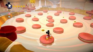
And it's intuitive, too. When Mickey is presented with a platform that's occupying a space a little further along the Z-axis, you just push the analogue stick forward. Mickey obligingly walks 'into' the screen. When it's time to go back to 2D, the game channels Mickey's path into one logical exit from the 3D space and the Z-axis is dropped from the gameplay. It's so seamless, the best of tight 2D design and the joy of 3D exploration and freedom can co-exist in the same level. Crucially, the majority of the game plays like the original, maintaining authenticity while tossing delicious morsels of current-gen flair into our eager metaphorical mouths.
"This is a game with early 1990s conventions everywhere you look"

The next success is how sympathetically the original game's elements have been augmented. The 'A's that bounce around the library may be 3D models, but they move and bounce like the original 2D sprites. Sure, they're now *saying* 'A' out loud in different voices--which is new--but (and here's the important part) if the technology had allowed it in 1990, I'm sure they would have been saying the same thing.
Likewise, the countless 'distorted glass' effects that litter the foreground, from reading glasses to lollipops, are exactly the sort of thing designers would have implemented in the 1990s if the technology had been there to allow it. This is a game with early 1990s conventions everywhere you look--it just happens to be made using PS3/Xbox 360's capabilities.
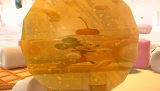
But--thankfully--not all 1990s conventions have been preserved. The difficulty level is highly reminiscent of the original Castle of Illusion, but with some key concessions to modernity. The liberal sprinkling of restart points mean you never have to start the entire level again if you're near the end, and most certainly never ask you to begin the entire game from the beginning. Modern audiences aren't used to that degree of harshness, so it was necessary to change it. But what you don't get is dumbed-down platforming action.
Sign up to the 12DOVE Newsletter
Weekly digests, tales from the communities you love, and more
"Secrets are hidden outside the camera's normal framing, or in an incidental cubbyhole in the scenery"
In fact, the platforming is better-designed than the original game. The original's blocky levels are too chunky to allow for many truly-concealed areas, instead resorting to the old 'some blocks have no collision boxes' technique to surprise you. In the new version, secrets are hidden outside the camera's normal framing, or in an incidental cubbyhole in the scenery.
So even though the game only takes between 2-3 hours to finish, it takes far longer to actually complete, as you test the platforming mechanics and push them to their logical limits. The game rewards a keen eye and a brain for trying new things. And all without ever making the first play-through feel overly complex.
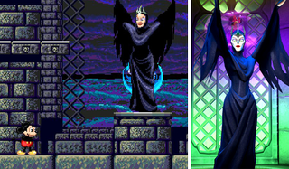
Future remakes of classic games need to learn from the successes of Sega Studios Australia's Castle of Illusion. If one thing alone should be taken away from this 2013 game, it's that remakes should abandon all thoughts of porting the original code and instead make the original game again from scratch, using today's hardware and the original concept documents.
By never losing sight of what made the original what it was, the Castle of Illusion of 2013 is the one that gamers imagined they were seeing in 1990. There can be no higher praise of a remake than that. The benchmark has been set.
You know that kid at parties who talks too much? Drink in hand, way too enthusiastic, ponderously well-educated in topics no one in their right mind should know about? Loud? Well, that kid’s occasionally us. GR Editorials is a semi-regular feature where we share our informed insights on the news at hand. Sharp, funny, and finger-on-the-pulse, it’s the information you need to know even when you don’t know you need it.
Justin was a GamesRadar staffer for 10 years but is now a freelancer, musician and videographer. He's big on retro, Sega and racing games (especially retro Sega racing games) and currently also writes for Play Magazine, Traxion.gg, PC Gamer and TopTenReviews, as well as running his own YouTube channel. Having learned to love all platforms equally after Sega left the hardware industry (sniff), his favourite games include Christmas NiGHTS into Dreams, Zelda BotW, Sea of Thieves, Sega Rally Championship and Treasure Island Dizzy.

