A totally non-geeky appreciation of typefaces in video games
Well, it might be a bit geeky. We're talking about typefaces, after all
Plain text would be so boring...
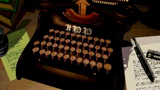
Ah, text. You might call it 'fonts' as in 'I like the font in God of War'. But fonts are for computers. What you probably mean is 'I like the typeface in God of War'. And that's what we're here to celebrate: typefaces in video games. Think of them as accents for written words. Just like everybody has an accent (even if you think you don't), so too does text. In fact, even plaintext has its own unique typographical qualities. True fact.
OK, we willingly admit it's an incredibly geeky thing to celebrate, but there's just as much artistic merit in a good typeface as there is in a character model or environment. Sometimes even more so. So here are some typefaces that make us feel happy in a geeky, pixelly kind of way...
Pac-Man

You might think there's not much to appreciate in a block-capitals, low-res typeface, but you'd be so wrong. Just look at it. The vertical stems of those 'A's with their staircase apexes, the low-weighted nature of the Ks with their thicker legs. The flared bowl of the R. Despite the limited resolution available, this is a stylish typeface.
We're not saying it's perfect. The quotation marks are only ever 'close quote', which gives it a workman-like feel that's actually rather endearing. And the kerning isn't quite right, making that last 'L' of 'BASHFUL' look at odds with the resolution of the screen. No matter. This is iconic arcade typography and it's no wonder all four ghosts are staring at it in awe.
Shadow of the Colossus

Even if the sound was turned off, we'd still be certain Dormin's words are spoken by someone very different. Look at the thin stems of the ascenders on the 'l', 'h', 'd', and 'b' letters. They're so long they tower over the total height of the capital letters. It's an almost handwritten style--one that defies conventions deliberately. Just like Dormin: Once you know the rules, then you can break them.
It's also got a slightly italicised slant to give emphasis to the words being spoken. However, the 'leading' (or the space between the lines) is surprisingly constricted. See how the bottom of the 'y' and 'g' are overlapped by the 'b' underneath. Also, while it could just be for clarity's sake, we can't help but notice the text is outlined by a dark shadowy silhouette...
Super Ghouls 'n' Ghosts
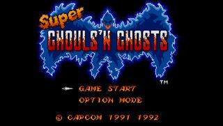
Ignore the title of the game. We're here to appreciate the standard text typeface in Super GnG. Look at the way the entire font appears to be italicised. But then look at the 'M', 'E', 'I' and 'D'. These letters aren't slanted at all. This italic scattering manages to retain a consistent visual style while simultaniously adding emphasis and appearing pleasantly official.
Sign up to the 12DOVE Newsletter
Weekly digests, tales from the communities you love, and more
Note also how the two colours used are both warm colours, indicative of fire. Then observe how the lighter hue is used on the lower-right sides of the letters, giving the impression of being lit by firelight from below. The embellished legs, spurs, and classically serif augmentations of the all-caps letters give it a classic appearance which echoes the historic setting of the game. In short, the game's entire personality is exuded by this typeface. Magnificent.
Omikron: The Nomad Soul
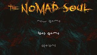
Quantic Dream annoyed a lot of people by filling many of Nomad Soul's text-heavy screens with this typeface. It's known as a 'display font'--one that's meant to be more visually striking than legible. So, momentarily putting aside its impracticality as a communicative device, let's examine its artistic merits.
Almost every letter is closer to being a symbol than a recognisable character. And, in isolation, there's no way you'd know that 'i' is an 'i' or that 'g' is a 'g'. But put them all together and the gaps are joined up by the wonder that is the human brain, until you can read the options menu. And, for that matter, everything else that's written in that typeface, from shop names to messages. If only Bowie's thong was as indistinct as this typography.
Grand Theft Auto
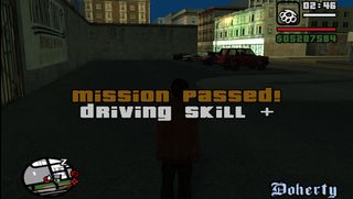
GTA has one of the most instantly recognisable fonts in all of gaming. Used in everything from the main logo to HUD money stats and mission complete screens, it's a core element of the GTA brand. But why is it so recognisable? Let's take a look.
Firstly, there's the fat, weighted thickness of every letter. In the whole font alphabet, only six letters' ascenders breach the x-height of every other letter in the alphabet. And that's including capitals. Everything else fits into a small box or drops an elaborate descender down into the next line. This makes it easy to manage the kerning between letters, as many fit together like jigsaw pieces. The mix of apparent capitals and lower case somehow doesn't grate unless you start to really look at it. Consistency is king in gaming and this font gels all the varying visual styles of each instalment's theme together perfectly. You see this and you know you're playing GTA.
Jet Set Radio
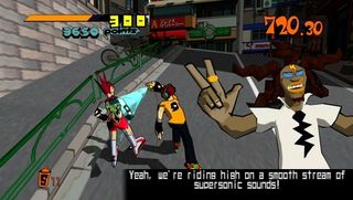
There are four distinct typefaces of note in JSR. The white font used for in-game text, and then the score icons, score itself, and timer. Brilliantly, their disparate styles combine to make one universal style: that of graffiti. The jumbo, toon-styled clock figures look hand-drawn. The score features diagonal lines which echo those of digital watch displays, only here they're used as part of a theme, not a convention. And the score display itself defies convention by including skewiff digits.
In terms of the text font, it's pleasantly boxy and uniform, even allowing a whole letter's worth of room for an apostrophe. The diminutive descenders and stunted ascenders give lower case letters extra impact, making the text look at first glance to be written in all-caps. The sans-serif style make this a surprisingly easy font to read, especially considering the tracking (space between letters) and leading (space between lines) is so sparing. It's necessary, though. Professor K would not be as cool in Comic Sans.
God of War
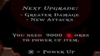
For a powerful game like God of War, you need a powerful typeface. Sure enough, that's exactly what we've got here. For starters, there is no lowercase. Uppercase is just the same as lowercase but EVEN BIGGER. Like when Kratos is talking and when he's shouting. It's all SHOUTING really, just one's a bit louder.
From a design standpoint, the serif-embellished letters are augmented with a central horizontal line of small embellishments that don't actually all run at the same height (perhaps an oversight?). Diagonal cut-offs on descenders give a bladed effect. Probably deliberate considering the Blades of Chaos you use throughout the game. Interestingly, there aren't many similarities between this typeface and the classic, ancient carvings you associate with ancient Greece. Still, it looks badass so we don't mind.
Street Fighter II
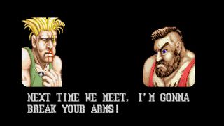
Instantly recognisable as Street Fighter's taunt font, this is a classic gaming typeface. It manages to look extra bold despite the limited number of pixels available for each letter, which does muddy the letters slightly. No matter, as they are all caps, all of uniform height and all gently serifed, except for the 'A's which look like their feet are pointing together. Most odd.
Despite being white text on a black background, the letters have a drop shadow of sorts. However, while it initially looks like a case of 'one down and one across', all letters have 'one down' at the bottom and then a mix of whatever the designer thought looked best. That's fine. It looks ace and we wouldn't change it for the world.
What's your favourite?
Do you have a favourite video game typeface? Let us know what it is in the comments and maybe the developer of the game in question will see your comment and write you a whole letter using nothing but your favourite typeface. Just imagine that. If they don't, at least you'll feel better for sharing.
And if you're looking for more, check out Game names that could mean something else completely and The visual evolution of game logos.
Justin was a GamesRadar staffer for 10 years but is now a freelancer, musician and videographer. He's big on retro, Sega and racing games (especially retro Sega racing games) and currently also writes for Play Magazine, Traxion.gg, PC Gamer and TopTenReviews, as well as running his own YouTube channel. Having learned to love all platforms equally after Sega left the hardware industry (sniff), his favourite games include Christmas NiGHTS into Dreams, Zelda BotW, Sea of Thieves, Sega Rally Championship and Treasure Island Dizzy.

