This is fan art
Exploring the skills behind kick-ass illustrations by fellow game fans
Warren Louw shows you how to create Kingdom Hearts’ Mickey …
Mickey’s body
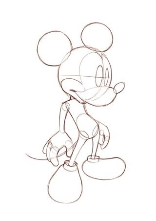
Here’s a rough drawing of Mickey, but with no clothes on. This way you can
see exactly the body and pose you’ll be working with, so that you’ll get all the placements right when you suit him up.
Rough line art
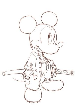
I’ve clothed the body, erased the clothed areas of his body and drawn out all the details I’ll be working with in rough. You could take it straight in for colouring, but for those wanting an edge with cleaner lines, try the next step.
Clean line art final
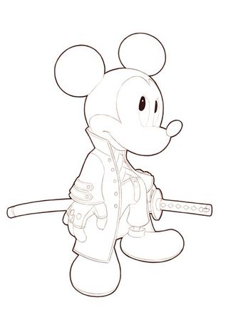
You’ll need a little bit of patience to get all those lines smooth and in proportion. I generally stick to one thickness for everything, but then create a thicker and darker outline around the character to make him more bold.
Sign up to the 12DOVE Newsletter
Weekly digests, tales from the communities you love, and more
First flat it out
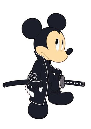
Now for the colours! This is a foundation of flat mid-tone colours, simply painted on and ready for shadows and highlights.
Begin with shadow
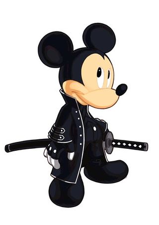
First add a flat single toned layer of shadow falling down one side to help give you an idea about how your character will be lit. Here the light will be coming from the right, so the shadow will create itself on the left of him.
Working with light
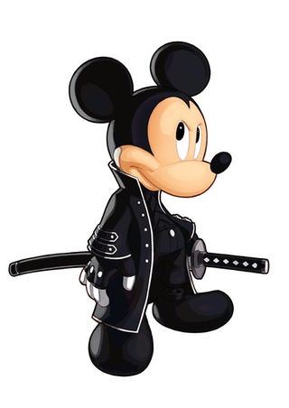
The only light I’ve added here are highlights on his face, katana, and a simple light blue silver lining running down the left of him, just to make the lighting more interesting. So now I have four levels of lighting to give him depth.
Victory!
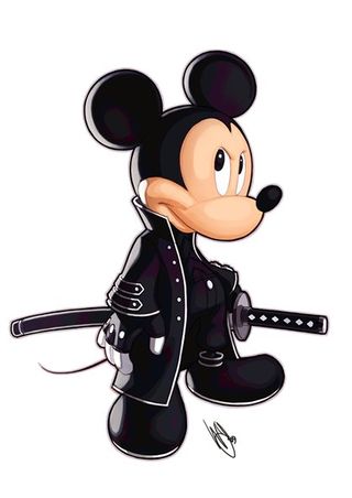
Above: Click to see an enlarged version
I add the final touches, making sure the white trim isn’t too dark in the shadowy areas. I increase the light density that’s powering the silver lining, and make sure that I’m happy with how everything is balanced. So now you have Mickey all geared up for some demon slaying!
Check out how Chun-Li was created
Warren talks us through the process he uses to make this stunning Chun-Li…
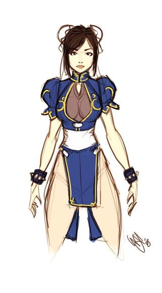
Since I’ll be slightly adjusting her original outfit, I need to understand how I’ll be changing it so that it’s functional in reality.
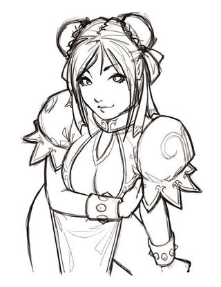
I decide to go with a dynamic pose with a little perspective, so I start off by just scribbling around, so that I can see if it’s working for me or not.
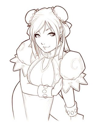
I’ve traced over the rough lines, but this time with far more accuracy. This stage is not one you want to rush! This will be your foundation to the rest of the artwork.
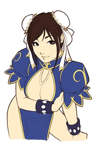
I colour her with flat foundation colors. I pick mid-tones for colours, so that I can go darker and lighter if I need to.
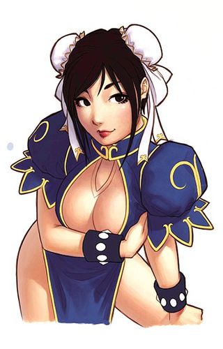
Time to start adding those shadows and highlights to really help bring her out. Here I’ve chosen a lighting source coming from the top right corner.
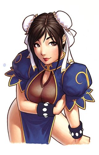
I work with these lighting tones by adding shadows to the yellow trimming on her outfit. I work on lighting her hair, and I also add a light blue reflecting light on her left.

Above: Click to see an enlarged version
Finally, I go over everything and make sure that it’s accurate, smoothed out and cleaned up. So there you have it, folks! I hope that you all enjoyed the process of how she was created.
Dec 2, 2009
For more news, previews, reviews and features check out GamesMaster magazine on UK newsstands now.Or buy a subscription today!


A showdown between fan-made creations and their official counterparts

Everyone's favorite computer software at her "wish she were real" best

See your favourite game girls in a totally (filthy) new light
The devs of a legendary indie Zelda-like have a new retro action game with "bumpslash" combat, and its Steam Next Fest demo is a gem: "Fans of Ys, take note!"
And you thought Hollow Knight: Silksong is late – 37 years in the making, this retro Metroidvania has a whip-smart Steam Next Fest demo that's as Castlevania as it gets
Most Popular


