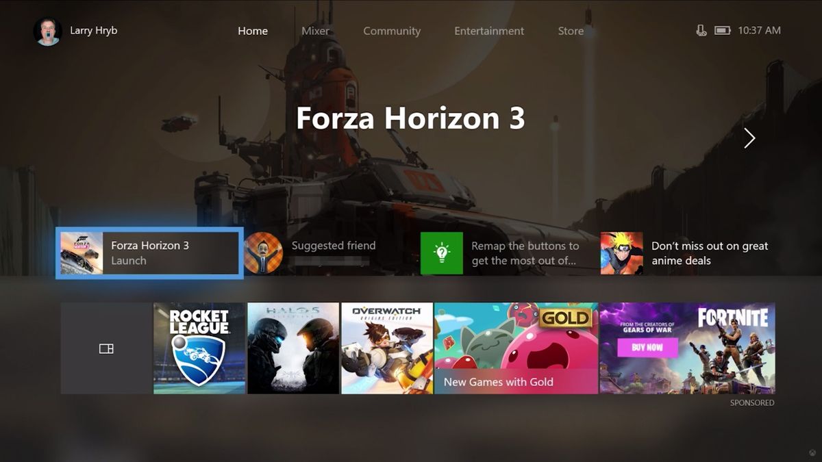
A new update to the Xbox One dashboard will be rolling out to Xbox Insiders (see: beta testers) starting today, and it's also the first chance for the rest of us to get a look at what's coming for Microsoft's console. Are you ready... for content blocks?
Remember when the Xbox 360 first introduced Avatars and started laying its menu options out in a long, vertical list, with horizontal scrolling for each item? That's the vibe I'm getting here, and personally, I'm all for it. The more I can customize my dash so it has only the things I care about and shuffles out the things I don't use, the better. Plus, the evidently improved navigation speed in the new UI looks like a definite boon.
That said, this is also the third big redesign of the Xbox One dashboard within the past two years, and the second one going to be implemented this year. You can see users' frustration with the constant changes in the video's comment section, where "Please stop changing the Xbox home every time I get used to the other home screen it is changed" is (as of writing) the top-rated comment. So what do you think? Is this update worth the upgrades or would you rather Xbox stop messing with its UI?
Sign up to the 12DOVE Newsletter
Weekly digests, tales from the communities you love, and more
Sam is a former News Editor here at GamesRadar. His expert words have appeared on many of the web's well-known gaming sites, including Joystiq, Penny Arcade, Destructoid, and G4 Media, among others. Sam has a serious soft spot for MOBAs, MMOs, and emo music. Forever a farm boy, forever a '90s kid.
Most Popular


