The worst box art of 2010
40 of the year's ugliest attempts at game packaging
Released: Aug. 3

We get it. It’s supposed to be a goofy lowbrow game for kids. But does that excuse the blur filter and grimy colors? Does that mean we should ignore the pig’s obscene grin, or the unnatural contortion that enables him to bang his crotch against the steering wheel? Or the fact that the box looks pretty much like what you’d expect from a title that abbreviates to “Calvin Tucker’s Redneck FART?”
Sign up to the 12DOVE Newsletter
Weekly digests, tales from the communities you love, and more

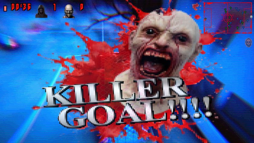
"Silent Hill mixed with FIFA 98" is a combination of words I never thought I'd see, but after playing this survival horror soccer demo at Steam Next Fest, it weirdly works

Monster Hunter Wilds PC players make Steam reviews their 15th weapon as Capcom's RE Engine delivers another Dragon's Dogma 2-sized disaster: "Very immersive game. You can cook a well-done steak on your GPU"
Most Popular


