The visual evolution of game logos
See how your favourite games' logos have changed over the years
How's it changed? The liberal use of red, yellow and blue harks back to a time when everyone was comfortable with the notion that games are toys. And toys needed to be bright and colourful to stand out. Because Mario is an international icon, the designers didn't seem to care about brand identity and so the logos were never the same until Mario 64 .
Is it better today than before? Yes, if only because the original reminds us of being young and insignificant.


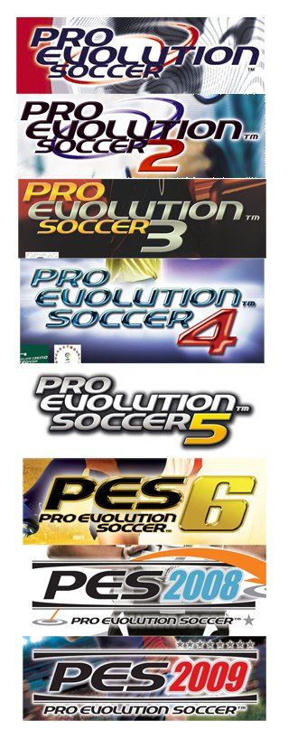
General theme? Better than FIFA but with worse presentation.
How's it changed? The one to notice is Pro Evolution Soccer 4 which is a horrible interpretation of the coloured glass effect and an off-the scale white drop shadow. The 2008 redesign saw the return of a swooshy thing as seen in the background of the original. It's now been replaced with a star thing.
Is it better today than before? Yes. Just, yes.


What the hell happened to our glistening electronic landscapes?

Bad decisions, bad timing and PR-mageddon
Sign up to the 12DOVE Newsletter
Weekly digests, tales from the communities you love, and more


