The visual evolution of game logos
See how your favourite games' logos have changed over the years
How's it changed? In no other logo evolution can you see, so clearly, the influence of the PhotoShop layer effects tool on a typeface. Drop shadow first, then a nice bevel, then a shiny bevel, then a pillow emboss and finally anastonishing combination of up to FOUR separate effects.
Is it better today than before? Only in that it now appears you can grasp the word Zelda and holdit like afridge magnet. Or at least that's what the emboss effect cruelly tricks us into thinking.


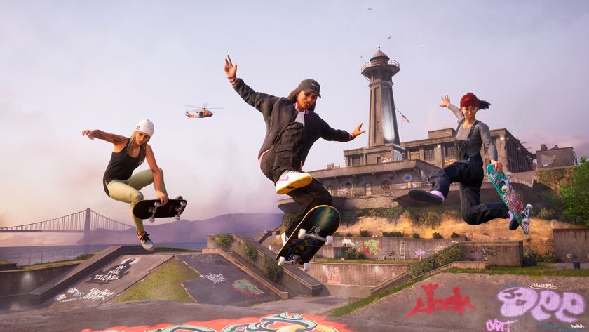
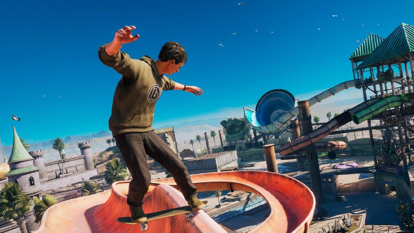
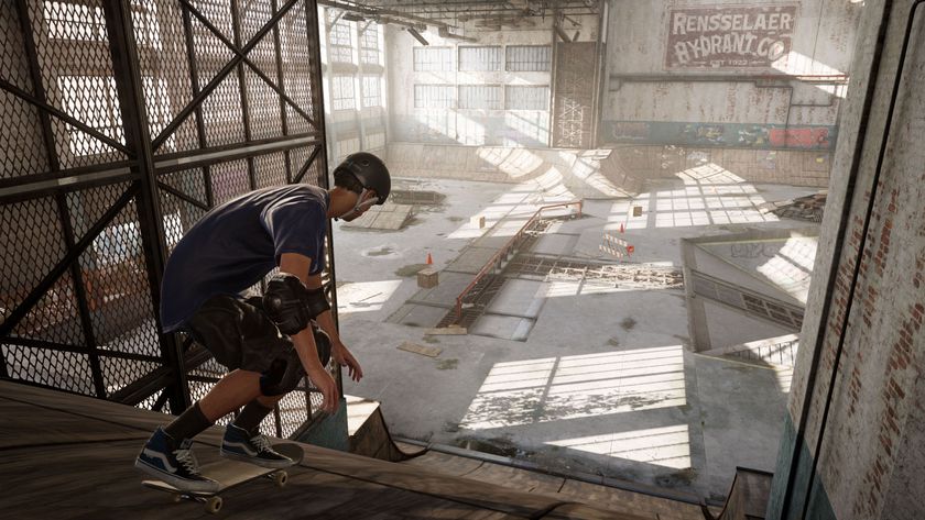
General theme? Is the lozenge shape supposed to look like a squashed skateboard wheel? That's all we've got down for this one.
How's it changed? The lozenge shape of the original is carried through til THPS4 in 2002 which is the official date from when the 'lozenge' became the uncoolest shape known to man.
Top designers were brought in to select the Stencil font, draw a box around it and adjust the angle to roughly 35 degrees. The most recent version had a lot of 'removing the box' work done toit.
Is it better today than before? Yes. The original was put together using a free fonts package downloaded in1995, when fonts were one of the few things small enough toget off the internet with a 28.8k modem.

Next up: Mario and Pro Evolution Soccer
Sign up to the 12DOVE Newsletter
Weekly digests, tales from the communities you love, and more
