The Starfield map is the one thing stopping me from living my spaceflight fantasy
Opinion | The one thing that's designed to help me discover Starfield, is the very thing that's turning me away

I love poring over maps. Whether it be a map plucked from the past in a history textbook, or one found among the pages of a fantasy novel, they offer windows into worlds from the comfort of your own home. Naturally, my fascination has also carried over into the world of games over the years, with maps to be found in virtual landscapes of all shapes and sizes. Given the interactive nature of games, maps and minimaps have become a mainstay fixture in all manner of adventures, and can play an important role in a practical sense. From pinpointing areas of interest, to reaching locations in order to progress, they help us navigate and find our bearings - just as they do in reality. Lately, I've found myself reflecting on the maps I've encountered in games thanks to Starfield.
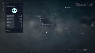
Since I first stepped into my spacesuit in Starfield, I feel like I've been battling with the maps and menus to an extent. The maps aren't all that helpful overall, and for me, it's taken away from the fantasy of spaceflight. I find the star system map navigation quite overwhelming, to the point that I've become overly reliant on fast travel to get anywhere I need to go to save myself trying to find a specific system. Planet-side, I've taken to ignoring the surface map altogether since it doesn't offer much in the way of information, and the absence of city maps has often had me at a loss when I'm trying to find my way to a specific shop that isn't tied to any objective in my mission log.
Some maps are better than others, and Starfield is by no means the first offender in this regard, but I can't help but feel my journey in the cosmos would have been a lot smoother if the maps and menus were more intuitive and easier to navigate. I'm far from alone in my frustrations when it comes to Starfield's approach to navigation, and the developers have even expressed a hope to bring city maps into the fold in a future update at some stage. But it has got me thinking about what I look for in a good map, and just why it is that Starfield's approach has impacted my enjoyment when it comes to exploration.
Mapped out

The beauty of maps in games is how diverse they can be. With different levels of interactivity depending on the game's approach, some can even feed into the theme or story of a particular adventure in a novel way. I always appreciated, for example, how you pull up a physical map to get around in the Wyoming wilderness in Firewatch, or how the map in Red Dead Redemption 2 is brought to life in the style of the Old West; complete with smaller details that mark some of the features or inhabitants of its rich landscape. Both maps suited the world they belonged in, and also effectively helped you navigate your way through the setting and story in different ways.
Starfield, on the other hand, uses a galaxy star map, which makes perfect sense given the setting. But with so many different star systems and worlds, I frequently find it difficult to find a particular planet using the maps layout and UI. More often than not, I end up turning to the quest log to set a direct route for me, which takes away from the fantasy of freely flying since I have to fast travel most of the time to get to where I need to go. While it must be a challenge to map out a universe with such an ambitious scale, I wish the map UI itself had more distinctive markers to make it easier to differentiate between systems.

There's certainly an appeal to the idea of getting lost in exploration, and I was excited to go to random planets to get swept up in the universe. But truth be told, I've rarely had any desire to explore outside of quests as a result of navigation. On the ground, you're too often tied to your scanner as you survey resources and scout out points of interest. With a surface geographical map, it doesn't offer much in the way of information. From a design perspective, this approach may be down to the fact that Bethesda used procedural generation for its many planets, but I still can't help but wish it could help in other respects. I was glad, for example, to discover that you could place pins down on the planet map, which makes a square appear on the Constellation watch UI, not unlike the Pip-Boy in Fallout.
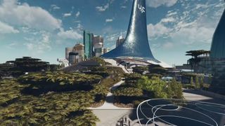
The trouble is, it's difficult to actually make out the spot on the watch because of the design of the UI. A small square appears that easily blends into the Constellation logo, and I still find it difficult to measure the distance between where I am and the marker I'm trying to reach as a result. Say what you will about Skyrim's map, but I always found it easy to read, and the markers you could place down were easy to navigate thanks to the minimap. The lack of city maps can also make it tricky to find your way to particular stores or locales. Trying to get back to my parents house, in New Atlantis, for example, had me going around in circles after completing the initial quest that led me there in the first place.
Sign up to the 12DOVE Newsletter
Weekly digests, tales from the communities you love, and more
As games get more and more ambitious, and worlds expand and grow into vast universes, how we can traverse and navigate only gets more important. Of course, it's only been a short time since launch, and with Bethesda looking to support the game for years to come, this could all be addressed down the line. With mods and a website creating an interactive map, I'm certainly not alone in my desire for improvements. But if anything, Starfield has made me appreciate just how much difference a map can make for me when it comes to exploration on the grandest of scales.
Starfield accessibility verdict: "Disabled players are left back on Earth".

I started out writing for the games section of a student-run website as an undergrad, and continued to write about games in my free time during retail and temp jobs for a number of years. Eventually, I earned an MA in magazine journalism at Cardiff University, and soon after got my first official role in the industry as a content editor for Stuff magazine. After writing about all things tech and games-related, I then did a brief stint as a freelancer before I landed my role as a staff writer here at 12DOVE. Now I get to write features, previews, and reviews, and when I'm not doing that, you can usually find me lost in any one of the Dragon Age or Mass Effect games, tucking into another delightful indie, or drinking far too much tea for my own good.
Most Popular


