The most mediocre box art
The blandest, dullest and all-around boring-est covers we could find

Want a surefire way to make someone's wallet snap shut faster than a supercharged bear trap? Combine an aggressively mundane title like "Suikoden Tactics"with washed-out colorswith a trio of uninteresting cosplayers attempting to recreate the Charlie's Angels logo. Wonder if that would help at all...

Nope, didn't work. Still bored. The only thing that could make this less desirable is a series of button commands and a battle grid slapped right on the cover.
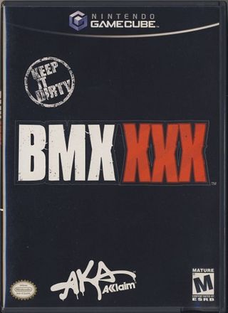
Hello, placeholder art! First time we saw this we swore it was a stand-in, something EB Games slapped together just to make it available for pre-order. It probably began as plain black with the logo, then someone at Acclaim demanded a "Keep It Dirty" blab and the obediently rebellious "AKA" stamp. Sorry guys, this doesn't even count.
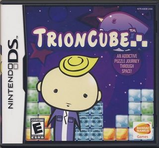
Whoa, slow down there! We like stacking blocks as much as the next website but this is just a bit too wild and crazy for us. Could this baby-faced cretin hock Trioncube any more boisterously? We’d better sit down for a spell and catch our breath.
If the sarcastic entry didn’t do it for you, we’ve prepared this alternative observation: here’s a box that looks as boring as stacking blocks sounds.
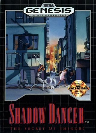
No energy here at all.
Ninja: “Uuuuhhhnn… I’m swinging my sword in your general direction.”
Thug: “Aaah, no, please I’d rather you didn’t.”
Lady: “Please excuse me, I’m trying to walk to a better box.”
Sign up to the 12DOVE Newsletter
Weekly digests, tales from the communities you love, and more
A fomer Executive Editor at GamesRadar, Brett also contributed content to many other Future gaming publications including Nintendo Power, PC Gamer and Official Xbox Magazine. Brett has worked at Capcom in several senior roles, is an experienced podcaster, and now works as a Senior Manager of Content Communications at PlayStation SIE.
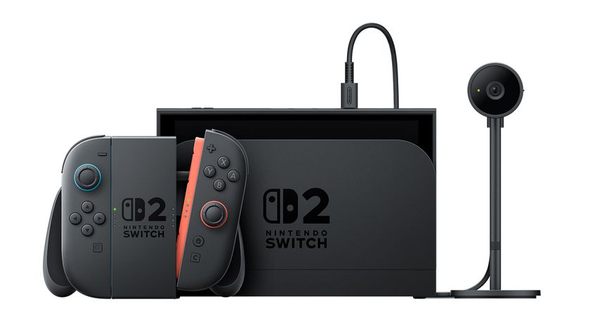
Nintendo says Switch 2's Discord-like GameChat is a "defining feature" of the new console that was partially shaped by Zelda: Breath of the Wild and a cult puzzle game

Switch 2's producer made requests "in great detail and great amounts" to make sure the eShop is as good as the Wii Shop Channel

