The making of The Legend of Zelda: The Wind Waker
A deep dive into the Zelda adventure that once sailed closest to the series' beginnings
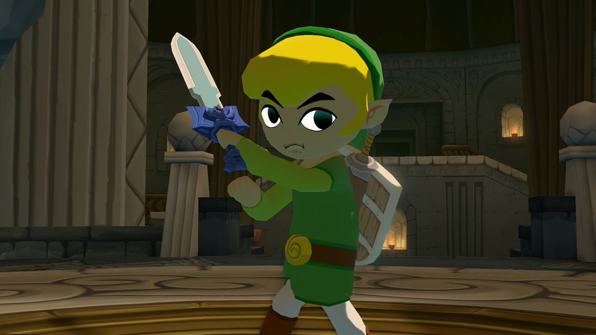
So you most likely already have your favourite Zelda game locked down. Everyone does, it seems. Many cite the exceptional 3D rebirth of the franchise that is Ocarina Of Time, 16-bit purists wouldn't dare name anything other than A Link To The Past while many newcomers adore Breath Of The Wild. A far less popular choice, however, would be the ambitious GameCube outing, The Wind Waker – liberties were taken with structure, mechanics and style that meant that this particular game sticks out like a toon-shaded sore thumb alongside the rest of the series. But does that make it a bad choice? Does it heck. If anything, there's more of the NES original in The Wind Waker than there is in any Zelda game, although it might not be immediately apparent through the distinct visuals and the soaked setting.
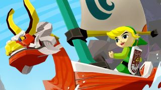
Speaking with Eiji Aonuma, we learn that Link's primary companion on the vast open seas was written from experience. "We were working on Wind Waker right around the time that my son was born," he recalls. "Having just become a father, I wrote the text for the King Of Red Lions, the talking boat who takes Link on his adventure, as if I was talking to my own son." It's a beautiful sentiment, but one with which Aonuma isn't entirely happy. "Looking back over that text now, I felt as if he had a really self-important attitude and was forcing Link to go along with him. I regretted that a bit and changed the way he speaks to be a bit more mild in the remake."
Erase and rewind
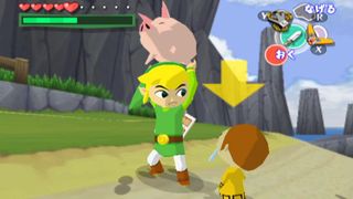
Rewind to before that, however, and you'll see a developer in a tight spot. After blowing minds and dropping jaws with Ocarina Of Time and its ambitious follow-up Majora's Mask, Nintendo found itself in a tricky situation. A new console meant all the old faces had to come back out to play – Mario had to bolt on a superfluous jetpack while we'd see the world through Samus' eyes for the first time, but what of Link?
"Right when Majora's Mask ended, we knew that GameCube was going to be our next platform, so we had to begin planning for that," explained Shigeru Miyamoto in a 2004 interview. "The reason we were able to show you the more realistic-looking Zelda battle at Space World 2000 was because we had been doing some preliminary experiments with the console prior to completing Majora's Mask. That's why that video existed. It wasn't until afterwards that we began working with the director and the programmers to go ahead and create The Wind Waker."
But there was quite a difference between the Space World demo and the game that was actually in development. "That announcement was shocking to Zelda fans," recalls Nintendo's Satoru Iwata. "Many were surprised and puzzled." Indeed they were – the Space World tech demo (for that's all it turned out to be) showed off a mature Link, while the game itself would take a decidedly different tack. "When I first saw the toon-shaded Zelda, I was very surprised and excited by it," admitted Miyamoto. "However, I was startled by the response we got from the press when we showed it off the first time. They all said, 'Oh, so is Nintendo now taking Zelda and trying to aim it only at kids?' Really, the whole concept we had behind it was that we thought it was a very creative and new way to show off Link. All of a sudden it had been interpreted as Nintendo's new strategy, and that was a shock for us."
And just like that, a change in art style divided a fanbase almost overnight. "When something unexpected happens, the first reaction people have is to be wary," Aonuma tells us. "We expected a negative reaction at the show. Although I don't regret anything, part of the reaction was that this version of Zelda looked 'kiddy' and we weren't able to shake that off with any of the PR we did later. We encountered an awful lot of problems from the drastic leap we took with Wind Waker." Miyamoto also wanted it to be known that this was not just change for change's sake. "When it comes to Nintendo strategy, it's not that we want to make games for kids," he explained. "It's that we want to make them creative while appealing to a wider audience. Obviously, we see games as entertainment, and we want to find the best way to make the gameplay experience entertaining for everyone."
But it was too late. Already, many of the Zelda hardcore had jumped ship based on the cartoon-style visuals of the new game, while yet more of the unconverted chased the impossible dream of photorealism on PS2 and Xbox. Hindsight is Link's best friend in this respect. Wind Waker's look is timeless, as evidenced by the updated HD version on Wii U – a spot of tidying up and it's instantly the best-looking game on the GameCube's upgraded cousin, whereas any PS2 game from the same era would take tens of thousands of development hours to scrub up to the same level.
Sign up to the 12DOVE Newsletter
Weekly digests, tales from the communities you love, and more
And in that respect, we have our first analogue with the series' origins. No matter how many photorealistic games are released from now until the rest of forever, A Link To The Past will still look good. And with Link's colourful and relatively basic look in The Wind Waker, we see exactly the same thing. It's a timeless art style, not one hung up on chasing the latest tech or trends and as such, it's one that still looks amazing today. But by Miyamoto's own admission, it's not the style that saw Wind Waker get the green light so much as the inherent practicality. "It's not so much that we wanted to go with the toon shading as it is that we are really happy with the proportions of Link in the game," he recalls. "We liked the fact that we can have the package art match the artwork in the game. In the past, you'd have a Game Boy Zelda game and a home console Zelda game where the art styles didn't match. On top of that, the art style on the boxes didn't match the art style in the games. We've really tried to cut back on that, so you can see the same Link across the different platforms."
Fun direction
It's here that design manager Satoru Takizawa jumps in. "We had been trying to figure out which graphical direction to take for the next Zelda game. And we wondered whether continuing the path taken by Ocarina Of Time and evolving upon it by giving it more detail was really the right path," he revealed in that same 2004 interview. The Space World demo had inadvertently shown the world a Zelda game it was not to receive any time soon, but Nintendo was confident in its decision both on visual and gameplay levels.
"Another benefit of those visuals was how we could represent the mechanisms and objects for puzzles in a more easy-to-understand way," Takizawa continued. "When the visuals are photorealistic, it had the adverse effect of making information difficult to represent game-wise." But it wasn't just the style that would prove to be a sticking point for The Wind Waker – it was the setting itself. The rolling hills of Ocarina Of Time were shunted aside for rolling waves in a controversial twist. But again, it's one that harks back to the series' earlier adventures more than most. Ocarina and Majora both do a decent job of presenting the illusion of freedom, but with your own ship (and once the good ol' King Of Red Lions allows it), the rolling waves are your very own playground. In earlier games, breaking the sequence would simply result in a dead end. Here, the main path may be blocked but there are still other things to investigate and explore – each of the 49 main islands on the map offers something to do whether you're a keyholder or not, some offering extra goodies while others purely tease great rewards once certain critical equipment is obtained.
Just mapping the whole seascape is its own reward, feeding the fish to fill out the map and make mental (or, if you're proper hardcore, graph paper) notes of what else lies in store once certain gear has been unlocked. One of the prerequisites for exploring the entire map was having the wind on your side, which was apparently something that Nintendo had been meaning to offer players for some time. "For a long time we'd wanted to be able to use wind in games," said Miyamoto. "We'd had windy stages in the Super Mario games before, but really it wasn't until we were able to use the technology of the GameCube and some of the visual styles possible with it that we were able to really show wind blowing in a video game. So, that was one of the things we decided to challenge ourselves with, which made it a driving force behind The Wind Waker."
But while other games were roping in voice actors to help flesh out their characters and stories, The Legend Of Zelda would remain one told through body language and subtitles. "We obviously carried this on from the previous Zelda games," explained Zelda veteran Eiji Aonuma. "We can express what we want within the game without having to use a lot of voice acting. While I can't say for certain it will always be like that with Zelda games, the way we did it for The Wind Waker is suitable for the world. Also, as people have played Zelda over the years, they have formed their own ideas of how Link might sound. If we were to put a voice in there that might not match up with someone's image, then there would be a backlash to that. So we tried to avoid that." In fact, the real beauty of Wind Waker is that so little of it even needs explaining, to the point where we were comfortably able to finish it in Japanese back in the day. This is not a complex story, but rather one made interesting by the characters and the life breathed into them by new hardware.
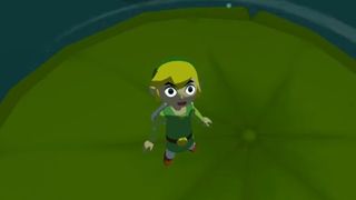
"Once we decided to go in the toon shading direction, we thought it would be important to use the technology as much as possible so we could draw out the natural features of the world," revealed Aonuma. "We wanted to show Link's expressions, and the eyes became very important. Gradually, as we managed to program the movement of the eyes, we began to look at different ways we could make use of that. It became part of the natural process of figuring out how to make Link feel more alive and aware of his surroundings. It was through this natural process that we began to put in items that would attract Link's attention."
Which craft
"Wind Waker had it all: exploration, innovation, freedom, looks… it's crazy that people aren't falling over themselves to proclaim this the best Zelda game, though nostalgia dictates that popular vote Ocarina Of Time must be crowned king."
And though some feat of game development witchcraft, this relatively simple feature would change the entire game. Link's awareness of his own surroundings became a hint system of sorts, his gaze wandering towards key objects, nearby enemies or puzzle items. It all feels incredibly natural but also helps out on a gameplay level without the need for any intrusive HUD elements or similar modern conventions. "When we decided to use the eyes in this way, we considered changing Link's eye colour throughout the game," Miyamoto mused. "There were points in the game where we programmed it so his eyes were bright red while he was fighting, and there were some different opinions on that. Obviously, one of the concerns was that you could only see the colour of his eyes if the camera was looking at him from the front. But, even if you could see his eyes we thought it felt a little strange. So, ultimately we decided not to do that."
Even so, the wandering eyes and increased emotion evident on Link's face proved to be one of the most popular and memorable features of the game – it isn't often that such emotion can be so easily conveyed by a game character and being able to read and identify with the protagonist so easily and universally was something we had never really seen in a game before. It was an ingenious system, both making the main character seem aware of the world around him while offering gameplay advice at the same time – pause to survey the scene and Link will glance at key objects with the very same eyes that were just surprised by a rogue Moblin, his gaze clearly drawn to the most important thing at that time. Even without the proposed colour changes, it's a mechanic that works brilliantly.
Wind Waker had it all: exploration, innovation, freedom, looks… it's crazy that people aren't falling over themselves to proclaim this the best Zelda game, though nostalgia dictates that popular vote Ocarina Of Time must be crowned king. But for all the risks it took and innovations it made, we can't see Wind Waker as anything less than a prince, and a bloody good-looking one at that. Ultimately, the style is what put many people off and Nintendo knows it. But the risk paid off and Aonuma was so taken with the look that it was his go-to style for Link's Wii U debut. "When we were discussing what kind of graphical style to use for the new Zelda game on Wii U we looked at a variety of past games as reference. Wind Waker was the game that had the most innovative graphics and yet, due to the capabilities of the hardware at the time, it was not able to fully achieve that potential," he tells us. "Thanks to the HD version the developers can now finally make it look like it was always meant to. We decided to release this version because we thought that users would also be able to share in that feeling."
And this, apparently, was the first choice for a remake. "The game that I most wanted to go back to and make it more accessible was Wind Waker," Aonuma reveals to us. "I'm really glad that I was able to do that." More remasters have, of course, followed in the Wind Waker HD's, err, wake. Majora's Mask was remixed for Nintendo's 3DS, while Twilight Princess and Skyward Sword found their own HD updates and Link's Awakening was fully remade with a gorgeous diorama aesthetic. "I think we will be a bit more careful in future, but if we find a new approach that not just the developers, but also the users would enjoy then I think we will want to break new ground again," Aonuma concludes. "But we haven't found such an approach yet…"
Keep up to speed with all of our celebratory Zelda coverage with our The Legend of Zelda celebration hub
Luke Albiges is a veteran video game journalist, having worked in the industry for over 20 years. In that time, Luke has been the Editor of Play magazine, Associate Editor of Retro Gamer, and Games Editor of games™. He contributed to countless gaming books and bookazines in that time as well, but he decided to leave the glamorous print journalism life behind to take on the role of Editor for TrueAchievements.
The Baldur's Gate 3-themed Stardew Valley mod that Larian boss Swen Vincke called "amazing" gets DMCA'd by D&D publisher Wizards of the Coast
After PlayStation boss praises Nier Automata as a savior for Japanese games overseas, Yoko Taro says he was specifically told to focus on Japan because it wouldn't fly overseas
