12DOVE Verdict
Pros
- +
Cleaner
- +
smoother visuals
- +
Exploring the vastness of Hyrule
- +
Handful of minor touches that simplify for the better
Cons
- -
Some really vague
- -
unclear moments
- -
Battle system
- -
other aspects are '98 relics
- -
No gold cart? C'mon
- -
guys!
Why you can trust 12DOVE
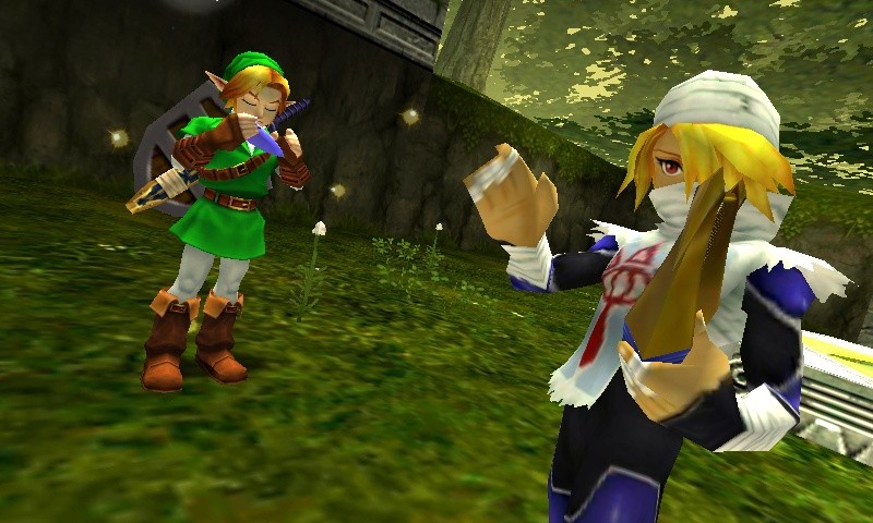
Well, this is certainlyan easy reviewto write. You know Ocarina of Time, the most popular, successful and beloved Zelda game of all time? The one that ushered Nintendo’s million-selling franchise into the third dimension and endeared an entire generation to Link, Ganon and Hyrule? It’s all here, every dungeon, item, secret and Skulltula, now in the palm of your hand. But it’s not a hasty port – this is a thoroughly prettier and smoother experience than the 1998 original, making it the best version of this already legendary experience.
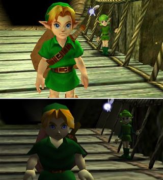
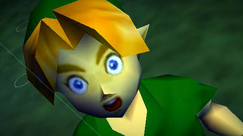
Above: As you can see, Link has received a visual upgrade
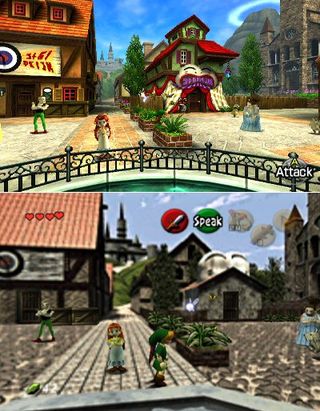
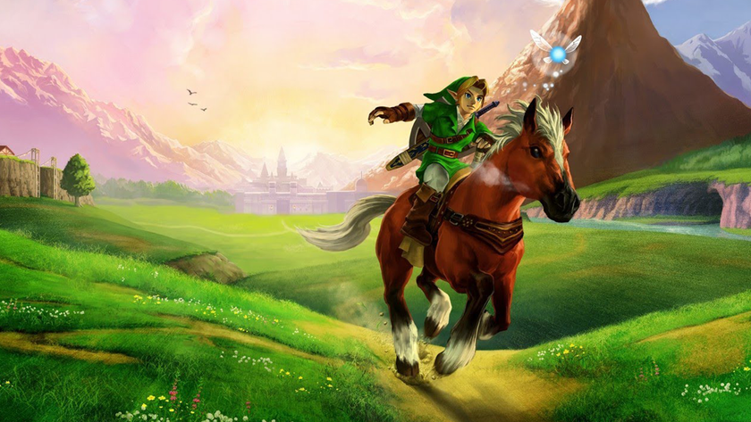
Above: It gets better – literally everything received a makeover, adding clarity and detail to previously blurry areas. Notice how you can see Death Mountain fromthis locationin the 3DS version
I recently played through the N64 version of Ocarina of Time just so I’d have a firm understanding of the differences in the 3DS edition. For the most part, everything is identical; the script is largely unchanged, as are item locations and the memorable soundtrack. The major differences, as I’ve already mentioned, are visual. Top to bottom, this is a slick looking game, with more detailed models and more vibrant design than the fuzzy original. Furthermore, Link’s own animations are smoother, making for slightly more lifelike movements. This fluidity extends outside of Link too, so other creatures and NPCs have a tad more spring in their step.
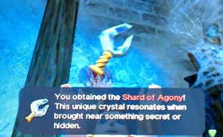
Above: One of the few differences – the Stone of Agony (formerly an N64 Rumble Pak) is now the Shard of Agony, and blinks when secrets are nearby
The improvements don’t end with graphics and animation, however. The entire bottom screen is dedicated to inventory, which was formerly accessed by pausing the game and flipping through four pages of content. Once there, you could assign three items to the N64 or GameCube’s face buttons, meaning any time you needed to change those items (or equip different boots, shields or tunics), you had to pause and flip through all that crap again. Now, the Ocarina has its own dedicated button in the lower left corner – that frees up a slot right away. You can then assign items to the X and Y buttons, plus two additional items in the I and II slots on the touch screen.
This gives you instant access to five pieces of inventory at a given time. This alone speeds up the game considerably, but it also means you can set something like the Iron Boots to said button and simply tap it to equip and un-equip it. This simple act makes the Water Temple a far less irritating slog, as it alleviaties one of the constant gripes about that dungeon.
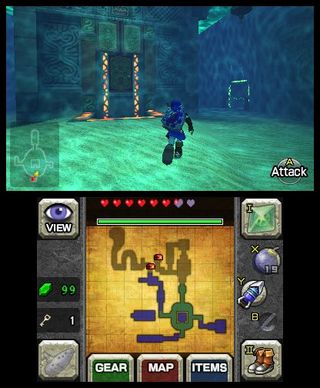
Above: The Water Temple also has these new color trails that lead you to key points in the dungeon. Helpful, but not babying if you’re concerned about losing your hardcore cred
Finally, a small but extremely welcome alteration is the text display speed; the N64 version plodded along very slowly, and if you hit B to skip proceed faster, it often blasted through the entire conversation instead of just that one dialog box. Now, text moves much faster, getting you in and out of long conversations more quickly. All these touches, both small and large, add up to make this the definitive version of Ocarina of Time… but that doesn’t mean it’s perfect.
More info
| Description | Riding through Hyrule Field or scurrying through the Lost Woods in 3D is a fine treat in small doses, and looks better than most other 3D attempts on the system, but it also happens to look and play great with the 3D turned off. |
| Franchise name | Legend of Zelda |
| UK franchise name | Legend of Zelda |
| Platform | "3DS" |
| US censor rating | "Everyone 10+" |
| UK censor rating | "" |
| Release date | 1 January 1970 (US), 1 January 1970 (UK) |
A fomer Executive Editor at GamesRadar, Brett also contributed content to many other Future gaming publications including Nintendo Power, PC Gamer and Official Xbox Magazine. Brett has worked at Capcom in several senior roles, is an experienced podcaster, and now works as a Senior Manager of Content Communications at PlayStation SIE.
The Last of Us season 2 showrunner talks new and even more terrifying types of infected with a big tease: "The Rat King is something that anybody who has played TLOU Part 2 is traumatized by"
English is no longer the biggest language on Steam as Chinese gamers embrace PC gaming even harder after Black Myth: Wukong

6 new movies and shows to watch this weekend on Netflix, Prime, Disney Plus, and more (March 28 - 30)
