The hidden value of video game main menus, and the design secrets that compel you to hit play
"We should make a good first impression": Video game main menus are more important than we realise

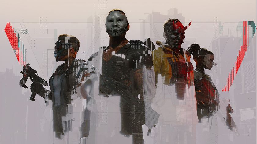
The secret sauce behind Destiny 2’s brilliance? Menus, maps and inventory management
Anyone who's ever been on a date or interviewed for a job doesn't need reminding about the importance of first impressions, but they hold even more purchase over human interaction than we might think. Psychologists have discovered, for instance, that humans are fickle enough to develop fully formed judgements about a complete stranger based on the first word to come out of their mouths.
If we're that myopic when it comes to making initial observations about other people, then why wouldn't the same thing apply to video games? The boot up process might seem like a fairly banal routine that's long been a tradition of any form of interactive entertainment, but – interpreted in this context – it's one of the most important features that a developer can come up with.
"When players first launch a game this is the initial taste they will get of what's to come," explains game designer and Level Design Lobby podcast host Max Pears. "From understanding the tone, to getting a glimpse to the overall art style, all of this is expressed in that opening menu."
"It's a recurring screen which players will frequently see, as most do not finish their adventures in one sitting. Therefore, we as designers have to make sure we keep it entertaining or help continue the narrative with the players."

It's a shame, then, that the majority of games don't make the most of this opportunity, but when they do, you really notice. Consider the main menu for Call of Duty: Black Ops, which takes place from the perspective of the campaign's protagonist at a key point in the first-person shooter's story campaign.
Not only does its unique format instantly stand out from the clean and simple UI expected of a Call of Duty game, but the whole thing is littered with Easter eggs and meta-textual curios, the crowning highlight of which is a fully fledged twin-stick shooter minigame that can be discovered once players escape the confines of their interrogation chair. Crucially, the entire conceit fits perfectly with Black Ops' darker, grittier tone and paranoia-fuelled Cold War setting, with Pears pointing to that consistency of flavour as a key goal post for effective main menu design.
"When creating games, one thing to ensure is that your guiding core pillars of the experience are set in stone," he explains. "By having those core pillars understood, you can apply that train of thought to [designing] your main menu."
Sign up to the 12DOVE Newsletter
Weekly digests, tales from the communities you love, and more
First course

"From understanding the tone, to getting a glimpse to the overall art style, all of this is expressed in that opening menu."
Max Pears
Players booting up Yager's 2012 shooter, Specs Ops: The Line, for the first time will be greeted by the image of a lone soldier resting atop a sniper's perch, the inverted American flag fluttering gently in the background as he looks out across the sand-covered plains of war-torn Dubai.
It's an apt scene-setter for the Heart of Darkness inspired story to come, but the menu's true genius only becomes more apparent over time. As the player continues to follow protagonist John Conrad's descent into delirium, the main menu's tableau develops in tandem, revealing itself to be more than just a static precursor to the main events, but a scene taking place concurrently to the story itself.
As events unfold, the menu portrays the soldier sleeping, conducting recon, and using his rifle, as day turns to night before the developments of the player's actions begin to impede more drastically on his position. It's not long before the skyscraper in the background is ablaze against a darkened sky, with the soldier nowhere to be seen, replaced only by a bird's nest. Eventually, the skyscraper has collapsed entirely, the sniper's perch all but destroyed, that tattered American flag barely visible amongst the rubble.

It's a smart yet subtle device that both acknowledges the player's progress while also allowing Specs Ops' main menu to more authentically reflect the tone of its ongoing story. What could have been just another structural necessity is now a mercurial piece of art woven into the very fabric of Yager's contemporary fable. More than anything, it just goes to show how effective video game main menus can be as a tool for enriching the craft, and how much potential is still left in this criminally overlooked aspect of video game design.
A window to another world
Pears is keen to emphasise that "no one size fits all" when it comes to the rules of designing an effective main menu. A multiplayer shooter has very different needs and aims to that of a fantasy RPG, for instance, and its user interface needs to both reflect, and pivot towards, those bespoke demands respectively.
Similarly, as Pears explains, main menus "need to find a healthy balance between appealing to players and appeasing their desire to get to the game as quickly as possible. You don't want to slow them down too much, as the main reason they bought your game is to play."
In others words, it's all well and good to have an all-encompassing audio-visual experience of a main menu that eats up a console's operating power, but if the sensory sound and light show is creating a barrier to the main event, then it's harming the game, and not helping it.

To return to Call of Duty as another example, Black Ops 4's main menu took inspiration from its former Activision sibling, Destiny 2, adopting a cursor-based interface in which players could navigate its various options via a PC-style pointer. When implemented well, as in Destiny, it's a silky smooth diversion from the norm that allows a game to stand out from its console contemporaries, while also easing the strain on inventory management in Bungie's looter shooter.
Unfortunately, that navigational device doesn't translate into Call of Duty, especially as Black Ops 4's high-res display of character models and overcrowded UI in its main menu meant that frame-rate stutters were a common occurrence on PS4 or Xbox One, extending the time between a player booting up the game, and getting into a match. As Pears explains, striking that fine balance between ease of play and impact of evocation is crucial.
Still, as we reach the precipice of next-gen, with both the PS5 and Xbox Series X scheduled to launch later this year, there's no reason to think games can't produce main menus which are visually impressive, operationally sound, and structurally intuitive all at once. These entry points are often designed as an afterthought, considered nothing more than a prerequisite as old as the medium itself, but– when treated as part of the game experience – main menus can allow interactive entertainment to utilise that interactivity and elevate themselves above other creative mediums. Developers ought to start recognising them as such, so that booting up your favourite game is more than just the press of a button.
For more, check out the biggest new games of 2020 and beyond still on the way, or watch below for our latest episode of Dialogue Options.
I'm GamesRadar's Features Writer, which makes me responsible for gracing the internet with as many of my words as possible, including reviews, previews, interviews, and more. Lucky internet!

Assassin's Creed Shadows was originally envisioned without Yasuke, but Ubisoft wanted the full feudal fantasy: "We were sort of making a stealth tank, and it didn't quite work"

Assassin's Creed Shadows lead says dual protagonists are "a cool thing" the new action RPG "does better than what we've done in the past"

