The Club - impressions
The bloody return of high scores
We do have a few reservations despite the game's vast potential. At the moment, frame-rate issues aside, it doesn't look anywhere near as pretty as Gears of War. Maybe the TV we were seeing it on was a bit too big to do it justice, but it looks a littledrab and some textures looked surprisingly low-res. Then what at first appeared to be incidental particle effects turned out to be flat sprites that always face you as you rotate the camera. Hmmm.
Also, the collision detection wasn't perfect - several headshots didn't seem to register in the build we saw, which isn't what you need when you're trying to be pin-sharp. Of course, we're sureall of these issues were quirks of the unfinished code and, at the end of the day, if the game hooks you, you won't mind quite so much about how it looks. But we do hope it does come out of its development time looking as jaw-dropping as it threatens to.
We'llkeep you updated on The Club's progressas it nears its late 2007 release. Until then, check out theImages tab to see the rest of the new screens.
Sign up to the 12DOVE Newsletter
Weekly digests, tales from the communities you love, and more
Justin was a GamesRadar staffer for 10 years but is now a freelancer, musician and videographer. He's big on retro, Sega and racing games (especially retro Sega racing games) and currently also writes for Play Magazine, Traxion.gg, PC Gamer and TopTenReviews, as well as running his own YouTube channel. Having learned to love all platforms equally after Sega left the hardware industry (sniff), his favourite games include Christmas NiGHTS into Dreams, Zelda BotW, Sea of Thieves, Sega Rally Championship and Treasure Island Dizzy.
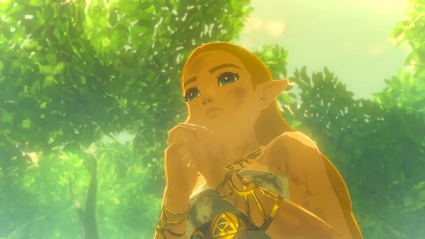
Breath of the Wild's Korok Forest might actually hit 60fps on the Switch 2 re-release, and Zelda fans can't wait for "an actual stable frame-rate" in Hyrule's most infamous region
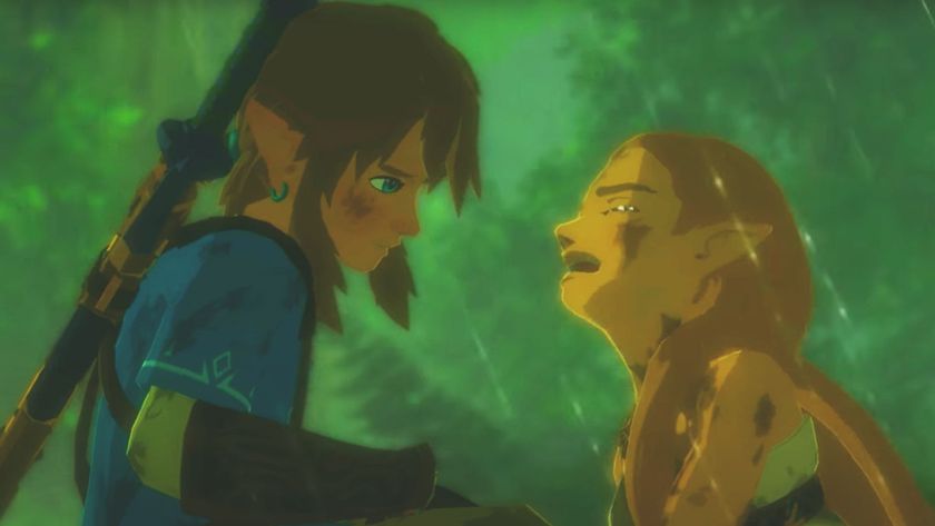
The Legend of Zelda: Breath of the Wild and Tears of the Kingdom are finally getting achievements, but it's paywalled behind the Switch 2 editions

