The 35 Best Movie Star Websites
Hollywood celebs at home on the web
Drew Barrymore

The Site: DrewBarrymore.com
Design: Barrymore’s flashy homepage looks a lot like an iTunes coverflow, if all the records you owned were made by Drew Barrymore. 3/5
Content: The first two sections are headed ‘Fashion’ and ‘Philanthropy’. We didn’t stay long enough to check out the rest. 2/5
Star Input: The occasional message from Drew, which seem to have all but dried up. 2/5
ET Sightings: We couldn’t see a single picture. 0/5
Jim Carrey

The Site: JimCarrey.com
Design: A surrealist swirl of Terry Gilliam-style landscape and pictures of Jim Carrey’s grinning, gurning face. The viewer is yanked joltingly from one section to another. Unusual, just about functional. 4/5
Sign up for the Total Film Newsletter
Bringing all the latest movie news, features, and reviews to your inbox
Content: Considering all the fancy presentation, it better have good, deep content – and it does. Mostly archive material rather than news, but there’s a wealth of back-catalogue info and clips. 4/5
Star Input: Carrey’s face is all over, but the actor himself seems to have paid professional webmen to upkeep the site. 2/5
Sense That A Giant Foot Will Crush Everything Suddenly: Very high. 4/5
Emma Watson

The Site: EmmaWatson.com
Design: A pic-heavy fashion mag feel props up the official web home of Harry Potter starlet Watson. 4/5
Content: The latest on Emma’s career, some fashion photography, links to movies. It’s like a regular teenage girl’s blog, except this one is a Hollywood actress, and the pictures are taken by world-famous photographers. 3/5
Star Input: The ‘official’ vibe is strong thanks to regular messages from Watson, inluding a recent one putting down rumours she was bullied at university. 3/5
Varity of hairstyles: Enormous, ranging from short to medium and long. 4/5
Tom Cruise

The Site: TomCruise.com
Design: A strong black background filled with excellent photography. It’s like the star himself – sleek and Hollywood polished. 4/5
Content: A decent archive of career material – timeline, movie summaries – and an up-to-date blog. Solid effort. 3/5
Star Input: Aside from an introductory letter and the official moniker, little that we could see. 1/5
Musicality: Excellent. Instrumental versions of scores to Tom’s films play while browsing, including Tangerine Dream’s amazing Love On A Real Train from Risky Business. 4/5
Kevin Smith

The Site: ViewAskew.com
Design: The home of Kevin Smith’s fictional New Jersey universe has a busy, fanboy-friendly feel – cluttered but navigable, and stuffed with links. 3/5
Content: Oh, loads. The site’s been up for years and has a mountain of archived material on Smith’s movies, plus a very active new feed about the director’s frequent appearances and shows, galleries, mag clippings and loads more. 5/5
Star Input: Smith has always been a big presence on the site, and features in the weekly podcast and frequently uploaded video clips. 4/5
Self-promotion count: Real high. There were ads for three difference Kevin Smith roadshows when we visited. 4/5
Joseph Gordon-Levitt

The Site: hitrecordjoe.tumblr.com
Design: A hipsterish tumblr thrown together by the Inception star to support his hitrecord community arts project. Simple and stylish, as per usual with tumblr. 3/5
Content: Scattershot, but the mix of hitrecord project updates (about which the actor is clearly very serious) and reblogged items from filmmaking friends makes for a compellingly private insight. 3/5
Star Input: It’s all Joe, people. 5/5
Famous friend count: Zooey Deschanel, Rian Johson, loads of others. 4/5
Gwyneth Paltrow

The Site: Goop.com
Design: Flouncy, flowery, middle-class mum pastel patterns. Like Charlie and Lola in html form. Looks nice, but a bit of a pain to navigate. 3/5
Content: Very full, though fans of Gwyneth’s big-screen work might be a little lost. It concentrates on her cooking, sightseeing and general pottering. 3/5
Star Input: Points for the fact it seems to be written by Gwyneth herself, but then all taken away again because she’s pretty smug and talks endlessly about travelling and charity . 4/5
Faux-British Pretentiousness: Off. The. Charts. 4/5
Simon Pegg
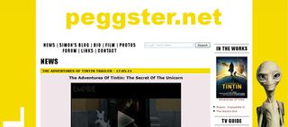
The Site: Peggster.net
Design: The net home of everyone’s favourite homemade Hollywood funnyman is yellow. Really yellow. It’s also well presented and easy to read, in scrolling news form. 3/5
Content: Aside from the up to date news stream there’s a ton of photos from Pegg’s various projects, and a reasonably busy forum. 3/5
Star Input: Yes! Simon has his very own blog. Although it hasn’t been updated since 2009. Shall we blame Paul? Yes, let’s. 2/5
Abandoned child feel: Pretty high, though the site’s soldiering on, sans Pegg. 4/5
Charlie Sheen

The Site: CharlieSheen.com
Design: Sheen’s Korner – what seems to be the hastily-constructed vehicle for the victorious animal-hybrid during his post-meltdown tour. Basic, but with a picture of Charlie as a superhero with his hands on fire. 2/5
Content: The flow of material seems to have stopped a few weeks ago, just as everyone realised maybe the whole breakdown thing wasn’t cool. Still – the aftershow tour updates are compelling. 2/5
Star Input: Mr Sheen appears in several exclusive videos on the site, but it’s clearly being run by an assistant. 2/5
Winning?: Not so much. 2/5
Adam Sandler

The Site: Adam.Sandler.com
Design: Appropriately enough the comic star’s page looks like a gaudy Hawaiian shirt, with a horrible flower motif and a wavy content bar design. 2/5
Content: Better than the layout would have you believe. There are clips from Sandler’s films, links to his other work, and a whole section devoted to his dogs. 4/5
Star Input: Sandler records short straight-to-camera updates every few weeks. 3/5
Playfulness: High, thanks to a whole series of flash mini-games based on Sandler’s films. 4/5
Avengers actor Carrie Coon didn't return for Endgame after a money dispute, and Marvel allegedly replied she should "feel fortunate" to be part of the MCU

Despite still being filmed, the studio behind Christopher Nolan's The Odyssey is already declaring it a "masterpiece" that Homer "would quite likely be proud of"


