The 35 Best Movie Star Websites
Hollywood celebs at home on the web
Samuel L Jackson

The Site: SamuelLJackson.com
Design: A stark, blocky look centred around a traditional blog layout. 3/5
Content : Fulsome. The news is regular, and there are well-maintained stashes of photographs and interviews. 3/5
Star Input: It’s official, but it doesn’t look like Big Sam contributes to the site. 1/5
Badassness: The no-messing layout and banner pic of Nick Fury keep Jackson’s rep in tact. 4/5
Sonny Landham
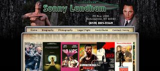
The Site: SonnyLandham.com
Design: Hello, turn of the century internet! The Predator star’s homepage is an old-school setup with garish fonts and, brilliantly, a big picture of a knife behind his name. 2/5
Sign up for the Total Film Newsletter
Bringing all the latest movie news, features, and reviews to your inbox
Content: The regular mix of biography and filmography, interrupted by a shocking section detailing Landham’s ongoing legal battle surrounding his wrongful imprisonment for domestic abuse charges in the 1990s. Sad but fascinating. 3/5
Star Input: Given the nature of the legal stuff, the site is very personal. 5/5
Creepiness: Every time you load the site a recording of Landham doing his famous booming laugh from Predator erupts from your speakers. 4/5
Matthew McConaughey

The Site: MatthewMcConaughey.com
Design: The toothy Texan star’s homepage is a dense and slightly cluttered affair, with the standard selection of bios and back catalogue packed into a flash-heavy package. 3/5
Content: Very much run of the mill, and not very up to date. The actor himself last checked in back in January last year... 2/5
Star Input: McConaughey has an all-but abandoned journal on the site, and there are personal pics of him and the family. Looks like good intentions, paving the way to barely any content. 2/5
Grin intensity: The galleries over overpoweringly full of big, big grinning. 4/5
Val Kilmer

The Site: ValKilmer.com
Design : Dated, with boxy menus and a cheesy pic of the one-time hunky star, but usable. 2/5
Content: There’s a nod to Kilmer’s successful past, but the site’s main purpose seems to be to promote the actor’s upcoming Mary Baker Eddy and Mark Twain biopic. Tough sell. 2/5
Star Input: Val drops in to offer occasional hellos, and it has the flavour of a startup filmmaker trying to get the word out about his upcoming movie. 3/5
Oddness: Oh that’s not gone away. The latest Note From Val is about movie nudity – specifically about how the star has never gone naked on film, because he ‘has always had an awareness that nudity is inappropriate.’ You tell ‘em. 5/5
Donald Glover
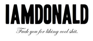
The Site: iamdonald.com
Design: The tumblr blog of Community star and comedian Glover uses sharp black-on-white font for a vintage fashion-mag feel. 4/5
Content: Shoes. Pictures. Clocks. Stuff people have said. It’s a catch-all personal account with no specific direction. 3/5
Star Input: Pure Glover. 5/5
Hotness: Glover has you covered, with a category simple called ‘sex’ full of hot girls. 5/5
Sean Connery

The Site: SeanConnery.com
Design: Amateur. It fills only a corner of the screen, is full of boxy frames and has a big picture of Sir Sean’s face in the corner. 2/5
Content: So-so filmography and bio, but the best bit is definitely the revolving door of positive fan correspondence on the front page. Classy. 2/5
Star Input: Connery has penned a heartfelt hello letter which sits on the welcome page, but the site isn’t very up-to-date, and we’d be surprise if the actor remembers it’s there. 2/5
Tastefulness: Oh yes, a link to his wife’s gallery page takes care of that. 3/5
James Woods

The Site: JamesWoods.com
Design: Pretty basic – there’s a landing page which links through to a blog and a couple of galleries. 2/5
Content: It looks like Woods started up the site with some enthusiasm but has never fleshed it out. The blog is about cycling in (actual) woods, but the galleries give a glimpse into the actor’s working life. 3/5
Star Input: It looks like it’s all James Woods’ work, in a ‘Wow, Jimmy, I can really tell your parent’s didn’t help with your homework at all’ kind of way. 5/5
Unglamorous hobbies: Hollywood wildman James Woods blogs about photography and cycling? What? 4/5
Robin Williams

The Site: RobinWilliams.com
Design: A straight-up blog, with a no-messing and easy to-use black background design. 3/5
Content: Patchily updated news stream, with some video content and ads for Williams’ latest show thrown in. 3/5
Star Input: Nothing direct, but there are plenty of interviews and backstage bits and pieces. 3/5
Hyperactivity: Not what we’d hoped – the site doesn’t capture Williams’ machine-gun style. 2/5
Sylvester Stallone

The Site: SylvesterStallone.com
Design: Simple Wordpress-ish layout, bolstered by the fact there’s a massive picture of Rocky in the middle. 3/5
Content: It leads off with a regularly updated news feed, and includes sections on Sly’s movie, art and fitness work. 3/5
Star Input: It looks minimal – a webmaster runs the blog, and there’s no diary to be seen. 2/5
Steroidal enhancement: We don’t know what you’re talking about. 5/5
James Gunn

The Site: JamesGunn.com
Design: The homepage of cult director and Dawn Of The Dead writer Gunn is a basic blog-with-extra-bits, with a thrown-together feel. 2/5
Content: The page has feeds drawn from Gunn’s Twitter and Facebook accounts, and the news feed is fairly regularly updated and focused on the man’s work. Solid, but for fans only. 3/5
Star Input: Gunn writes the blog himself, giving the site a personal edge. 4/5
Anti-crime stance: The trailer for Gunn’s new film Super means the page has this in spades. SHUT UP, CRIME. 5/5
