The 32 most iconic movie posters
Hand-drawn illustrations, iconic stills, and clever taglines
Sometimes you don’t even need to see the trailer to know what a movie is all about. Sometimes, all you need is to just look at the poster.
With its roots in vaudeville and carnival advertising, the history of movie posters dates to roughly 1890. That’s when Jules Cheret’s French-language short film, Projections Aristiques, advertised itself with a black-and-white illustration of a young girl holding up the sign telling observers when and where to see the movie. (This was, of course, long before the days of mass distribution of movies.)
A few years later in 1895, the poster for the silent film L’Arroseur Arrose (in English, The Waterer Watered) was the first to preview the contents of the movie itself, whereas posters before it simply promoted the technological novelty or quality of the recordings. L’Arroseur Arrose was the first to actually tease the story, about a gardener in an amusing mishap. From there, the rest is a long, drawn-out (get it?) history.
Throughout the 20th century, the meteoric rise of Hollywood studios saw marketing departments hire illustrators from magazines and paperback novels to draw up the posters of theatrical releases. In the 21st century, dedicated artists now use an array of digital tools to create posters that are sometimes just as memorable as hand-drawn works of art. To celebrate the ongoing history of movie posters, here are 32 of the most iconic movie posters of all time.
32. Mr. and Mrs. Smith (2005)
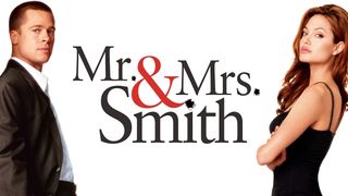
Since the release of this “Brangelina” vehicle in 2005, engaged couples everywhere have imitated this saucy-yet-funny poster that memorably features Brad Pitt and Angelina Jolie (once a married couple themselves in real life) for their quirky wedding invitations. While the optics of a husband and wife tasked with killing each other may in fact be awkward for newlyweds, getting one of these in the mail lets you know exactly the bride and groom’s sense of humor.
31. The Texas Chain Saw Massacre (1974)
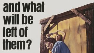
“Who will survive and what will be left of them?” asks the poster of this enduring horror classic in big, bold, black ink. Between that striking rhetorical question and a strikingly realistic illustration of Leatherface revving up a chainsaw in front of a tied-up girl crying for help – all framed strategically to let just enough of your own imagination fill in the blanks – and what you have is a deeply disturbing poster for one of the all-time greats.
30. Fear and Loathing in Las Vegas (1998)
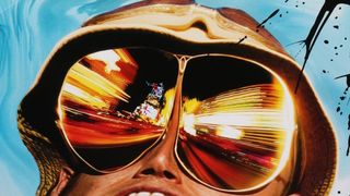
Terry Gilliam’s surreal comedy, an adaptation of Hunter S. Thompson’s pseudo-memoir about a work trip in Las Vegas, bombed in theaters when it opened in 1998. But as the movie gained cult status, college students everywhere adopted the movie’s psychedelic poster for their dorm rooms, likely to commemorate its depiction of a manic high as they themselves tried out some good stuff. Between Johnny Depp’s snake-like neck evaporating from his body and the neon lights of Las Vegas bombarding his sunglasses, Fear and Loathing in Las Vegas’ poster is a work of art in its own right. It helps that the movie is great, too.
Sign up for the Total Film Newsletter
Bringing all the latest movie news, features, and reviews to your inbox
29. Attack of the 50-Foot Woman (1958)

It’s one of those posters that are more iconic than the movie itself. Nathan Hertz’s pulpy sci-fi is about a wealthy heiress – played by Allison Hayes – who is turned into a giantess after an alien encounter. If the title doesn’t successfully communicate what the movie is about, the immortal poster by Reynold Brown does, with its gorgeous rendering of Hayes in a two-piece making a mess over a city bridge. Flip through a rack of vintage movie posters somewhere and you’re bound to find this one.
In 2016, comedienne Ali Wong spoofed this poster for her acclaimed Netflix special, Baby Cobra. In 2023, Taylor Swift paid homage to the movie in her Eras Tour, where she’s seen smashing a city in a background video display during her performance of “Anti-Hero.”
28. The Snowman (2017)
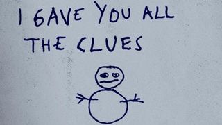
We’ll admit, this one is here because of the many memes it inspired. But independent of an ironic sense of humor, there is actually something chilling (ha-ha) about this poster for The Snowman, an unpopular horror-thriller about a serial killer who leaves behind snowmen at his own crime scenes. Made up of a crude drawing of a snowman and a child’s desperate message to the cops who failed to save his mother, which reads “MISTER POLICE YOU COULD HAVE SAVED HER I GAVE YOU ALL THE CLUES” in blue crayon, The Snowman’s poster is more unnerving than anything actually contained in the movie.
The simple but distressing vibe of The Snowman’s poster was actually done over a decade earlier. In 2007, the Nicole Kidman-led horror movie The Invasion had its own poster replicating a mother’s message to her children, with the words “DON’T SLEEP, DON’T GO HOME, I’LL FIND YOU, MOM” written in ink.
27. Parasite (2019)

The U.S. poster for the Oscar-winning Korean satire Parasite is one of those posters that became iconic almost as soon as it came out. Sporting the main cast with their eyes blocked out, all of them scattered throughout a lavish, ultra-modern home – and the pale legs of a person’s body ominously tucked away in the corner – Parasite’s poster communicated the movie’s basic plot and overall themes about identity and class very well, without so much as even showing you who’s in it.
26. The 40-Year-Old Virgin (2005)

2005 was a flashpoint for comedy, and for Oscar and Emmy-nominated actor Steve Carrell specifically. It was the same year the droll sitcom The Office premiered on NBC, starring Carrell as hapless manager Michael Scott. The series was not an instant hit, but it blew up after the success of Judd Apatow’s hit The 40-Year-Old Virgin, which also starred Carrell as a kind but lonesome middle-aged virgin whose friends help him get some overdue fun.
Because Carrell was not yet a known entity when The 40-year-Old Virgin hit theaters, its poster is actually genius. It features a blown-up, in-your-face portrait of Carrell looking aggressively norm-core in a baby blue polo against a stark orange background that demands your attention. Is he a creep? Or is he just a guy with bad luck? Paired with the movie’s plainly hilarious title, and what you have is a perfect and hilarious poster even if it isn’t a work of art.
25. Superman (1978) and Batman (1989)
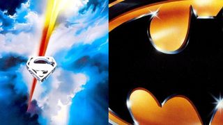
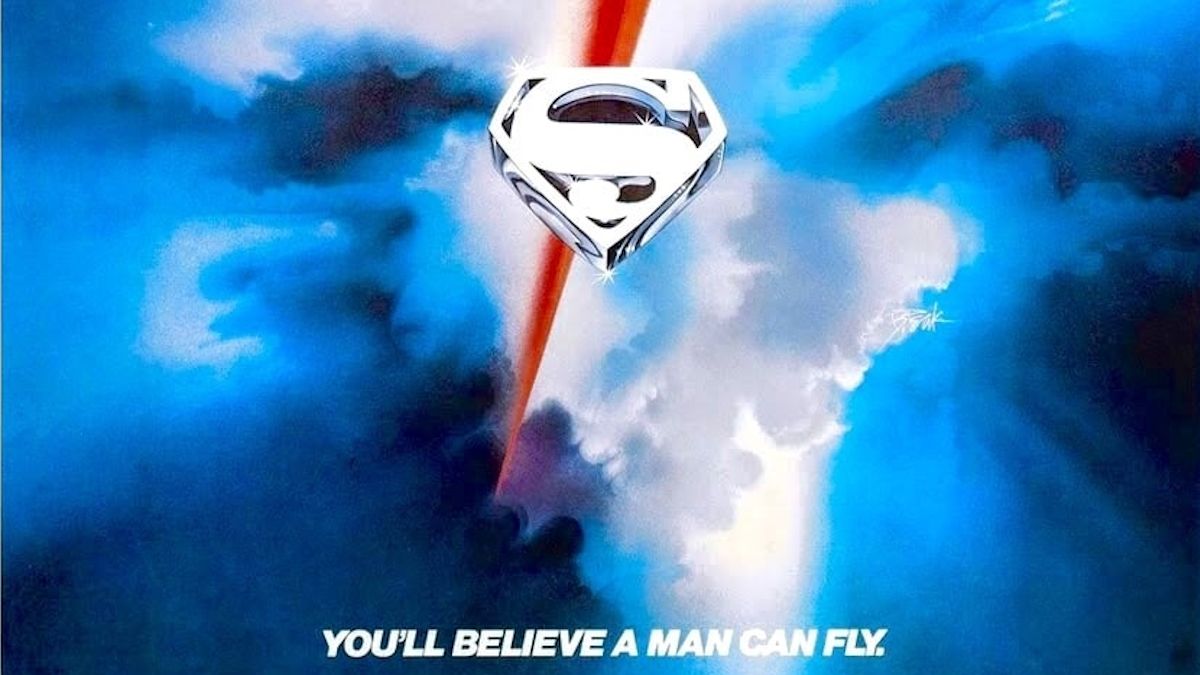
It’s kind of appropriate how the two biggest superhero icons from DC Comics have somewhat similar posters. Superman’s poster was first, with his familiar “S” logo, drawn in a silvery-white, placed just below the center frame of a picturesque sky with a red, blue, and yellow streak – maybe that’s Superman himself flying past like a speeding bullet. Directed by Richard Donner, the Christopher Reeve-led film was a major hit and the first movie to prove that superheroes have a place on the big screen. After all: We finally believed that a man can fly.
Some 11 years later, Tim Burton’s Batman modeled its poster in that same vein, but in a uniquely Batman way. All it had was just Batman’s logo, blown up to be cut off on the left and right sides. The late ‘80s was a period of wild economic prosperity, which made Batman’s polished gold and black logo feel suited to the times as a film about an elusive billionaire leading a double life. While the vast majority of superhero blockbusters implement poor imitations of Drew Struzan’s iconic “floating heads” style, there’s still an occassional superhero tentpole that comes along – like The Avengers, or Blue Beetle – that emulates the simplicity of what Batman and Superman did so well.
24. Apocalypse Now (1979)

Francis Ford Coppola’s nightmarish descent into the Vietnam War has a few iconic posters to its name. But still unmatched is the original theatrical poster sporting the terrifying, sweaty visages of Marlon Brando and Charlie Sheen above the Do Lung bridge. A psychological thriller disguised as a war movie, Coppola himself struggled to bring Apocalypse Now to life all throughout a very troubled production. But so much of the movie endures as an iconic piece, as does its unforgettable striking poster illustrated by Bob Peak.
23. Airplane! (1980)

The peak of disaster movies was arguably the 1970s, which made them ripe for parody as soon as the ‘80s rolled around. The iconic comedy co-directed by Jim Abrahams and the Zucker Brothers had a poster just as memorable as lines like “And don’t call me Shirley” with an illustration by Robert Grossman of an airplane flying in the sky, impossibly twisted into knots, cleverly communicating the topsy-turvy surreal humor that awaits all who board this flight.
22. The Social Network (2010)

David Fincher’s drama about the creation of Facebook is one of the most prescient films of the 21st century, and its poster was appropriately clever and foreboding of the coming decade’s influence under technology. Placed on the far right side is Facebook’s navy blue user interface, but at the center is a blown up portrait of Jesse Eisenberg (as Mark Zuckerberg) with the words “YOU DON’T GET TO 500 MILLION FRIENDS WITHOUT MAKING A FEW ENEMIES'' printed directly on him. All of it captures the story behind Facebook’s billion-dollar creation: How the man who made friends all over the world lost his own.
21. Forbidden Planet (1956)
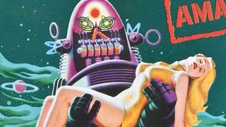
For the classic sci-fi feature starring Leslie Nielsen and Anne Francis, artist Roger Soubie replicated the aesthetics of vintage paperbacks and Silver Age comic books. In his unmistakable mid-century illustration, Robby the Robot carries the slender body of the beautiful alien Alta (Francis) in his arms in front of a distinctly otherworldly scenery. Forbidden Planet, as well as its incredible poster, endure as the epitome of sci-fi as it was before it changed forever with Star Wars.
20. Breakfast at Tiffany’s (1961)
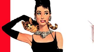
In his first ever movie poster, paperback illustrator Robert E. McGinnis made Audrey Hepburn the picture definition of 1960s mod chic with his iconic poster for Breakfast at Tiffany’s, a heavyweight classic of a romantic comedy. Forget the kissing couple over yonder. It’s the all white background surrounded by orange, violet, and red bars that help make Hepburn look elegantly gorgeous in her form-fitting black dress and ostentatious silver jewelry. For a first-timer, McGinnis knocked it out of the park, which is why it’s no wonder he subsequently made over 40 more posters for movies.
19. Halloween (1978)

John Carpenter’s Halloween has one of those posters that only gets better the more you look at it. Illustrated by Bob Gleason, the poster doesn’t actually feature Michael Myers but an optical illusion of a pumpkin jack-’o-lantern that doubly acts as the repeated stabs of a kitchen knife. It’s a genius illustration that could never happen today, when IP-branding takes priority.
When Bob Gleason made a new poster for the 2022 sequel Halloween Ends, he recalled the experience of making the original poster for Fangoria. “It was my original idea,” Gleason said. “I was working with B.D. Fox and Friends, a design firm specializing in movie posters, showed them a rough sketch and explained what I wanted to do. I want to have the knife, and I want to show the echoing pattern and have it be a jack-o'-lantern at the same time.”
The firm initially “dismissed” Gleason’s idea before coming around to it. Gleason delivered the final work only a few days later. “I think because the movie is so iconic, and the image is simple but powerful. It really worked. I thought it was a really good idea, and it turned out that way.”
18. A Clockwork Orange (1971)
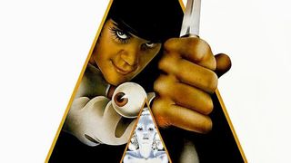
If some movie posters make more sense the more you look at them, then Philip Castle’s poster for the Stanley Kubrick film A Clockwork Orange makes less sense the more you inspect it. At first glance you get the broad strokes: It’s Malcolm McDowell, as his anti-hero Alex, wearing his signature bowler hat wielding what looks like a knife. But then look closely. He’s peeking through an abstract black and orange pyramid, and there’s a silver-white statue of a woman beneath him. Also, there’s an eyeball, teasing the movie’s harrowing moment where Alex is tortured to Nazi propaganda.
Illustrated by Philip Castle in close conjunction with Kubrick, Castle worked off notes given to him by Kubrick, whose big request was that the poster include the bowler hat. In a 2014 interview with Design Curial, Castle said: “When visiting him, I liked to actually put the drawings in front of him and discuss them. It was a big deal for me and I didn't want to blow it … This work can be very boring. The highs are getting the job in the first place; designing it is terrific, and finishing it off is terrific, but the process in between is long-winded and laborious.”
17. Back to the Future (1985)
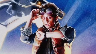
Decades before blockbusters all adopted blue-orange hues for its posters, Robert Zemeckis’ zippy mid-’80s classic Back to the Future did it and did it right. Its iconic poster comes from industry giant Drew Struzan, who is most known for his floating heads, replications of setpieces, and lifelike illustrations; his work alone could inspire its very own list.
For Back to the Future however, Struzan took a slightly different approach with just Michael J. Fox, as Marty McFly, standing next to the DeLorean in a pose that is recreated by everyone who dresses up as the movie for Halloween. Even if the proportions to Marty and the DeLorean aren’t quite accurate, there’s no denying how timeless this piece still is.
16. The Graduate (1967)
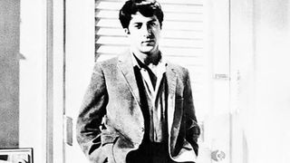
More often than not, the best movie posters are hand-drawn illustrations. But sometimes a great poster can use a photograph and still imprint itself in our collective consciousness. Enter: Mike Nichols’ The Graduate, a classic 1967 romantic comedy-drama about an aimless college grad (Dustin Hoffman) who starts an affair with an older woman, Mrs. Robinson (played by Anne Bancroft), while falling in love with her daughter.
The movie is a classic but the poster is an all-timer, even if it’s not totally accurate to how it’s seen in the movie. (There’s all kinds of differences to how Bancroft’s leg is placed visually in relation to Hoffman standing in front of her.) Regardless, both the poster and the moment it teases underscore the movie’s appeal, about forbidden tension between two people who maybe shouldn’t even though they know they will.
15. Gone with the Wind (1939)
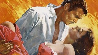
Gone with the Wind, Victor Fleming’s epic romantic drama set during the American Civil War, was first released in 1939 and was re-released by MGM in 1967, resulting in one of the most successful re-releases of a movie of all time. The ‘67 re-release came with a brand new poster by magazine artist Howard Terpning, who later went on to become a fine art illustrator chiefly depicting scenery of the American West and Plains Indians. For Gone with the Wind, Terpning turns up the heat between stars Clark Gable and Vivian Leigh, with Leigh cradled in Gable’s arms surrounded by orange flames. It may not be the original poster, but Terpning’s work is undoubtedly the one people remember the most.
14. Silence of the Lambs (1992) and Scream (1996)
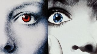
Silence of the Lambs and Scream are two different horror movies from two different directors – Jonathan Demme and Wes Craven respectively – yet they both share visually similar posters that use striking motifs: Plain white ghostly faces.
For Silence of the Lambs, Jodie Foster’s face appears in high contrast white (with a bluish hue), and an orange moth over her mouth. The moth is known as a death’s head moth, so named because the species has a skull-like pattern on its back. What most people miss about the poster is the “skull” on the moth is actually made up of women’s bodies (and is actually the work of Salvador Dali and Philippe Halsman, using their photograph “In Voluptas Mors”). This obviously communicates the serial killer Buffalo Bill, who targets women.
Scream, meanwhile, uses similar high contrast white faces but to different effects. Scream’s poster features Drew Barrymore, who may or may not be recognizable due to the heavy editing and close-up. Still, it’s Barrymore, which makes you think that she’s the main character of the film until she’s (spoilers!) killed off very early, which was an intentional choice so audiences could not guess where the story goes from there. There’s no extra detail in the poster like Silence of the Lambs, but both posters are the kind you maybe don’t want to see on the other side of a dark room at night.
13. American Beauty (1999)

You may think that’s American Beauty star Mena Suvari’s hand and midriff on the suggestive, iconic poster for Sam Mendes’ celebrated drama (about, among other things, a salesman who starts falling for his teenage daughter’s friend). But because Hollywood is a silly and complicated place, the poster is actually made up of two other women: Chloe Hunter (stomach) and eventual Mad Men star Christina Hendricks (hand).
In a 2021 interview on The Rich Eisen Show, Hendricks recalled the gig for the American Beauty poster, saying: “I used to be a model, and one of the gigs I got was to go and shoot a movie poster. I had no idea what the film was. There were two models, myself and one other. And we did different versions of her hand and her stomach, and my stomach and her hand, and my hand and both. My hand made it in and her stomach made it in.
Recalling that it was a very small gig that paid modestly, she was still just “thrilled to have a job.”
She added, “I didn't know what American Beauty was going to be. And then I finally saw it and was like, 'Hey, that's my hand!'”
13. Blade Runner (1982)
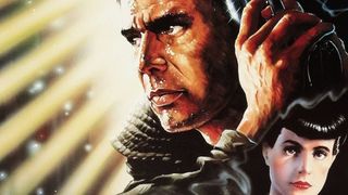
While designing the poster for Ridley Scott’s enduring sci-fi classic, the late John Alvin had a small problem. Literally. The only reference photo he had of Harrison Ford in his full costume (as Deckard) was the size of a postage stamp. According to Alvin’s official website, Alvin had to use a magnifying glass just to see the picture clearly.
So, to create the now-iconic poster for Blade Runner, Alvin referenced the compositions seen in Golden Age film noir (with movies like Out of the Past and This Gun for Hire); it helped that Blade Runner was spiritually a noir movie too, so it had the DNA for that sort of visual language.
Alvin also suggested to Ridley Scott that the poster emphasize the imaginative cyberpunk architecture that the movie features in abundance, which Scott liked. The result is an iconic movie poster that calls to mind classic Hollywood while promising something totally new and exciting, which was exactly what Blade Runner was and still is.
12. E.T. The Extra Terrestrial (1982)

Before his death in 2008, John Alvin was an industry giant whose talent for posters turned seemingly hard-to-sell movies into blockbusters. In addition to the posters for movies like Blade Runner and Disney features like Aladdin and The Little Mermaid, Alvin worked with Steven Spielberg on the director’s family classic E.T.: The Extra Terrestrial.
Just like Blade Runner, the iconic poster of E.T. touching Elliot’s hand (played by actor Henry Thomas) came out of necessity. The filmmakers were resistant to let anyone see the final design of the alien, so they only sent John Alvin a rubber green hand to reference.
Initially bewildered by the lack of support – and Alvin calling the assignment “impossible” according to a 2022 blog post by ArtInsights – he later came up with an idea (possibly inspired by Michaelangelo’s “The Creation of Adam”). What resulted is a now timeless image that teases the otherworldly magic of Spielberg’s masterpiece. And it’s all because Alvin just didn’t know what the alien actually looked like.
11. Titanic (1997)

Perhaps being one of the biggest movies of all time just makes the poster iconic by association. But the theatrical poster for James Cameron’s Titanic is quite minimalist compared to the maximalism that Cameron’s movies often are (including Titanic). The poster features a faded image of Leonardo DiCaprio and Kate Winslet in a tender embrace, while the towering bow of the Titanic points upward to communicate the thought-to-be-unsinkable ship’s incredible size and inevitable downfall. That the point of the Titanic subtly divides DiCaprio and Winslet indicates the tragedy at the heart of this romance, which works in concert with its ominous tagline: “Nothing on Earth could come between them.” Oh Jack, I’ll never let go!
10. The Thing (1982)

Another Drew Struzan banger, the poster for The Thing is technically a spoiler: Someone in the movie becomes “The Thing” at the end. But who? Even now the movie inspires rampant speculation online, while director John Carpenter claims to know exactly who and won’t tell. Nevertheless, the movie endures as does its poster, with its striking imagery of one of the researchers in arctic winter gear overtaken by a malevolent, evil alien force is enough to freeze anyone in their place at first glance.
9. Jurassic Park (1993)
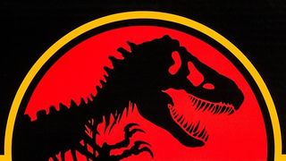
Sometimes all you need is a killer logo and a great tagline. Case in point, Steven Spielberg’s Jurassic Park. The poster is sparse, featuring just the in-universe Jurassic Park logo – itself an incredible piece of graphic design, with a roaming tyrannosaurus skeleton in a bold, foreboding red backdrop – and the wildly clever tagline that reads: “An Adventure 65 Million Years in the Making.” No celebrity faces, no gorgeously rendered scenes from the movie, and certainly no hint that Jurassic Park has the most realistic dinosaurs ever imagined. Yet Jurassic Park takes a bite of the competition by doing so much with so little.
8. Alien (1978)

Between the alarming tagline “In space no one can hear you scream” and an oozing green alien egg cracking open, the poster for Ridley Scott’s Alien is another one worthy for a theoretical movie poster hall of fame even if it doesn’t show off a single face from the movie’s ensemble cast. In a time when sci-fi films like Star Wars made space the place for adventure, Alien made us remember that the vast nothingness of the final frontier is actually lonely – and dangerous.
7. Metropolis (1927)

Fritz Lang’s groundbreaking silent film sci-fi is an achievement, but its poster – designed by German artist Heinz Shulz-Neudamm – is arguably the epitome of the art deco style. Prominently featuring The Machine Man (played in the movie by Brigitte Helm) in an abstract cityscape, the poster for Metropolis broke all the rules long before they were even written. What is Metropolis about? Who is in it? Where does it take place, and when? The poster for Metropolis answers nothing, yet it promises seemingly so much more. And the movie delivers. In 2012, the poster was among a collection that sold for $1.2 million.
6. Pulp Fiction (1994)

Armed with one of the most iconic images of all time, the poster for Pulp Fiction doesn’t actually tease anything in the movie besides guns and a smoking Uma Thurman. The original photograph was snapped by Firooz Zahedi, a noted celebrity photographer who took the photo of Thurman – in her character as Mia Wallace – at his private studio some time in April 1994. Ownership over the photo came under a tense legal battle in 2021.
Regardless of who owns the picture, the poster for Pulp Fiction endures as a college dorm room staple and has been emblazoned on everything from t-shirts to coffee mugs. And it’s not hard to see why. Between its clever imitation of “pulp fiction” paperbacks and Thurman looking intimidatingly beautiful while staring directly at you, what you have is a poster that both embodies a specific time in Hollywood yet feels timeless.
5. The Exorcist (1973)
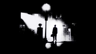
Cinematographer Owen Roizman captured a hauntingly beautiful image of actor Max Von Sydow, in character as the titular exorcist Father Merrin, standing underneath a gaslamp as he prepares to confront a malevolent evil. Graphic designer Bill Gold edited Roizman’s image to create the poster for William Friedkin’s The Exorcist, which effortlessly captures the unholy vibe of the movie without actually showing off the movie’s ingenious (and horrifying) effects and makeup.
The Exorcist simply has one of the best movie posters of all time and stands tall as one of the most terrifying, not because of what it shows but because of what it doesn’t show. In this moment, it’s the inhalation of breath before the screaming starts.
4. Scarface (1983)
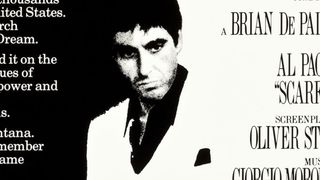
Is the world of Scarface black and white? The everlasting poster for Brian de Palma’s crime drama implies that the world of Tony Montana (played by Al Pacino), who rises and later falls as a powerful Miami drug lord, operates on that binary. There is no good and evil. Only strength and weakness, rich and poor, life and death. Pacino himself appears in black and white standing between the light and dark, which foretell his struggle to navigate the dangers that await on the road to the American dream.
3. Star Wars, Style A and Style C (1977)
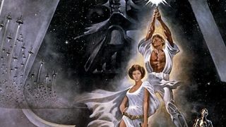
One of the most influential movies of all time for all the obvious reasons, George Lucas’ original Star Wars has not one but two iconic posters. “Style A,” made for the U.S. theatrical market, was drawn by Tom Jung, who based his work off of plentiful reference photos but only the broadest of strokes to the story, including a basic theme of “good versus evil.” This is maybe why Jung draws Luke like a superhero beefcake, while his own sister Lea poses like a vixen from a 1930s comic book. The “cross” formed by Luke’s saber and dividing the menacing helmet of Darth Vader behind them came from Jung’s own interpretation of the story.
For the UK market, a second poster (“Style B” as it is called) was made by brothers Tim and Greg Hildebrandt replicating Jung’s composition. A third poster, “Style C” made by Tom Chantrell, took a different approach. This one features more authentic recreations of the characters, although someone has definitely nitpicked over Vader’s inaccurate lightsaber.
Both the A and C posters have gone on to become memorable pieces of iconography in Star Wars’ vast empire, and have inspired countless other rip-offs, parodies, homages. Each piece is a work of art in its own right, all of it contributing to the grandeur of a galaxy far, far away.
2. The Godfather (1972)
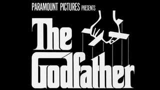
One may argue that The Godfather’s poster could be the laziest of all time. The marketing team behind Francis Ford Coppola’s film simply recycled the cover of Mario Puzo’s original novel, illustrated by S. Neil Fujita, with its abstract drawing of a hand holding puppet strings. (Because the movie is about power and control in the Italian mafia, you see.) But it was still a stroke of genius, as Coppola’s faithful yet riveting retelling of Puzo’s novel meant the symbolism was still relevant, as well as elegant. It’s now an iconic piece in cinema, and in hindsight, just too good of an offer that couldn’t be refused.
1. Jaws (1975)

How do you communicate terror from the deep end? Steven Spielberg’s monumental horror blockbuster Jaws has instilled fear in generations of moviegoers from ever wading too far from safety. Its poster from Roger Kastel is just as iconic as its lines (“We’re gonna need a bigger boat”) with a monstrously realistic image of the shark lurking beneath a most vulnerable swimmer. While the poster has been rife with parodies – we’ve all seen one reimagined with cats, I’m certain – the poster remains undefeated from its place at the top of the heap.

Eric Francisco is a freelance entertainment journalist and graduate of Rutgers University. If a movie or TV show has superheroes, spaceships, kung fu, or John Cena, he's your guy to make sense of it. A former senior writer at Inverse, his byline has also appeared at Vulture, The Daily Beast, Observer, and The Mary Sue. You can find him screaming at Devils hockey games or dodging enemy fire in Call of Duty: Warzone.








X-Men star Michael Fassbender says he auditioned for James Bond, but ended up suggesting they go for Daniel Craig: "I don't know why I was promoting him"

The Boys star and self-proclaimed "huge video game nerd" Jack Quaid says his dream role would be in a BioShock movie because it's "one of my favorite games of all time"
