Forget classes, my favorite thing about the new D&D Player's Handbook is its art
Opinion | This feels like a major step up from the old version
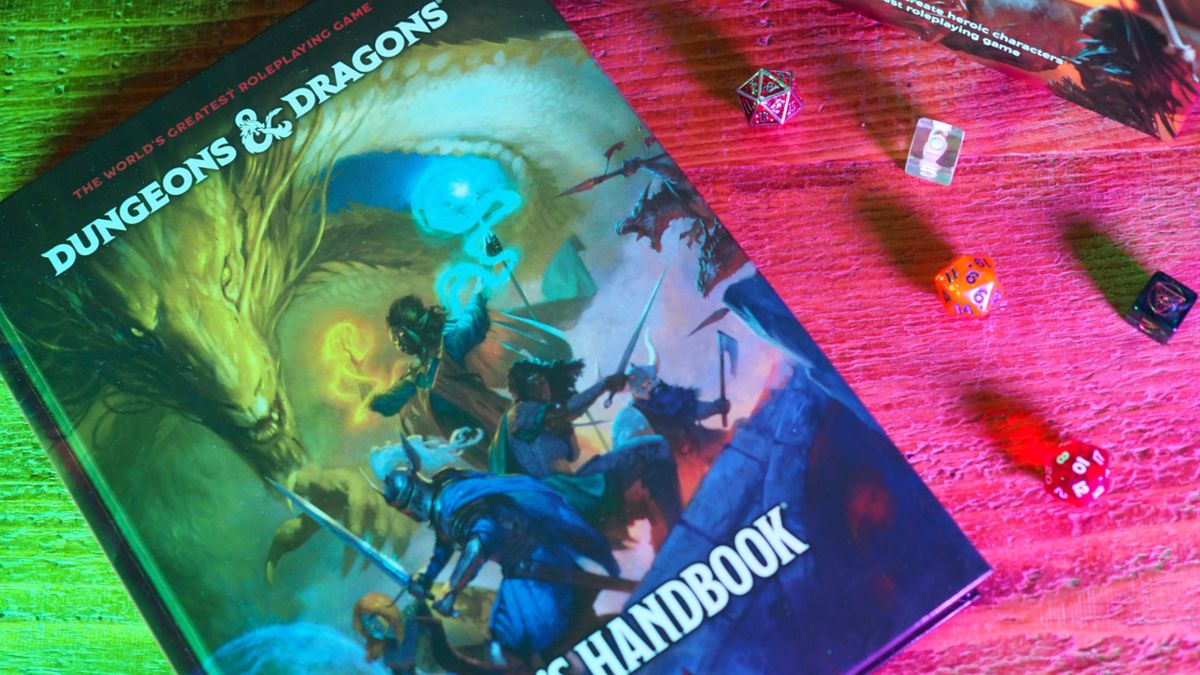
Within the first few pages of the new D&D Player's Handbook, you're greeted by pictures of dodgy deals with hags, a battle to the death with wyverns, and the fickle nature of a d20. (Roll a 1? Whoops, that's straight into the spike pit with you.) It's enough to make the previous version feel drab in comparison, and the book is so much livelier as a result. You can thank the game's recent success and (far) larger budget for that, but it's not the only reason. According to Dungeons & Dragons art director Josh Herman, it's also because this was an opportunity to start fresh.
"If you had one image to show somebody who had never played D&D before… what is that? That's what we tried to do in almost every instance," Herman explains when we catch up at Gen Con 2024. "What should a Player's Handbook show? What should a Dungeon Master's Guide show? What should a Monster Manual show? With the Player's Handbook [cover], we're looking at parties. We knew that we wanted to show a party, a composition of people. We wanted to show them with a dragon. That started [things]. What are they doing? What situation could they be in? And so we explored a lot of sketches on the player sample cover specifically to figure out what that moment was."
What we ended up with feels like quintessential Dungeons & Dragons, but with no holds barred. After spending a couple of days with the revised Player's Handbook, I can comfortably say that this is D&D putting its best foot forward.
Supporting act
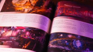
With this 2024 update, the Player's Handbook is finally as lavish as you'd expect from what is often labeled as one of the best tabletop RPGs. In the old version, too much was left to your imagination. Class pages, some of the most used in the game, were frequently limited to one or two illustrations and decorative elements apiece, while the spell section was an unrelenting wall of text. But with this update, things are given a premium treatment deserving of that reputation.
Alongside a much grander piece of hero art for each class (which proudly takes up a whole page this time), each subclass also gets an evocative illustration that teases readers with what they might be. Whether it's a fantasy rockstar from the Bard's College of Glamor or the Paladin's colorful Oath of Ancients build, it's hard not to be inspired by the wildly different takes on offer. Equally, you'll get artwork displaying how a spell works every page or two – and it's actually quite compelling, showing off how magic works where before you'd have to guess what something like 'Chromatic Orb' looked like.
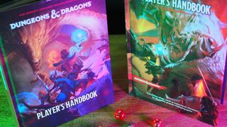
Wondering why the core rulebooks are changing in the first place? According to the game's creative director, it's about smoothing out wrinkles that have come up in the last 10 years. More specifically, D&D "didn't burn the game down" for the new rulebooks: it's still the RPG you love.
Rather than feeling limiting, these illustrations help kickstart your creativity. Each background has its own painting of a landscape or scene that begs you to imagine your character there, for example, and I found myself piecing together a story based on them without even realizing it. Does the Charlatan run that dubious stall of goods in the carnival? Is the underground lair full of heist plans and weapons the Criminal's, or does it belong to their gang? And why have mugshots of ne'er-do-wells been crossed out in red along the wall? Backstories begin forming themselves with minimal effort, and this alone makes the 2024 Player's Handbook more compelling than its 2014 equivalent. I can see this section being a hit with newcomers in particular.
That's because the art isn't just there to look pretty – part of the draw is that it all tells a story. As Herman notes, artwork in D&D books is about "supporting the text, whether it's a monster or a place, or a villain, or a character class. Because in essence, D&D is the text – the rules of the game. And so the art is really there to support that, and to show what is on the page as much as possible. Because the text is incredibly juicy and filled with really interesting things, right? And there's a lot of ways to take that."
Sign up to the 12DOVE Newsletter
Weekly digests, tales from the communities you love, and more
This is why the new artwork often takes place before or after climactic events – such as goblins preparing to launch an ambush, or a horse-drawn carriage charging away from a menacing castle. According to Herman, that allows readers to fill in the gaps. Otherwise, you'll "rob the player of the agency" to create their own narrative, subconsciously or otherwise.
An easier read
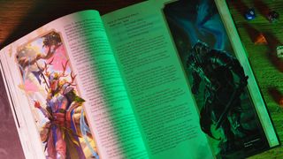
"A critique on the 2014 Player's Handbook, especially the bigger classes, is there's just not that many [illustrations]," says Herman, who explains that the team wanted to bring more personality to D&D's classes and characters. "You know, there's a handful of selections. You get a couple illustrations of, like, a dwarf, so you just don't really get that many views on what that character can look like. And I think that creates a relatively narrow view of what players think that they can make. So we wanted to add a lot more stuff, a lot more flavor."
With the sheer amount of art and content filling up this 384-page tome, however, overwhelming readers proved a real risk. That was a major concern for Herman and co as a result, and the attention shows. The book is much easier to skim than before, and your eye is immediately drawn to crucial info via boxouts, tables, and icons to represent classes or stats. Yes, there's still a lot of text to parse through. But in direct contrast to previous editions where sections bled together and thus were tricky to find quickly during a session, it's a more logical read this time around.
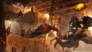
It's not just the art of new D&D I'm excited about; the upcoming virtual tabletop is also on my radar. Indeed, Project Sigil is "the Minecraft of D&D" according to developers.
"How do we support the text better from a UX player experience?" Herman says. "There's been 10 years since the last [core rulebooks] came out. So there are evolutions in the way that people read things and look at things, and people are a lot more visual. I think a good example would be the class spreads. We intentionally designed all of those from the beginning, which is different to the 2014 [rulebook]. Every time you get to a class, there's an iconic image of what that class looks like. And then the subclasses are all vertical half majors that go along the sides. And what that does is… it's a sort of subconscious thing. So every time [readers] get to a class, they know that when they get to [art on] the left-hand side, that is the beginning of a new section."
In a nutshell, the new Player's Handbook is trying to set up D&D for the next several years; there's an emphasis on being more accessible than ever whilst adding new perspectives that should revitalize existing players. As Herman concludes, it aims to be "nostalgic but exciting and fresh." And from what I've seen so far – who am I to argue with the have-a-go-if-you-think-you're-hard-enough party on the cover? – it hits that target with gusto.
For recommendations on what you should play next while you wait for the new D&D Player's Handbook, check out the best board games or our guide to the best card games.

I've been writing about games in one form or another since 2012, and now manage 12DOVE's tabletop gaming and toy coverage. You'll find my grubby paws on everything from board game reviews to the latest Lego news.
- Rollin BishopUS Managing Editor
