Sam Ashurst's House Of Horror: Murderers, Monsters And Mutant Chickens
Plus! Interview with VHS legend Graham Humphreys

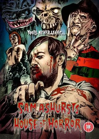
Hello fright fans, my name's Sam Ashurst and I'm Total Film's resident cult horror expert.
I spend so much time banging on about '70s giallo movies, '80s VHS trash classics, '90s serial killer flicks and '00s foreign chillers that TF have finally decided to give me my own column. Possibly to shut me up.
Each week, I'll be dissecting the latest DVD and Blu-ray releases, uncovering hidden gore gems, and rummaging through my VHS collection to bring you some of the most bafflingly beautiful video covers from the '80s.
And come back every Friday for exclusive clips, interviews and cool competitions to get your plasma pumping.
So, take off your razor-tipped gloves, hang up your cobweb-covered hat and gently rest your bone-blunted axe beside the door.
And welcome to my House Of Horror...


Dead Hooker In A Trunk (2009)
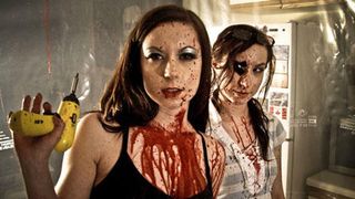
Hobo With A Shotgun might be getting all the buzz, but that's not out for aaaaages. And there's another grindhouse gem equally worthy of your attention, out on DVD on Monday.
Like Hobo With A Shotgun , Dead Hooker In A Trunk easily lives up to the promise of its title.
But it could be called Bad-ass Twins Find A Dead Hooker In Trunk Before Being Pursued By A Serial Killer, A Cowboy Pimp, Pervert Cops, And Chainsaw-Wielding Drug Lords and it still wouldn't disappoint.
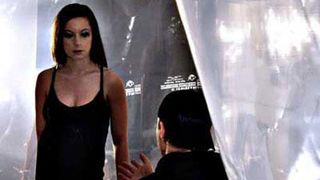
Honestly, this thing is packed with cool moments. They might not always be completely cohesive, but grindhouse geeks are used to that.
If you want a nuanced plot, watch Chinatown . If you want a thrill-ride that'll occasionally make you spit-take your popcorn and Coke, watch Dead Hooker In A Trunk .
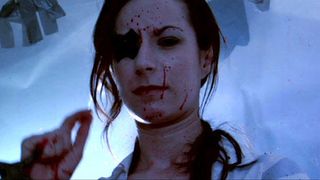
Case in point, none of the characters have proper names, they all go by ridiculous nicknames. But that doesn't stop you from falling in love with each and every one of them.
They're all great, from the Goody Two Shoes who can't stop puking every time he encounters some violence, to the Junkie who I initially thought was played by a weird genetic experiment combining the DNA of Winona Ryder, Rachel Bilson and Angelina Jolie, until I did some basic research and discovered she's actually a professional stunt-woman.
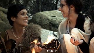
Written, directed and produced by stars Sylvia Soska and Jen Soska (and part-funded by their parents), it's cheaply made, but as most of the budget seems to have gone on the gore effects, you probably won't care.
Which isn't to say it isn't artfully shot. In between the mayhem and genuine shocks, the Soska sisters demonstrate an almost lyrical eye.

I'm fairly sure they'll eventually end up making a stone-cold classic. Hopefully featuring the Dead Hooker characters I've become so attached to.
Get on-board early by picking up the DVD on Monday. It'll make a great double-bill with Hobo With A Shotgun .
Sign up for the Total Film Newsletter
Bringing all the latest movie news, features, and reviews to your inbox

Queens Of Evil (1970)
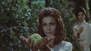
It's so good to see films like Who Can Kill A Child and Dead Hooker In A Trunk finally getting releases in the UK this week.
But if ever a film deserves to be rescued from obscurity, it's Queens Of Evil . The first time I saw it, I spent most of the runtime muttering 'This is brilliant.'
But don't get me wrong, I absolutely understand why it's disappeared down the back of the sofa, it's clinically insane.
I imagine it's never been released on DVD in the UK because it's probably technically a drug.
It's almost entirely composed of WTF moments, and a plot that steadily gets more and more bizarre every time you think it can possibly get any odder.
The story is deceptively simple. A hippie biker breaks down after an encounter with a businessman, and stays in a shed owned by three attractive women.
Their odd encounters form the main thrust of the narrative.
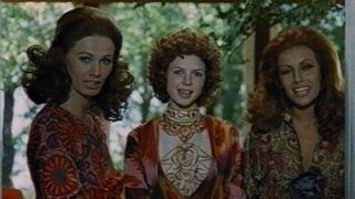
But if that outline sounds relatively normal, here are just some examples of its all-encompassing weirdness...
When our protagonists go fishing, they state they've made an appointment with the fish to catch them. 12.00pm, to be precise. That's pretty generous of the fish.
Our female leads live in a house with more inside-trees than the royal wedding, and more cushions than a planet made entirely out of cushions that's just been invaded by a vast alien race who also happen to be cushions. But that's not even the strangest aspect of the place.
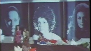
The three females usually sit in front of massive head-shots of themselves, possibly to remind themselves how beautiful they are, despite that fact they eat towering cakes for breakfast.
People have conversations in places that are geographically so far apart but are edited so closely together that the only explanation is that the speaker utters half a sentence in the woods before making his companion walk five miles in total silence so he can finish it in the kitchen.
One dream sequence involves a woman firing a gun using an arm that's sprouted from her vagina.
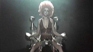
I'll say it again, it's a weird film.
But then we reach the final five minutes. Just in time for a genuinely incredible and utterly brutal climax that somehow achieves the impossible and makes sense of all the weirdness that's come before it.
In one deft sidestep, Queens Of Evil shifts from a surreal experience to a profound masterpiece.
Watching it is an absolutely gleeful affair - you'll have a reason to grin pretty much once every two minutes, before the climax comes along to make your jaw slacken and your mouth hang open.
So come on Arrow, come on Eureka, someone release Queens Of Evil on DVD or Blu-ray. I'd be happy to provide an audio commentary.
But do be prepared for a lot of it to involve me muttering 'This is brilliant.' Because it really, really is.

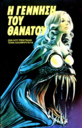
Looks Like: According to this Greek Death Laid An Egg VHS cover, the film is an incredible monster movie in which either a beautiful woman transforms into a massive lizard-snake-thing or a massive lizard-snake-thing has a beautiful woman growing out of its head.
Either way, this film definitely contains a massive lizard-snake-thing.
Actually Is : An atypical Italian giallo, mainly set on a chicken farm (seriously) with a mystery that isn't made clear until a twist-filled final reel.
It doesn't feature a single massive lizard-snake-thing, but it does have an odd scene involving mutant hens.
Imaginary Dialogue: "Holy shit! That snake has tits for eyes!"

C.H.U.D (1984)
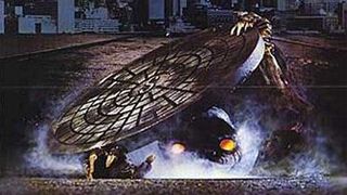
New York in the '80s. A city still recovering from a series of garbage strikes that left streets lousy with trash.
It was a city gripped by toxic terror, its newspapers filled with nuclear warnings; the price of having a cold enemy who perpetually threatened nuclear winter.
A city with a network of homeless communities slowly spreading out underneath its streets and subways, like an infection just beneath the skin.
Only New York in the '80s could've churned out C.H.U.D , the gloriously misguided attempt to provide social commentary on all of the above, in the context of a neon yellow-eyed monster movie.
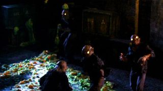
Whereas a company like Troma would use toxic waste as a starting point for pun-filled plots packed with grotesque heroes and even grosser villains, C.H.U.D seems to have a very different M.O.
It places nuclear waste and homelessness as two issues to be ignored at your peril. Combined here, they mutate into a far bigger problem. One that you can't look away from; one that'll smash down your door and extend its neck in your general direction if you try to escape it.
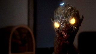
It's this odd mix of genuine social conscience and (beautifully designed) radioactive mutants that makes C.H.U.D both completely of its time and weirdly timeless.
And its messages still hold true today. Authority is not to be trusted. The deeper you bury your secrets, the more dangerous they'll be when they inevitably surface, and heroes can be found in police departments and soup kitchens alike.
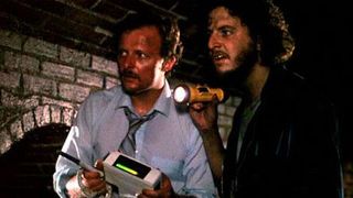
C.H.U.D was discarded as b-movie trash almost as soon as it hit cinemas - but in my opinion it's as important an examination of New York's dark underbelly as Taxi Driver.
We can only imagine what Travis Bickle would have made of the C.H.U.D. He probably would have wished for an acid rain to wash them off the streets.
As for me, I've got a soft spot for the film. It's grubby, it's gruesome, and it's occasionally unhinged. But it's also incredibly cool. Just like New York in the '80s.
I'll be providing a live C.H.U.D introduction at the 10th Fantastic Films Weekend festival , which takes place at the National Media Museum in Bradford on the 10 - 12 June. Come down and say hello! But first, go here to see the great line-up of films


Last week I had the honour of interviewing one of my favourite VHS cover artists, Graham Humphreys.
You might not necessarily recognise the name, but you’ll definitely know his work. He created so many iconic images for VHS, including Evil Dead, the Nightmare On Elm Street series, Return Of The Living Dead and many more.
Graham’s a true artist, who also just so happens to be a lovely human being. I took a trip to his studio in central London to have a chat about his VHS career.
So, how did you start out doing VHS cover art?
The VHS work sprung from the theatrical campaign for Evil Dead .
When Palace released the movie, they simultaneously released it onto VHS.
That’s how I got my first VHS cover.
Did you watch all the films you created covers for?
Very occasionally I would just be given a set of stills and you’d work from that, because they’d say ‘Well we know what we want, you know this face has to be on there, this is the material’ and so on.
But I watched most of them.
Of the films you did watch did you have a favourite?
Oh, possibly Creepers . It was the first Argento film I’d seen, believe it or not.
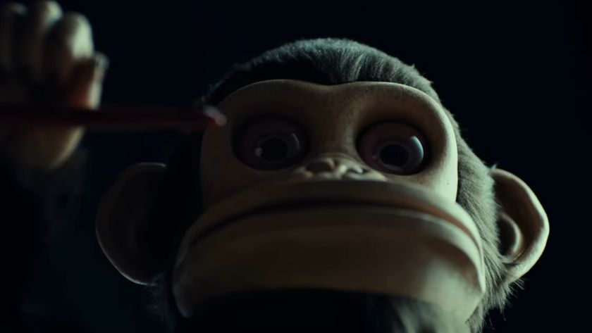
I remember being quite surprised at the level of violence particularly at the climax and guiltily enjoying it. I thought the monkey with the razor was great. I couldn’t quite believe it!
And so that became the main part of that image. I really enjoyed working on the illustration.
Films like Dracula Has Risen from the Grave - a fantastic, evocative title and alluringly colourful lighting.
The Lost Continent is another. Quite bizarre imagery.
You mention Hammer - how do you think a character like Freddy Krueger fits into the legacy of Hammer icons like Frankenstein, Dracula and The Mummy?
Personally I think not that well. Whereas the first Hammer Horrors sourced classic literature, reimagining the very familiar Universal icons, the Freddy character was a new animal without pedigree and without a literary genesis - not to diminish his place in the pantheon of monsters, of course!
Your Nightmare On Elm Street covers are incredible - were they fun to work on?
I'm very happy and humbled that you think so. Yes, they were fun. In reference to the previous question, the imagery for parts 1 & 2 felt to be new territory.
The character seemed very fresh and full of possibility. The first poster conceals Freddy, but for the second poster, without the need for sublimation, it was an all out celebration of the monster!
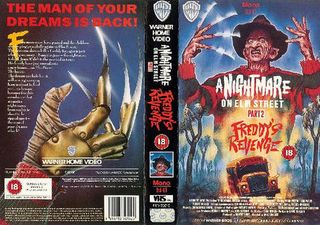
Why do you think people are so sentimental about the hand-drawn VHS box covers of the '80s?
Possibly because they represent a perceived golden age of horror, when anything seemed possible and the gates were wide open - certainly before certification and the 'video nasty' furore.
There is a sense that the packaging has been lovingly crafted rather than conveyor belted through the system.
The painted images tease the imagination, often concealing the reality of the all to often disappointing product within. You could never be sure whether the box contained a gem or a turd.
Your Spookies cover is one of my favourites of your straight-to-video stuff, it's beautiful - but the film itself is a bit of a guilty pleasure, what did you think of that movie in particular?
I confess to being hugely disappointed. I really wanted to like the film, but the terrible acting wasn't bad enough to merit amusement.
The various creatures had been lovingly designed, but as is all too often the case, the budget couldn't stretch as far as the imagination!
However, the painting was a pleasure to render.
To my continual embarrassment, when I marked up my overlays for print (not a computer to be seen then) I assigned the wrong percentage of reduction from the original artwork to video sleeve.
It may not seem very apparent, but the image is too big, resulting in an incorrect crop, particularly on the back where the scythe wielding skeleton is disappearing behind a photo still.
I seem to recall an entire character has disappeared off the edge! Unlike computer composited design now, there was no way to preview a finished sleeve without the expensive proofing process and to rebuild the sleeve would have been too expensive. Damn!
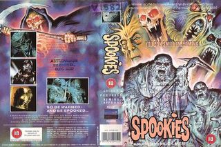
Could you talk me through the creation of that iconic Evil Dead 2 poster?
Certainly. Well, obviously they wanted it to emulate the original poster, so the starting point was the symmetrical structure.
In terms of structure, the original used the window frame device and in the same way that the tape reels form a 'box' for the actual title.
The Book Of The Dead became the 'box' for the Evil Dead II title also.
And we had a man with chainsaw and a screaming lady – all the clichés!
And of course, the trapdoor with a zombie below and a creature at the top, basic geometry.
In terms of the actual painting, I had good reference for Bruce Campbell but for the actress I had a friend pose for me, I used a Polaroid as a reference for the body, and added the head. I used my own hand as a reference for Henrietta's.
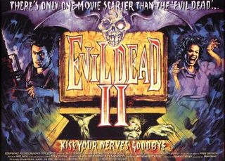
How did your friend feel about seeing the final poster?
The interesting thing is she was a different shape, she was a generously built lady, so I had to slim down the limbs, but oh yeah she was delighted. She thought it was very funny.
Would you watch stuff on VHS now?
Probably not, because I hate the way the tapes get snagged. That happened quite a lot - my cheap machine! The blurring of the reds and bleeding of colour always annoyed me.
I can understand why people still like the scratchy experience, the pirated feel. I saw a lot of films on pirate video, often the only way to see something after the 'video nasty' ban .
When you can’t see scenes properly, you imagine what’s there, so it becomes better in your mind. Scarier, too, sometimes.
Viewing a DVD or Blu-Ray release often reveals the reality of the budget, otherwise disguised on the quality of VHS.
Having said that, I do like to see things presented in the way they were meant to be seen. The director's original vision (or lack of).
I think the trouble with VHS is you know somebody has made a film and it’s not looking the way it’s meant to be, it’s not at its best, so I do feel slightly robbed.
Did you ever hear back from the filmmakers about your stuff?
Occasionally. I met Sam Raimi during the release of Evil Dead II , he was in London to promote the film was very enthusiastic about the posters.
Robert Englund was very generous about my Nightmare On Elm Street artwork, too.
Recently I’ve illustrated a DVD cover for a film called The Pack , and the director emailed me and told me how much he liked it. He knew my work. It’s very gratifying.

Now, I know I said last time that Video Of The Damned would be making its glorious return this week, but then I was offered this exclusive clip from a film I really want to support, so VOD is on hold for seven more days I'm afraid.
But it'll be back, better than ever, next time, I absolutely promise.
And I'm sure you won't mind when you see this intense slice of Julia's Eyes , which is out today.
If you want more information on the film, check out our The Making Of Julia's Eyes feature, which went live on Tuesday.
For fans of the sort of atmospheric horror flicks that were unleashed on audiences in the '70s, there really is no other film to see in cinemas this week.
Sam Ashurst is a London-based film maker, journalist, and podcast host. He's the director of Frankenstein's Creature, A Little More Flesh + A Little More Flesh 2, and co-hosts the Arrow Podcast. His words have appeared on HuffPost, MSN, The Independent, Yahoo, Cosmopolitan, and many more, as well as of course for us here at 12DOVE.
Most Popular


