Portal 2 concept art is pretty Chell
Our favorite test subject has been reimagined
GameInformer's continuing series of Portal 2 exclusives just revealed new concept art of Portal's heroine, Chell, as well as an extended interview with Valve's Matt Charlesworth aboutthe team's decisions. According to Charlesworth, Valve's main goal is to make everything "look 10 times better than the first Portal."A new Source engine might facilitate that best (just saying), but ignoring that thought, the concept art is fully exciting.
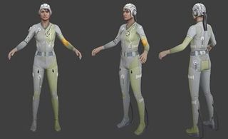
Valve has experimented with a variety of ideas, including scrapping Chell. But since they know how much we love our silent, barely-visible test subject, that idea was abandoned, and Chell will return with a new, sleeker, but still depressingly drab look, which we're seeing the beginnings of.

"The constraints we had were that this girl was supposed to be dressed by machines, so any markings on the suit would have been on there for readability by the computer. She was never supposed to look as if she'd been designed. But that's something we fought with – to make her still appealing to the player, but not look over designed. Anything that doesn't serve a real purpose on the character tends to get cut."
The interviewis stuffed with insight about Valve's perception of Chell and the world of Portal,and how they'd like to player to perceive her. Check it out, and let us know what you think about the Chellvolution. Most of the complaints we've seen are about her cap... but we sort of love it.
Mar 23, 2010
Sign up to the 12DOVE Newsletter
Weekly digests, tales from the communities you love, and more


A 16-year-old pitch for a newly discovered first-party PSP game has me mourning the death of PlayStation's Japan Studio all over again

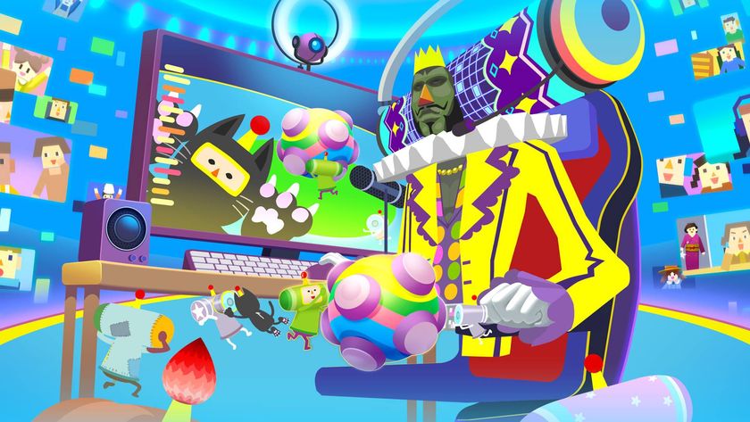
The first all-new Katamari Damacy game in almost 8 years is trapped in Apple Arcade jail, and I can only hope it follows in Hello Kitty Island Adventure's footsteps to eventually escape

