"People come up to me and say that's still their favourite Pokemon card": Mitsuhiro Arita reflects on 20 years of Pokemon's strangest and most iconic designs
Meet Mitsuhiro Arita, the illustrator behind some of the Pokémon TCG's strangest and most iconic designs
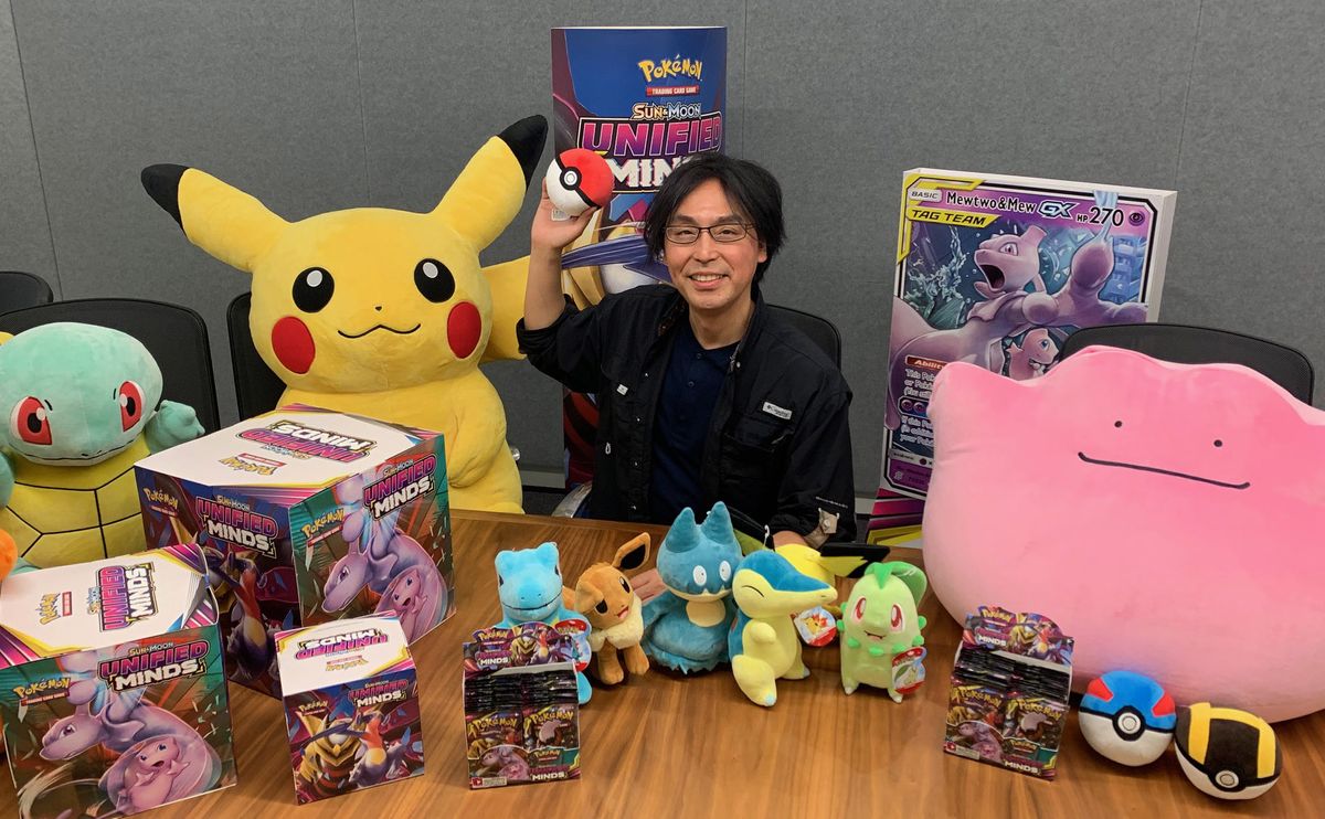
For a certain generation of would-be-trainers out there, there's this one universal truth: Pokemon made young grifters out of all of us. Do you remember ducking out of phys-ed to swap cards behind the basketball courts? How about tearfully begging your parents for just one more booster pack, all in the hopes of getting your hands on a rare with any kind of schoolyard stock value? Did you package unwanted Pokemon together in giant blind-auction bundles, hoping that quantity alone would be enough to make a friend-turned-disgruntled acquaintance trade away their ever-elusive shiny Charizard? Listen, it wasn't pretty, but all's fair in the quest to become the very best like no-one ever was. If you have any stories like these from the late '90s, then you will be familiar with the work of Mitsuhiro Arita.
You may not recognise the name, but you'll certainly recognise his legacy. Arita-san has been illustrating Pokemon Trading Card Game cards for more than two decades. His designs were among the first to be put into distribution by Media Factory back in October 1996, when the Trading Card Game – or TCG – launched in Japan in an effort to capitalise on the success of Pokemon Red and Green, which had launched earlier that same year. Two cards, in particular, have stood the test of time – the original Charizard and Pikachu from the Pokemon Trading Card Game: Base Set.
Pikachu and Charizard, the fan favourites
"The Charizard and Pikachu were very big for me. Everybody loves them but, at one point, I thought I would never make anything better in the future," Arita-san tells me, reflecting on two cards of the over 600 he designed that have followed him all throughout his career. "I had no idea that the Pokemon Trading Card Game would be this popular nowadays."
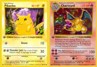
And yet here we are all the same. Pokemon bigger than ever, a global phenomenon that shows no sign of diminishing. Looking back over his career, Arita-san is incredibly humble. When pushed to name his favourite Pikachu of all the various designs over the years, he's surprisingly diplomatic – respectful of the artists that have had a hand in shaping the iconic mascot. "I'm the type of person that doesn't really like to focus on one specific thing being the best… but I enjoy the variety and diversity of different [designs]. So, there's not a particular Pikachu out there that I like better than others…." he says, although is quick to say "but when I drew [that] Pikachu, people were very happy."
If he won't say it, then I will: chubby-cheeked Pikachu is bloody amazing and beats out the ketchup-loving monster that Ash Ketchum carried around in the anime for the better part of two decades (Ryan Reynolds as Detective Pikachu is, admittedly, a close second). Still, it's difficult to identify what it is about the original designs that we hold so dear – is it mere nostalgia? Perhaps, but then a part of it comes back to the TCG occupying this weird little space in Pokemon's story of world domination. Looking back at it now, many of the TCG designs look like a funhouse mirror reflection of what we were seeing on TV and handheld screens. That, of course, is all a part of the charm of the TCG, much of which is a direct result of Arita-san's steady hand.
"People will still come up to me and say that that's still their favourite Pokemon card," Arita-san laughs as we bring up the original Charizard design – you know, the one that steered millions towards choosing the Charmander final-form when Pokemon Red and Blue finally made its way to the West. "I think it's amazing that I have polished my art skills for about 20 years now, and still the fact that people like that original one the best is really striking."
It is striking, but it's also a wonderful example of how powerful art can be in these creative circles. Arita-san is keen to note that he recognises that his earliest work isn't his best, especially when compared to the work he's doing for Creature (current developer of the TCG) with his tag-team designs, but that doesn't necessarily matter. If the work resonates with the audience, that's all that should matter. "I know that a lot of artists get a bit depressed when thinking 'I don't have the right skills' or 'I'm not skilled enough at drawing' but this kind of goes to show that even if it's not the most advanced or technically superior card illustration that I have ever drawn, there's still the fact that a lot of people love it, and have continued to love it for over 20 years. It had a big effect on my career."
Sign up to the 12DOVE Newsletter
Weekly digests, tales from the communities you love, and more
Being responsible for every Tag Team card
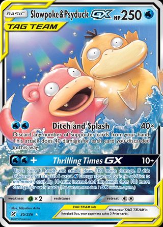
Arita-san isn't just one of many illustrators working on the Tag Team set; he's the sole designer behind each and every one of the cards. One in particular allowed him to exercise his creative freedom, and it's an unlikely suspect. A lot of the popular Pokemon cards tend to be the most powerful and impressive looking monsters and legendaries, but for Arita-san, he has a particular fondness for Psyduck & Slowpoke.
The design, pictured above, shows the two with smiles on their faces, splashing in the ocean with their hands in the air as the sun beams down. Both are pastel coloured and when combined with the clear blue of the water, there's very little to be threatened by aside from the attacks listed below. Arita-san told me he had the idea for the card about three months before he created the final design, despite wanting to "get it done on paper really fast, like a compulsion to draw it". Arita-san thought the idea for the card was "so funny and interesting", because Psyduck & Slowpoke aren't intimidating whatsoever. His motif behind the design was the idea of a beach ball and that he wanted people to look at the card and feel familiarity with it, like playing at the beach.
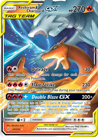
I assumed that as a designer, there must be a boat load of illustrations that don't end up getting used in favour of others, and one that Arita-san remembers fondly is a slightly altered version of the Reshiram & Charizard Tag Team card. The printed version of the card, pictured above, shows the two joining forces to breathe fire at a foe, with close-ups of both heads putting their scorching powers together. Originally however, Arita-san had Reshiram breathing red fire just like Charizard, before the art director said that blue fire would look more impressive. He went on to show me a number of alternate designs for the Pikachu & Zekrom Tag Team too, featuring Pikachu using its agile nature and small form in creative ways to dart around Zekrom and utilise its hulking form.
The final specific Tag Team card Arita-san mentioned to me was Giratina & Garchomp, but that's because it was tougher to design than most of the others. He had to construct a way to reflect the fact that both Pokemon are from different worlds; Garchomp resides in our world, but Giratina is a legendary deity from another realm. He had to "purposefully not make it clear which world it was set in" in order to retain some ambiguity.
How to design a Pokemon card
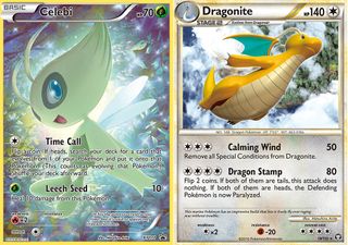
When it comes to designing Pokemon cards, if you grew up collecting them, then you undoubtedly gave it a shot at one point in your life. Whether you made a wonky off-brand Pikachu that got stuck on the fridge door or your efforts inspired you to work in graphic design when you grew up — I was definitely in the first category — being able to design a truly great Pokemon card is something few people can claim to have done. Arita-san, being one of the most noteworthy illustrators for the Pokemon TCG, undoubtedly meets that criteria, and he has one key piece of advice for anyone creating their own Pokemon cards.
"They have to, at all times, retain their playability." Arita-san explained that's the one thing everyone forgets, because it's easy to get carried away when designing a card on a large digital screen. "People would put a lot of effort into the small details – if you actually print that out on a small card, that effort – the fact that they’ve almost tried too hard with the little details is really counterproductive, and the whole composition loses energy as a result." A handy piece of advice he gave was that if you've got a printer available and you're designing the card digitally, print it out multiple times throughout the process to get a real grasp of how it looks physically.
What about the style of the artwork though? Pikachu has a very iconic look; red cheeks, black-tipped ears, a tail in the shape of a thunderbolt, all coated in its bright yellow fur. Comparing the Pikachu we know and love to Arita-san's chubby-cheeked classic means the differences are stark, but that wasn't just his creative freedom coming into play. In the process of designing a card, he explained that they're presented with multiple styles and versions of that Pokemon to draw inspiration from, so believe it or not, Thiccachu wasn't just down to Arita-san.
Sun & Moon: Unified Minds is the latest Pokemon TCG expansion available right now, and Arita-san designed each and every one of the Tag Team cards featured in the set. If you're fortunate enough to pull one in your boosters, take a closer look at the smaller details in the artwork and appreciate just how much effort goes into creating a Pokemon card, no matter how small they may initially seem. The truth is, it's the little details that can transform a Pokemon from being forgotten to time to being utterly iconic, and that's a quality in design that Mitsuhiro Arita has demonstrated time and time again all throughout his prolific career.
Give me a game and I will write every "how to" I possibly can or die trying. When I'm not knee-deep in a game to write guides on, you'll find me hurtling round the track in F1, flinging balls on my phone in Pokemon Go, pretending to know what I'm doing in Football Manager, or clicking on heads in Valorant.

