Ocarina of Time 3DS/N64 screenshot comparisons
Nintendo's upcoming re-release adds more than another dimension
When it wasfirst revealedat E3 2010, the 3DS remake of Ocarina of Timeappeared to be just that - a direct conversion of the N64 game, nowwith3D effects. Closer inspection of the provided screenshots, however, suggested the new edition may sport enhanced graphics as well. At the time, it was hard to tell, as we only had a few images to work with. Now it's a bit easier, as Nintendo recently released five new shots from the first and second dungeons that we can directly compare against the aging N64 classic.
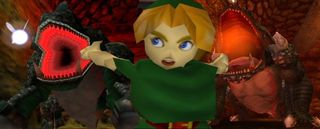
Above: A Link to the past... and the future
I've gone about this two different ways. First, Iblew upthe 3DS screens so they would be the same size as the N64 shots. You'll see more jagged edges in the 3DS images this way (they're not meant to be scaled up) but you can make out the differences much easier. On the next page, I flipped the process and left the 3DS images alone while shrinking the N64 images. For the record, I'm playing the N64 version of OoT as it appeared on the GameCube collector's disc.
Kokiri Village
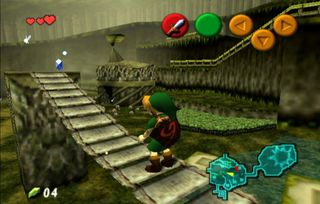
N64:Notice the sprout on top of thehut in the background, and the fact you can't see the Kokiri villager standing next to the blue rupee until you're like 10 steps away

3DS:The same area of Kokiri Village. Compare the hut, the now-visible villager and even Link against the N64 version. Higher poly count, better textures, though still somewhat hazy. That could be for "mystical fairy" effect though
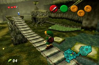
Above: Another angle from the N64 version. Notice how many goddamn button prompts are on the screen, most of which are moved to the touch screen on 3DS
Deku Tree Skulltulla
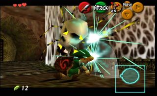
N64: Link swiping at a giant Skulltulla in the first dungeon
Sign up to the 12DOVE Newsletter
Weekly digests, tales from the communities you love, and more

3DS: The exact pose from this screen was tough to match, but you can still get a feel for the improved, cleaner visuals. Link is noticeablyless angularand the webs aren't a blurry mess
Ghoma
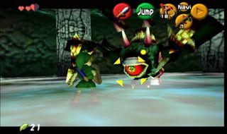
N64: The game's very first boss, as seen with 1998 technology

3DS: Ghoma in 2011, with sharper colors, a more defined "lair" and less misty fog along the floor. It's also easier to tell what the hell Ghoma even is
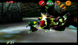
N64: Link swinging at Ghoma with the target reticle locked on. Again, the 3DS version has far less clutter on the top screen, so, it'll be nice to see more of the actual game once that stuff is moved to the touch screen
Next page: More comparisons, including the titanic Dodongo!
A fomer Executive Editor at GamesRadar, Brett also contributed content to many other Future gaming publications including Nintendo Power, PC Gamer and Official Xbox Magazine. Brett has worked at Capcom in several senior roles, is an experienced podcaster, and now works as a Senior Manager of Content Communications at PlayStation SIE.



"I can't go through [with] this": The weirdest Zelda ad didn't get Nintendo's approval, but it probably happened anyway because the marketing execs were already on-site

A Zelda movie is finally happening, but Nintendo's Shigeru Miyamoto used to adamantly oppose the idea even "if Steven Spielberg himself" wanted to do it

