Best Shots advance review: Nocterra #1 is a fast-paced debut from Scott Snyder and Tony S. Daniel
With an interesting premise and a lot of promise, Nocterra #1 delivers a D-I-Y response to the apocalypse
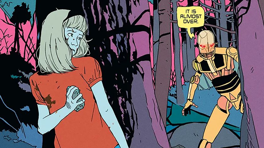
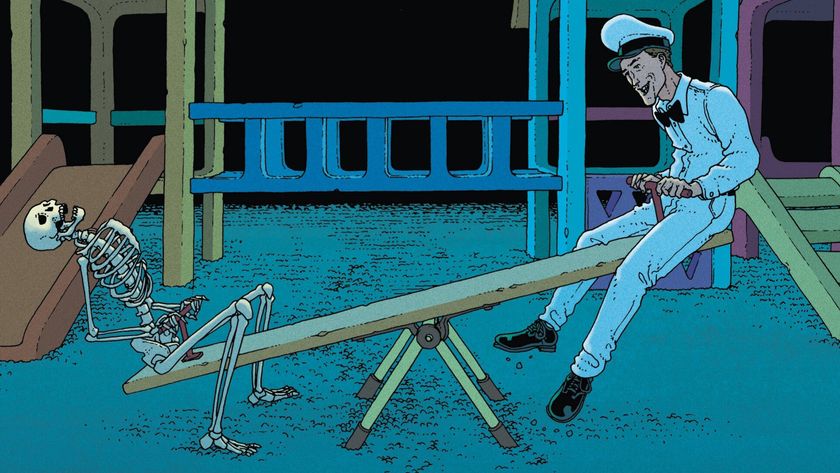
There are two great elements to Nocterra #1: the self-mythologizing of ourselves in the touchstones of our own memory, and the irrational and inescapable anxiety of knowing something about you, or that you did, or that you thought about, is deeply tied to things fully removed from our control. These moments bookend the debut issue of Scott Snyder's newest creator-owned series, but unfortunately, the rest of the book doesn't quite live up to those emotional beats.
Written by Scott Snyder
Art by Tony S. Daniel and Tomeu Morey
Lettering by Andworld Design
Published by Image Comics
'Rama Rating: 7 out of 10
Nocterra tells the story of a world plunged into darkness by 'The Big PM,' a strange phenomena that blots out the sun and stars, and transforms any living thing left in it for more than a few hours into a monstrous shade. Thirteen years after the Big PM, our protagonist Val Riggs is working as a big rig-driving ferryman who caravans passengers in between the last few remaining brightly-lit outposts of human civilizations in the United States.
Scott Snyder piles the worldbuilding into this issue, primarily through monologuing from Val and dialogue between her and her brother Emory, who outfits her with the explosive and brilliant tech that keeps her safe on the road. It makes for a fast-paced debut, but feels a bit like homework; I ended the issue knowing a lot about the technical aspects of shade profligation and sickness and wishing I knew by they settled on the name 'The Big PM,' or what happened to Val and Emory's parents or why a man in a pitch-black suit leaves a whole room of hardened Mad Max: Fury Road-trippers speechless. These things will certainly come up later, but the first issue might have felt a little less cramped if both the worldbuilding and character-building aspects of the story had been woven through at a similar slower pace, rather than breakneck fast for one and traffic jam slow for the other.
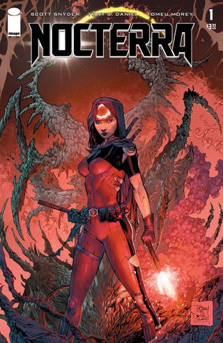
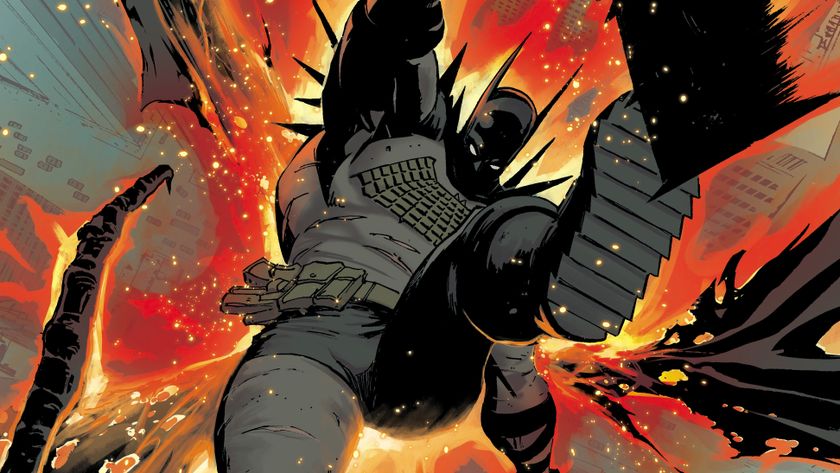
Artist Tony S. Daniel and colorist Tomeu Morey do a solid job bringing the world of Nocterra to life. Their rendition of the shades is deeply unsettling, and the moments during the big action set piece of the book where you only see claws and the hint of a limb go a long way towards driving home the unknowable origins and nature of the shades, and that the endless night has left the Earth of Nocterra fully unrecognizable to our own. The most interesting characters are those who look as if they've managed to piecemeal together a Tron cosplay on a budget: the ones who have cobbled together full-body outfits of whatever they could find and outfitted themselves with string lights and reflective strips to amplify the color.
The Luxville Colorado outpost is the artistic highlight of the book, a rundown town that has been obviously and fully repurposed to serve as a shining city on the hill for a bleak world. Daniel's clean lines and Morey's moody colors capture the atmosphere of an overcrowded haven running low on hope, and there's something unsettling about the piercing brightness of the way Morey colors the abundant lighting in the world, from the spattered dots of strings to the blazing beam of a spotlight. I love the shot of Val's gleaming rig barreling down the highway, and the dissonance of seeing glum, frightened faces crowded into a truck hold that's lit like a contemporary Twitch stream or dance club.

Nocterra #1 preview


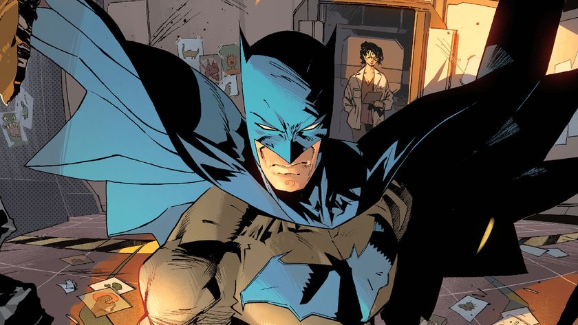
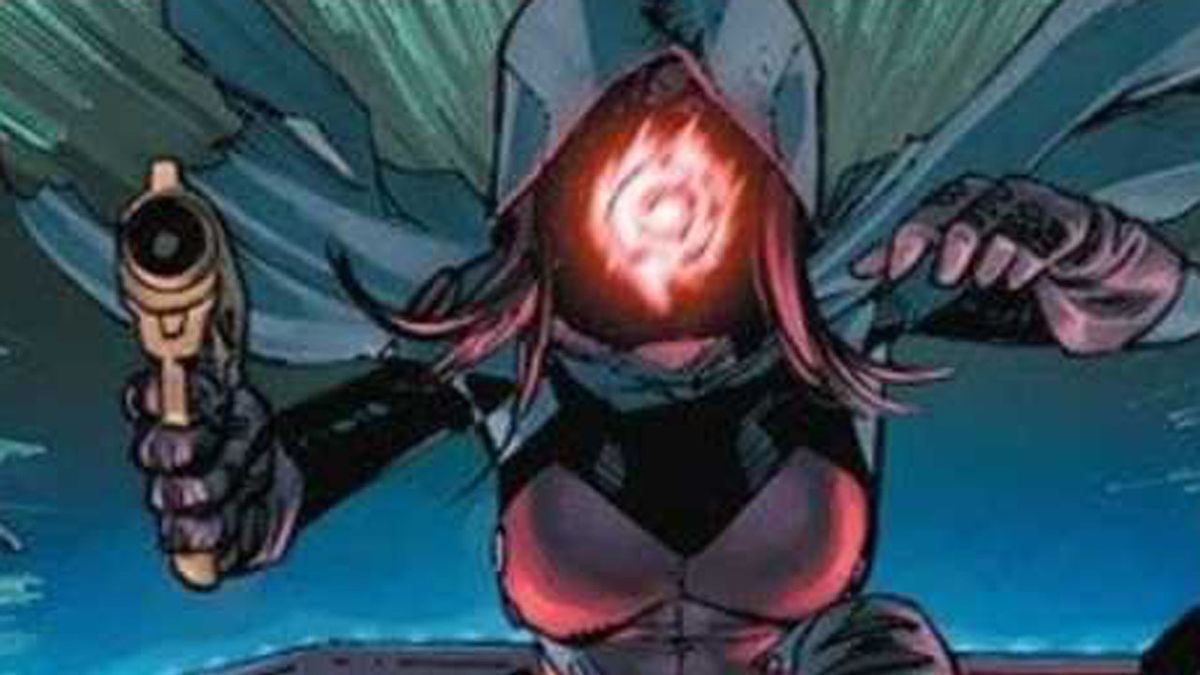
The series waffles a bit between this piecemeal, D-I-Y response to the apocalypse and more traditional superhero aesthetics, though, and those moments make the book feel a bit bland - characters like Val would be at home on any superhero team, and there's no narrative explanation or consistent visual language to any of the designs to ground the characters in the world the Big PM has left behind. Val looks cool, but Val's design doesn't line up with most of the other characters.
In a world where light is a lifesaving resource, it's strange that a cracked helmet would leave Val almost invisible outside of her truck in the pitch black. Given how common creative aesthetic lighting has become - the prevalence of draping string lights and strings of color-shifting LEDs - there are a lot of really interesting design opportunities the world of Nocterra presents, and it would have been a great way to make Val stand out from the wide universe of not just dystopian fiction in general but the extensive library of Snyder's capes comics work.
Comic deals, prizes and latest news
Get the best comic news, insights, opinions, analysis and more!
That said, most of these things can and hopefully will be resolved in future issues - the hazard of a debut issue is you have only one issue to set expectations, and the eternal struggle of monthly comics for consumers is waiting to see how things play out requires investing in an indeterminate number of single monthly issues to hope things pay off. None of that is Nocterra #1's fault, or the fault of the team, to be clear. The world the Nocterra team is building is an interesting premise with a lot of promise, and frankly, as a person who would love to live in a world where driving around on a lightcycle in a sick suit like I'm fresh out of Tron is seen as a practical decision, I'm hopeful that they lean more into the possibilities the world provides and eschew the grimmer dystopian/superhero tropes in future issues. (Please make a lightcycle big rig. Thank you.)
Nocterra #1 goes on sale March 3 in comic shops and on digital platforms. For the best digital comics reading experience, check out Newsarama's list of the best digital comics readers for Android and iOS devices.
