How Nintendo's most famous castle changed Mario forever
The outside of Peach’s Castle was 3D gaming’s gentle introductory playground. It seems oddly sparse today: just a cluster of trees and a lake devoid of traditional game-like challenge. But that’s the point. Nintendo built Mario 64 on a foundation of technological breakthrough with its sprawling 3D worlds, but nothing but pure design and animation brilliance can be thanked for Mario’s supple, elastic controls. There was a joyous, bouncy pleasure in the sheer act of movement, and the open, undulating grounds of Peach’s Castle were built for frolicking in.
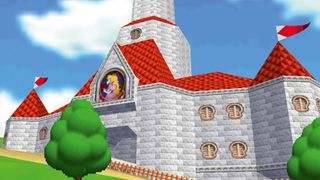
What a contrast with all those locked doors inside. Super Mario 64 didn’t feature the first platform game hub level but certainly codified the form, since other aspects of its design meant the between-levels part of the game had to shoulder much more responsibility than before. A map screen is great when you’ve got the best part of 100 levels to lay out, but Super Mario 64 only had 15. They were bigger than anything players had ever seen, designed for repeat visits and full of diversions, but the game needed a different means of tying the courses together.
From a functional perspective, then, Princess Peach’s royal abode is pure padding – it takes Super Mario 64’s 15 stages and sprinkles them over four subdivided floors. Despite the gating it does so nonlinearly, a subtle clue that things had changed from the days when Mario’s adventures were nothing but an epic journey towards the right of the screen. This was a space to be explored, with multiple entrances, exits and rooms you were meant to return to. Still, it’s a relatively compact, tidy and efficient environment compared with the bloated hubs it would inspire: you could fit Peach’s Castle many times over into Donkey Kong 64’s DK Island or Banjo-Tooie’s sprawling Isle O’ Hags.
There was a weird, voyeuristic novelty in walking around the nearly abandoned dwelling. We’d visited the Mushroom Kingdom plenty of times, after all, but never been invited to potter about the royal residence before. So it was a surprise to discover Princess Peach was an avid art collector. Given Mario’s three-dimensional transition, there’s something wonderfully symbolic about jumping into 2D paintings that then reveal themselves to be 3D worlds; it’s easy to miss the simple trick they pull off. The painting gimmick doubles up as an economical piece of level design: Mario 64 doesn’t need to integrate its environments into its hub zone or provide plausible transitions between the hub and the courses – it just hangs them, like exhibits, on the wall. They’re still logically placed, though: the entrance to the watery Jolly Roger Bay awaits beside schools of fish in the coolly lit aquarium; Super Mario 64’s final courses – the vertiginous Tick Tock Clock and sky-high Rainbow Ride – await in the castle’s summits.
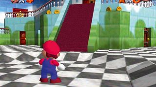
The strangest thing of all about Peach’s Castle, however, is that it feels like a real place, an actual home to contrast with all the themed gauntlets hidden inside it. Peach’s fondness for landscape paintings has an obvious design-related purpose, but there’s no denying that by modelling and filling her castle with such curios Nintendo had made the Mushroom Kingdom more grounded than ever before. The brightly coloured, prehistoric charms of Super Mario World’s Dinosaur Island had been reined in favour of a blander, fairytale aesthetic and a castle that, frankly, would slot neatly into Disneyland.
Meanwhile, the layout of the castle was oddly plausible – the courses might be stuffed with enemies and tricky platforming gauntlets, but Peach’s home was made up of nothing but long corridors and echoing rooms (there’s a Boo-infested courtyard, but this is the otherworldly exception to the rule). Even a puzzle in which Mario must ground-pound two pillars to drain the moat outside was unusual – it loosely paralleled finding alternate course exits in Super Mario World to unlock new levels of the map, but its focus on the castle’s mechanical workings was more akin to a Zelda temple than anything we’d seen in a Mario game.
A common criticism of Super Mario Sunshine is that the GameCube title’s preoccupation with turning Isle Delfino into a consistent, unified place held back its level design – a misstep that it took Galaxy’s abstract droplets of play to correct. If that’s true, then perhaps the first inklings of the impulse to make 3D spaces believable and consistent can be spotted here. As the Galaxy games managed to increasingly capture the purity of 2D Mario in 3D space, they whittled away at the hub until it was once again a map screen.
Sign up to the 12DOVE Newsletter
Weekly digests, tales from the communities you love, and more

But they lost something in doing so. Before Peach’s Castle, games like Mario were all about the rush to the level exit, the leap to the flag. But 3D worlds dangled the possibility of more immersive spaces: places we could pause, dawdle in and explore. Peach’s Castle was one of the first. It showed us a Mario who existed beyond the end of the level, a Mario without any immediate task. A Mario free to spend afternoons outside, somersaulting from tree to tree.
Read more from Edge here. Or take advantage of our subscription offers for print and digital editions.
