New Batman: Arkham City box art is officially official this time
New and probably final version of the sequel's cover looks good
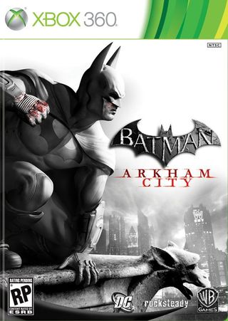
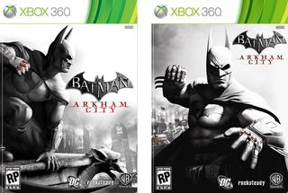
You may recall that a couple weeks ago we got our first look at the box art for Batman: Arkham City. A funny thing happened on the way to the printers apparently, as today we%26rsquo;ve been given new assets that Rocksteady and Warner Bros are calling the %26ldquo;official front of box art.%26rdquo; So erase that other cover from you mind and get ready for the new reality.

The new one and the original are cut from the same cloth, as they use black, white and red coloring, with emphasis on Bats%26rsquo; bloody knuckles. Still the latest version is an improvement in our eyes, with a more dynamic pose and the appearance of Batman%26rsquo;s constant friend the gargoyle. The previous exterior was good, but we%26rsquo;d rather see the Caped Crusader striking a pose than be moments from punching us.

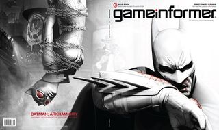
The only thing that looks off to us is the tiny bit of blood coming from underneath Bruce%26rsquo;s mask. It implies he has a bloody nose or some other injury, which is believable as Bats took lots of damage over the course of Arkham Asylum, but it implies some weakness that doesn%26rsquo;t feel right to us. Still, it follows a look from early press showings:

What do you think of this hasty turn-around in cover art? Is this an improvement or should the designers start working on a third %26ldquo;official%26rdquo; version?
Jun 29, 2011
Sign up to the 12DOVE Newsletter
Weekly digests, tales from the communities you love, and more
Henry Gilbert is a former 12DOVE Editor, having spent seven years at the site helping to navigate our readers through the PS3 and Xbox 360 generation. Henry is now following another passion of his besides video games, working as the producer and podcast cohost of the popular Talking Simpsons and What a Cartoon podcasts.
Most Popular
