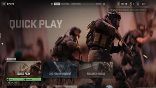
Modern Warfare 2's UI is so bad players are fixing it themselves
One concept shows how Activision could go about fixing its poor Modern Warfare 2 interface.

It's fair to say that players of the recently-released Modern Warfare 2 game from Activision aren't happy with its UI, but one player might have already fixed the problem.
Many have accused the current Modern Warfare 2 UI of being complicated and confusing, with the issue such an obvious one that people have taken to sharing concept artwork that shows how they would go about fixing things. One such example has been posted to Reddit by user u/InterventX. And they might just be onto something.
this_is_what_i_wish_the_ui_would_look_like_made from r/ModernWarfareII
The result is absolutely a better option than the one that we've been using for the last few days and it's definitely cleaner and clearer to look at. It's also similar to the Warzone interface that many of us have been using for a long time now, which might explain why we feel so at home.
Thankfully, as bad as the UI might be, it doesn't impact the game once you actually get going and the fun usually makes people forget about the mess they just had to deal with. Until it comes to dealing with it all over again, that is.
Thankfully, help might be at hand. One new report has Activision already working on tidying things up a bit, although we will have to wait to see whether that pans out before we get too excited. However, talk of a UI revision for Modern Warfare 2 and Warzone 2.0 definitely gives us hope.
Willing to look past that UI? Then be sure to check out which Modern Warfare 2 maps are available to start fragging noobs on.
Sign up to the 12DOVE Newsletter
Weekly digests, tales from the communities you love, and more
Most Popular

