The LittleBigPlanet 3 Beta shows off 9 small but significant changes
Crafty devils!
Unusually, for a series that was positioned as 'game-changing' back on PS3, the buzz for LittleBigPlanet 3 has been relatively slight. Perhaps it's because the tools for level-creation have become so vast and complex that only a significant investment of time spent 'learning the ropes' (coupled with a flair for creativity) could unlock the most satisfying LBP experience. In other words, most people just can't be arsed to make decent levels. Shame, because LBP is bloody brilliant.
I've been playing the Beta for LBP3, and while it's already a veritable wonderland for the creatively minded, there are clear signs that new developer Sumo is trying to make the do-it-yourself stuff more user-friendly. Here are nine smart, exciting things that I discovered while messing around with Create and playing other (vastly superior) levels made by the community.
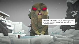
Image above taken from: 'Winter Wonderland' by ONEEYEDBANSHEE
You can make 3D levels
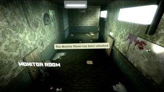
Yeah, this is a biggie. You can now create worlds that are fully 3D, shifting the camera behind the player, and making them the centre of the experience. On the surface, this means you can make proper 3D platformers like Super Mario 3D Land. In fact, don't be surprised if there are a bunch of Mario clones already online when you get the game.
However, the community has already been using it for more ambitious purposes. The screen above is from Project "HILL" Retro Horror Experience by ACDRAMON, which is a cross between Resi 2 and Silent Hill 2. The creator uses the new camera angle to replicate the look and feel of classic survival horror, and employs the new transition system to let players open doors and appear in new rooms. From here, they can even find and read notes and diary pages... just like Resi and 'Hill. Amazing.
Light is amazing
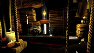
One of the first levels I played is called 'Lighten Up' (by KOMODOBROTHERS). Here, you're given an Illuminator (yeah, it's a torch) and tasked with navigating Sackboy through a dimly-lit library. Sure, LBP has always had extensive lighting options, but now you've got a tool that can be specifically used to puncture the darkness. What does this mean? Well, on a basic level you can create dark levels, and challenge players to navigate platforming with limited knowledge of their surroundings.
However, light can also be used as a trigger. In Lighten Up, there are several light-activated switches that raise lifts, expose bounce-pads, or even force platforms to rotate. You need to keep your Illuminator beam trained on the switch to make them activate (well, here anyway), so this really adds an extra dimension to the puzzle solving.

No really, the lighting is awesome
Later on, I play 'Fotaya Temple' by theflashback02, which has a kind of jungle / Aztec ruin vibe (although the screen above is from 'Lighten Up' again). There are more smart tricks with light here. At one point, Sackboy finds himself in a dark room, with only a candle in his hands to light the way. The glow around the flame, and the way it flickers and bends as you move, is a wonderful visual touch, and here it's used as a trigger to light-up a whole new area without the need for a clumsy transition. Speaking of which...
One thing that has always been more of an annoyance than anything is the way creators are forced to transition players between sections of their levels. Sure, you can just build a connecting section, but sometimes you just want to teleport Sackfolk straight to the next part of your level. Well, in LBP3, that's now a thing. It helps you create more of a flowing, almost cinematic, narrative to your levels.
Sackboy has more moves (as does the whole crew)
One thing I noticed in a few levels is Sackboy's new climbing ability. Create now lets you include climbable textures, which--more than anything--help you get out of sticky situations where jumps or bounce-pads don't cut it. Holding R1 makes Sackboy climb ladders and cargo-nets etc.
Similarly, Toggle has the ability to push large blocks while in his 'larger form', simply by walking into them. Oh, and Swoop can glide by tapping R1 too, which is a little less useful, as tapping A makes him flap anyway. Still, it looks cool, especially in the awesome 'Tower of Swoop' community level (by BREEZY-THE-PRO).
Layers are more complex, but easier to navigate
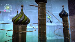
To become a truly great LBP creator, you need to understand how layers work. This third game gives you loads more options for transitioning players through various layers, which should--in theory--make your levels easier to design. There's a slide that pushes players from the back to the front automatically (and doesn't allow them to return to the back layer). Similarly, there are switches that can be grabbed, pushing the player to any layer the creator chooses, and rail-rides, as seen in 'Iced Over' by SE-MI92 (above).
Then there are layer bounce-pads, that can push Sackboy both in a specific direction and through layers. And, if you fancy a little flourish, you now have proper breakable textures to crash through. Think NFL players smashing through that paper wall when they run onto the pitch at the start of a game. Only with cute mascots made of wool.
It's easier to make stories, not just levels
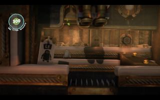
There are a bunch of new features designed to make story-telling easier in user-created levels. From a cosmetic perspective, stock backgrounds are more detailed, and some of them are properly animated. Speech is more natural when you implement it in non-player characters too (I played a level called Loot Le Gold by OMGYOUWOULD, where two Sack-Gangsters tasked me with recovering a load of gold to repay a debt).
What really adds spice, though, are mid-mission objectives and user-created pins. You can now provide players with optional quests (so, in Loot Le Gold, I got a bonus for looting five vaults), and award them with pins for doing specific things. Combined with smoother transitions between areas, and the ability to better hide spawn-gates, creators can now build proper stories rather than just isolated levels. In LBP and LBP2 it always feels like you're crafting continuity via an elaborate use of technical smoke and mirrors, but LBP3 appears to forefront the idea of joined up levels and narrative.

The community is already doing amazing things
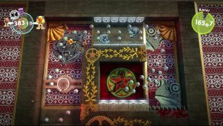
So, one of the most impressive things people do with existing LBPs is make entire mini-games, not just straight platform levels. The increased toolset in this Beta has already lead to more accomplished mini-games, as created by the community. I played 'Gravity Crash', a side-scrolling shooter with an incredible variety of enemies, options, and level variety.
I must confess, while I've spent hours crafting levels in previous games, I'm still unsure how some creators achieve mini-games like Gravity Crash (or Cosmic Gate--a Rez-style game by PIRMAUT--which you see above). So I can only guess at the new options that allow things like ship upgrades, regenerating health bars, and enemy ship attack patterns. Just know that, if you have the talent, it's possible in LBP3.
You can now edit while playing
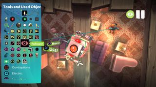
YES! No longer do you need to continually switch between Play and Create modes to test and amend your levels. You can now make changes while playing, using the Power-Up tool. And it's really easy to use. Any time you want to change the size or shape of a texture block, or want to shift its layer, or just move / delete it... you just open up your PopIt and use the selector to fiddle with the offending item.
You can also insert objects into the world while playing, and add other decorative bits and pieces as you see fit. It's tough to overstate just how important this is. It really is a time-saver, and allows you to edit in context rather than within the weird technical area of the Create space. Oh, and you can pause and rewind in Play mode too, just like in Create.
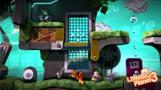
Learning is more fun
No matter how previous games dress it up, learning how to create levels is a bit dull. Well, LBP3 now makes more of an event of these tutorials. You actually navigate levels while Larry Da Vinci talks you through the game's extensive tools.
This is also a really, really important addition. Not only does it make learning more fun (apologies for the horrible clich), but it shows you how to use the game's Create features in context. So you can actually see the benefits of moving something back and forth through layers, or having a texture that dissolves etc. It's a big step towards making the creation of levels simpler and more appealing to those who aren't quite motivated enough to dive in.

Back, Sack, and Cracking
So, there you have it: a taste of what to expect from LBP3's user-creation options. It's by no means an exhaustive list, and there are loads of improvements that I probably haven't spotted. Have you been playing the Beta? Are you now inspired to try to make your own levels? Let me know in the comments below.
While you're pondering that Game of Thrones-themed level you're going to make in LBP3, why not check out more GR features? Here's one about The Bizarre Pig-People Who Live In Forza Horizon 2. And another about 8 Games That Didn't Have Real Endings (But Fixed It Later).


Pokemon reaches settlement in lawsuit over mobile game "Pocket Monster: Remake," operators "sincerely apologize" and say they've "learned our lessons"
Life is Strange director says Don't Nod returned to its episodic roots in Lost Records because he's not "invested" in Netflix's binge model

Pokemon reaches settlement in lawsuit over mobile game "Pocket Monster: Remake," operators "sincerely apologize" and say they've "learned our lessons"

Life is Strange director says Don't Nod returned to its episodic roots in Lost Records because he's not "invested" in Netflix's binge model
Most Popular


