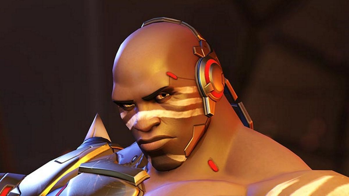
Now that Doomfist is running rampant across the battlefields of Overwatch (or at least the PTR), players are getting a sense of his playstyle, backstory, and most importantly, his skins. Reddit user ligerzero459 has compiled a gallery of all of Doomfist's skins, but we're gonna go one step further and rank all 10 of 'em, from worst to best. Let's get to it!
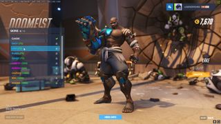
"Lake" is a simple recolor of Doomfist's original costume. There are going to be more of these in the list ahead, but this one is particularly egregious because the gray sweatpants make Doomfist look like he just got out of bed.
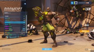
"Plains" is another recolor, but here the problem is that there's just too much of one dominant hue. It's just so very, very green.
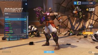
"Daisy" is a recolor that only changes out a few tones while keeping most of Doomfist's costume the same, but what a shift it is.
"Cheetah," as you can imagine, adds the spot patterns of a big cat to Doomfist's wardrobe. Unfortunately, it's a bit garish, and it doesn't even accurately live up to its name; if anything, those look like jaguar spots. Scientific inaccuracy = literally unplayable.
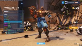
The last of the palette swaps, "Sunset" gets points for basically turning Doomfist into a Captain America analog. Red, white, blue… we salute the 'fist.
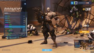
"Painted." Now this one is pretty cool. No changes to the model, but with a dark black gauntlet and ghostly white paint across his torso, this Doomfist is super intimidating.
Sign up to the 12DOVE Newsletter
Weekly digests, tales from the communities you love, and more
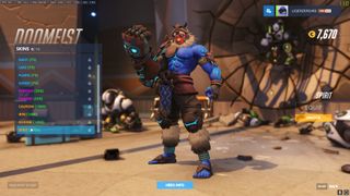
I really like where "Spirit" takes Doomfist's overall look, with a facemask and swirling tattoos, but the dominant blue doesn't come across as particularly vicious. Blue is a calming color. If only there was something like…
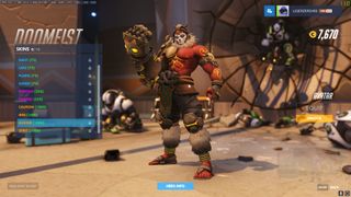
Yup, like that. Thanks, "Avatar."
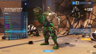
"Irin." Forget the possible misspelling there, because Overwatch just got a Tekken crossover. There's no way that's not a reference to the robotic fighter known as Jack, right? … right? I really love the curves thrown in to add some dimension to Doomfist's metal torso here, and it definitely stands out.
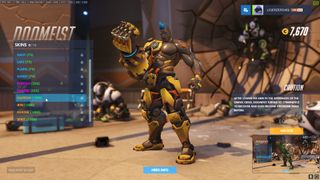
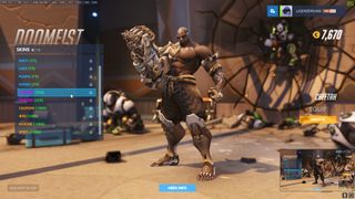
The overall winner here is "Caution." While Irin certainly looks very, very cool, Caution is just a bit more cohesive. There are more colors at play, and the blue stands out as a great highlight. Plus I love the attention to detail, where you can see spots that the metal has been scratched, chipped, dirtied, and otherwise worn down. A great costume should tell a story without a single word, and Caution does that. Good work, Blizzard.
Sam is a former News Editor here at GamesRadar. His expert words have appeared on many of the web's well-known gaming sites, including Joystiq, Penny Arcade, Destructoid, and G4 Media, among others. Sam has a serious soft spot for MOBAs, MMOs, and emo music. Forever a farm boy, forever a '90s kid.
Most Popular


