16 incredible photos from Forza 5 (and how to take them)
It's easy anyway (just press A) but there is an art to it too...
Forza 5's photo mode is amazing...

Being able to take a sexy photo of your favourite car has become a staple of racing sims these days. But the grunt offered by the next-gen hardware of Xbox One allows Forza 5 to render phenomenal images. Sure, they look good while you're setting them up, but then the game takes a few seconds to render them out in cinema-quality CG, resulting in images good enough to frame and hang on your wall. Hit the 'expand' icon on the top-right of any picture to see it in all its glory.
But while there are some pretty decent preset effects to click through, the photo options can all be adjusted manually. So in case you don't know your aperture from your armpit, here's a quick guide to taking some unforgettable snaps. So 'click on' to slide 2 and we'll get started! (groan...)
Pull back the zoom for drama
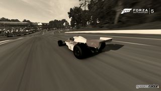
The zoom is automatically set to 1.0x. But you can pull it right back using down on the d-pad. The result is a shot like this. There is some distortion of images around the edge of the frame (so be careful not to let cars appear there unless you want to emulate Mega Drive's Virtua Racing), but keep your subject near the centre and the sense of drama is palpable.
Here I've coupled the pulled-out zoom with a slow shutter focusing on the car, to give the impression that the ground is rapidly sliding past. Finally, sepia is turned up to give it an old-fashioned feel to complement the 1970s F1 car. Mmmm... cliched!
Conversely, zoom right in to flatten an image

This picture was taken as far from the target vehicle as the game will allow, then zoomed in to maximum zoom. This has the effect of flattening the picture, making for an almost 2D look, like games used to do in cut-scenes in the late-'80s and early 1990s (remember that Super Monaco GP one? No, of course you don't...)
A narrow aperture has been used to ensure everything's kept in focus, and those crowd sprites (and they are sprites, not 3D) look super-sharp. Even if they are looking the wrong way. Hmmm...
Vignette adds darker corners
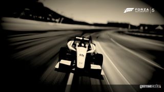
The vignette effect has been used in everything from Micro Machines 2 to Zombi U. True fact. Use it to make your picture look like it's being shown on a low-quality projector, or on 1960s TV or something. And yes, again I've used it with the sepia effect to age the look of the pic. Sorry about that.
Sign up to the 12DOVE Newsletter
Weekly digests, tales from the communities you love, and more
The other noteworthy technique in this picture is using the focus of the camera to make the background blurrier than the subject--in this case the car. The potential of this technique is pretty massive, and is useful for making over-sterile textures look more natural.
Oversaturation FTW
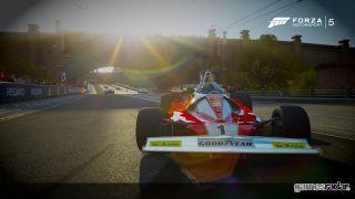
You can slide the colour saturation bar all the way from black and white through to crazy, oh-my-god-I've-burned-my-retinas oversaturation. But there's a happy medium to be found. For instance this picture, which is very slightly oversaturated to give the picture a Technicolour feel.
Composition also plays an important part in this picture's success. The car isn't in the centre of the picture. The light flooding in from the top-right casts shadows off the car's wheels that align with the invisible 'vanishing point' of all the lines that lead the eye into the picture. Incidental bonuses like high-contrast reflections in the car's bodywork add realsm that tricks the eye into thinking this is a real car in the picture.
Monochrome can look ultra-stylish

One of the default filters is this snazzy monochrome filter that strips out all the colour, leaving you with just black and white. This isn't the same as a standard black and white picture, which would offer more naturalistic shades of grey, although some greys remain. If you don't want those, just boost the contrast to full.
Here, I've moved the camera in close to pick out the detail of the Austin Cooper S motif. There are interesting areas in the reflections, tail lights and building on the right that maintain the viewer's gaze after the initial impact of the picture has subsided. Always include at least one high-detail area in monochrome. That's my tip.
Don't always focus on the car
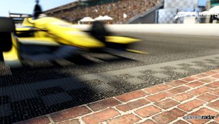
I call this picture 'The Brickyard' as it is focused on the famous bricked startline of the Indianapolis Speedway--the only strip of track remaining from the track's original brick surface. So what I've done is allowed a little leeway in shutter speed to blur moving objects, but used the X button to pick out a section of the bricks as the main focus of the picture.
The result is a picture that picks out the historic section of track and juxtaposes it with the modern ferocity of the Indycars that race on it. It also works well in black and white, although I found a little colour makes it more immediate.
This one's focused on the car...
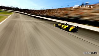
That 'push X to focus on something' feature is brilliant. Look at this comparison. With the shutter speed set to very slow, hit X on the car (which should be moving when you hit pause or this won't work) and set the shutter to open fairly slowly. It'll depend on how fast the car is moving but the scenery that isn't moving will appear blurred, as though the camera were tracking the car. As you can see, it really captures the sensation of speed.
Anyway, get that picture locked in your brainmind and then click to the next slide for the alternative...
...and this one's focused on the road
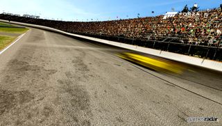
This is the same picture, but X-focused on the road instead. The speeding car becomes a blur because it occupied a greater space while the virtual shutter was open. Pretty cool, huh?
Incidentally, the aperture is set to very narrow to allow everything in the picture to be 'in focus', despite the depth of the environment. And yes, every time I see the world 'aperture', I too think 'this photo was taken for the good of all of us... except the ones who are dead.'
Tilting is awesome (but don't go tilt-crazy)
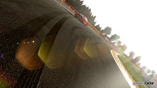
The tilt function is accessed via the left and right buttons on the d-pad. It's easy to be overzealous with it, but subtlety is often king. Depends if you want people to realise it's tilted or not. This one obviously is.
Again, I've focused on environmental details instead of the car itself, in this instance the tyre tracks and lens flare. And, in case you were wondering, of course I made the next corner. Me and my Ferrari F40 are invincible...
Justin was a GamesRadar staffer for 10 years but is now a freelancer, musician and videographer. He's big on retro, Sega and racing games (especially retro Sega racing games) and currently also writes for Play Magazine, Traxion.gg, PC Gamer and TopTenReviews, as well as running his own YouTube channel. Having learned to love all platforms equally after Sega left the hardware industry (sniff), his favourite games include Christmas NiGHTS into Dreams, Zelda BotW, Sea of Thieves, Sega Rally Championship and Treasure Island Dizzy.
Porting Mario Kart 8 Deluxe to the Nintendo Switch was "kind of an afterthought," and now it's so popular that getting fans to switch could be a challenge
Devs behind beloved destruction-focused racing game Wreckfest launch the sequel in early access with a trailer full of physics glitches and fatal error messages

