How Dead Space's innovative ideas and design created one of the most distinctive horror games of recent times
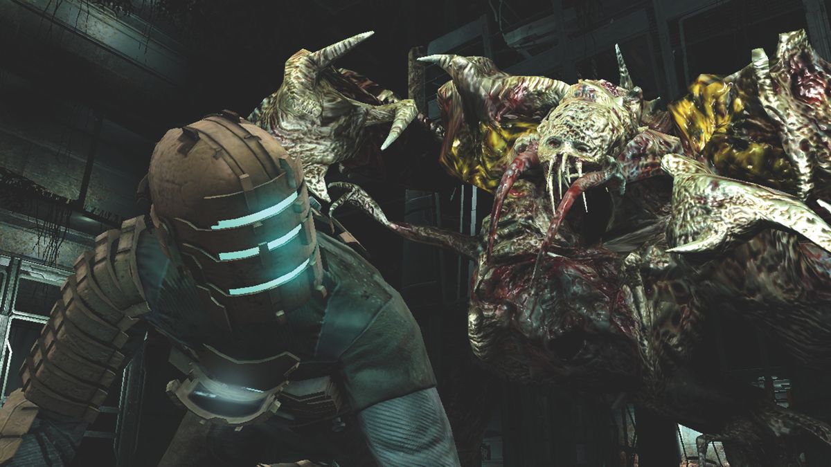
Within 20 minutes of starting you understand the horror Dead Space has in store for you. You’re navigating down a corridor, and the lights are flickering. You hear this fleshy, thudding sound: thwack, thwack, thwack. Is it an enemy? Is it a threat? The beams of your plasma cutter lighting the way ahead of you; the only sound is that wet, fleshy impact and the impact of your heavy boots echoing on the floors.
Thwack, thwack, thwack.
You round a corner and see a worker of the ship, banging his head on the steel wall. He’s bleeding, his skull is broken, and yet he carries on. It’s here you know that whatever's got a hold of the USG Ishimura crew is unstoppable, insidious, and that Dead Space is going to be a really dark game.
Dead Space is one of the most highly-rated horror franchises of all time. That’s no mean feat when you’re sharing space with Resident Evil, Silent Hill and System Shock. Something about Dead Space resonated with players, however. It offered something different to the predictable, stock formula horror games were subscribing to by 2008 and drew in an absolutely incredible team of experts in every field to collaboratively make one of the strongest horror experiences gaming has ever seen.
The main draw of Dead Space was its combat: as previews started to go live, it was becoming clear this wasn’t playing by the usual rules. Press would go to preview events, see that industrial-gothic, sci-fi setting and try to play it like any other shooter - bodyshot, bodyshot, headshot - rinse and repeat. But something terrible happened to those early players, unprepared for Dead Space nifty twist, and the devs stood at the sidelines and grinned - their gamble had paid off.
Dead Space relied on what the development team perfectly dubbed ‘tactical dismemberment’
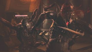
Taking on one of the corpse-inhabiting, parasitic Necromorphs in Dead Space was quite unlike anything you’d have seen in a survival-horror game until that point. The enemies were so wholly different, so totally other, that your tried-and-tested techniques wouldn’t work. No, shooting a Necromorph in its warping, mutating head or chest would only aggravate it. In some cases, approaching your enemy in this way would accelerate the creature, bringing you to an even swifter death.
Dead Space relied on what the development team so perfectly dubbed ‘tactical dismemberment’. Game designer Glen Schofield (whose name you might recognise from his later ventures at Sledgehammer Studios, creating Call Of Duty games) stated during development that this was the “primary theme of Dead Space”. And you can tell – of the myriad different enemy types in the title, none of them feel repetitive to fight: taking off a limb from each enemy type has different effects.
Sign up to the 12DOVE Newsletter
Weekly digests, tales from the communities you love, and more
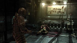
Early on, the game teaches you that slicing off an opponent’s legs with your plasma cutter is the best tactic – it’ll slow them down and stunt their mobility. Later in the game more complex enemy types start to crawl out of Dead Space’s body horror-fuelled depths. You try the same thing again only to find the enemy is quicker, leaner, more agile. You find yourself on the business end of sharpened bits of its alien cartilage or bone or whatever awful thing it’s wielding as it barrels down the corridor to impale you and infest your warm, twitching body.
The Necromorphs were actually conceived relatively early in the game’s life, thanks to production designer Ben Wanat. Wanat wanted the alien enemies to feel relatable. The production team deeply believed that aliens in games often felt too ‘other’, away from humans, and that encountering them, therefore, lost any sense of real threat or weight.
By making the main enemies of the game come from humans they became repulsive, they became alarming, they became relatable
There’s a real sense of horror and pathos to the Necromorphs, though, and that came with this horrible foreshadowing, too: by making the main enemies of the game come from humans, by making them readable in that way, they became repulsive, they became alarming, they became relatable. They’re evocative in a way that some space bug just isn’t – if one of those things managed to get you, you could see what would become of you – as twisted and broken as the very ship you’re trying to save.
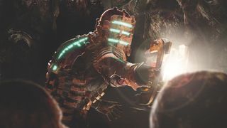
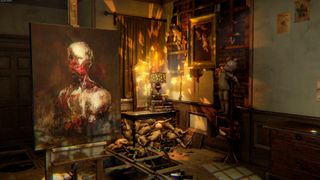
The setting of the game has also become remarkably iconic. The USG Ishimura managed to merge the gothic claustrophobia of traditional, almost medieval-inspired horror games with the grounded industrial sci-fi that gaming hadn’t really explored before. The design philosophy behind the USG Ishimura was both technical and artistic: EA had given Redwood Shores the freedom to heavily invest in ‘constantly alive lighting’ (something we were all very excited about last gen, and which has become almost a standard now).
Art director Ian Milham therefore opted for this gothic look – it turns out that ‘ribs’ in architecture really show off the shadows and lighting that the studio wanted, and with this in mind, Milham began to craft the masterpiece that is the Ishimura. The result was this gothic, rusted leviathan of a ship that sat dark and still in the orbit of a distant planet, silent and brooding, brimming with threat and malice. It was sci-fi that felt real and readable – far more grounded than some of the more ethereal space shooters out there.
It’s amazing to think Dead Space ran on the same engine as Redwood Shores’ engine from the Godfather game – the two couldn’t look more dissimilar. But turning up the contrast in the engine gave Dead Space its now-iconic visual flavour: dark, deep, and illuminated by scanning flashes of light that have the player inventing new terrors for themselves thanks to the uncertainty these flashes of light create. It’s a technique that’d later be used by Creative Assembly on Alien: Isolation to equally unsettling effect.

The development team’s construction of the Ishimura went deeper than just making it visually imposing. If you play the game again, you’ll notice just how little room you’re given to manoeuvre when you’re exploring the bowels of the ship. This was intentional – the developers wanted you to really feel the pressure every time a new enemy was introduced, every time you were foolish enough to disturb one of their ‘nests’.
Unlike most horror games, where enemies are made ostensibly readable to prevent player frustration, Dead Space wanted to trick you. Milham has stated that he wanted players to see something and not know what kind of range it had straight away. It was this focus on what makes horror actually horrible over sticking to the tropes that made Dead Space feel so fresh.
Isaac Clarke – your surly, objective-driven protagonist – was another way Redwood Shores flew in the face of convention. He wasn’t some noisy, cocksure young lad hired as part of a counter-zombie unit or some nonsense like that, no, he was just an engineer. And the game really didn’t let you forget that.
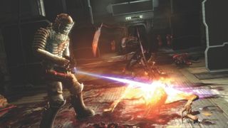
Every weapon Clarke could equip wasn’t really built for combat – you equipped tools typically found in engineering garages, surgical chambers, workshop floors. It gave the feeling of rooting around for scrap a real, in-world feeling of authenticity: you weren’t just scavenging resources, you weren’t just collecting ammo in boxes in bedrooms for no reason... you were finding tools and weapons that fit the world. Thinking back on it, Dead Space was one of the most immersive games of the last generation, simply because the mechanics and fiction of its lonely universe worked so incredibly well together.
It also helps that the game’s UI was so unintrusive, too: Dead Space introduced the genius idea of giving you all the vital on-screen information you needed without resorting to a HUD. Your health was shown as a series of lights tracing your spine, your inventory was projected from a projector in your mask (in real-time, no less) and your objective marker could be seen by a light that emitted from your palm at the press of a button. No messy systems, no over-wrought menu design. It’s like the clean, easily navigable UI was designed to contrast directly the enemies you were fighting and the design of the Ishimura itself.
Dead Space was the first game from the studio that would go on to become Visceral Games. Previously, it had been a runner of EA’s licensed catalogue – James Bond, The Lord Of The Rings, Tiger Woods, The Godfather and more made up its portfolio until then. By the time the studio had managed to prove itself worthy of creating its own IP, it had already become masterful at game design from practically every angle, and that artisanal craft was shown off sublimely in Dead Space.
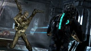
The series arguably peaked with its Dead Space 2 – it just perfected the experimental formula Dead Space set out – but unfortunately dipped with Dead Space 3. The games never lost their core focus, though: they always played around with the inherent darkness of man, always pushed industrial weaponry to its core, always gave you enemies that surprised and challenged you, no matter how many times you faced them.
None of this would have existed without Dead Space. The game came out of nowhere and was offered as a fantastic one-two punch from EA in the winter of 2008 along with Mirror’s Edge, almost making a statement for the publisher: “this is what we can do”, it proclaimed, “and this is what we can do with single-player games”. It set the precedent for one of the most well-rounded and satisfying generations in gaming, and as such Dead Space should be remembered as a game that celebrates how personal, how masterful, how terrifying a good horror game should be.
This article originally appeared in Xbox: The Official Magazine. For more great Xbox coverage, you can subscribe to OXM here.
Dom is a freelance writer covering games, music, and pop culture. He's written for GamesRadar, TechRadar, Red Bull, the Daily Star, The Guardian, TrustedReviews, PocketLint and more. He's now Features Editor at VG247 and a columnist at NME.
Nintendo of America president Doug Bowser says FromSoftware's The Duskbloods is evidence of Hidetaka Miyazaki's faith in the Switch 2 hardware
Former PlayStation exec Shuhei Yoshida gives the Switch 2 Direct a 7/10, and he says it would be even lower if FromSoftware didn't show up with The Duskbloods

2003's Kirby Air Ride was "ahead of its time," Nintendo exec says, and the Switch 2 sequel might finally let people appreciate "the genius of Masahiro Sakurai"
