Best Shots advance review: Home Sick Pilots #1's "design and energy go a long way"
Haunted houses as ramshackle mecha in Image's newest #1
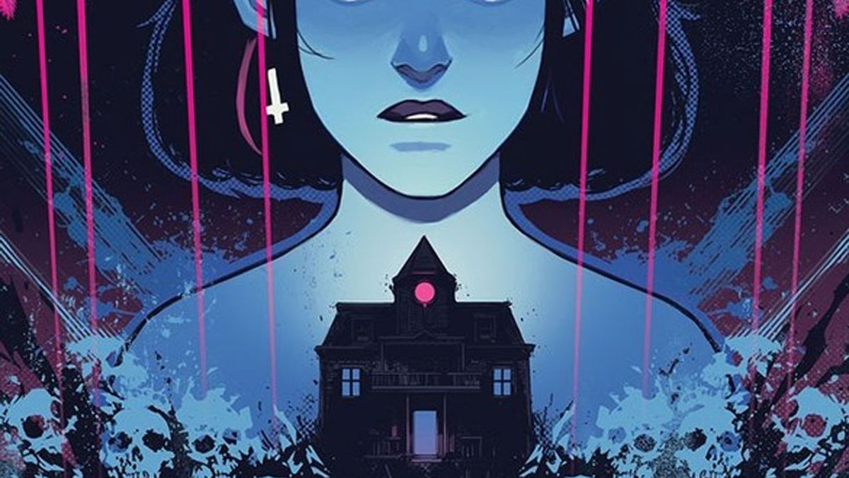
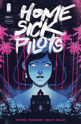
What is a haunted house without its ghosts? Aside from emptier than it already appears. Such is the thinking behind Home Sick Pilots #1, an issue which does a strong job of visually evoking the mid-'90s punk-scene milieu in which it takes place, while still struggling to connect the pieces of the story in the right order to fully deliver on the hook promised in the initial announcement.
Written by Dan Watters
Art by Caspar Wijngaard
Lettered by Aditya Bidikar
Design by Tom Muller
Published by Image Comics
'Rama Rating: 7 out of 10
To be fair to writer Dan Watters, he does ensure that the first scene puts the haunted-house-as-mech idea front and center. At the bottom of the first page, artist Caspar Wijngaard depicts a long-standing, long-abandoned, now decrepit house. He makes use of pareidolia – the idea of seeing faces in inanimate objects – with steps leading up to an open door, a luminescent pink coming from within, and a jagged piece of porch functioning like a pointed tooth. Even before the house stands up and starts walking, it feels alive.
Inside is someone who, via their narration, claims to be re-calibrating the ghosts in order to work together. This is Ani and if you're wondering how she ended up like this, Watters' script then jumps back in time by a few weeks in order to start explaining. Ani is part of a band, the Home Sick Pilots, with her friends Rip and Buzz. She's also a foster kid and there are rumors going around at school about why. There are also stories about the old James house. The house that kills people.
Working with a house that wants someone and someone (Anii) who wants somewhere, Watters gives a strong sense of his lead character and why Ani's personality ultimately leads them to the house. This is enhanced by the stark black pages which have no panels on them, only Aditya Bidikar's hand-crafted lettering that delves even further into her state of mind.
Where the issue falters is that this primary chunk of the issue's narrative doesn't quite connect to the bookends. It still looks like it's going to be a while before Home Sick Pilots catches up to that in medias res opening, considering the main thrust of the story with Ani and her friends here takes place over less than a day. Meanwhile, the final pages of the issue provide an additional wrinkle to the story, though it's one that unfolds via a new duo of characters. How these three parts of the story link is understandable, though it's not as smooth as a first issue can be when laying out its conceptual basis.

Home Sick Pilots #1 preview


While the narrative has some kinks to be ironed out, Wijngaard's art is exceptional and nails the energy the book wants to convey in its punk connections. When we meet the Home Sick Pilots, they're at another band's show in a bowling alley. The radiant hues of pink and blue lighting that accompany the performers don't reach across the entire room. From where Ani and her friends are standing at the back, the grunginess of doing a gig after-hours by breaking and entering is communicated, then the cops show up to make that even clearer. As the gig-goers flee, Wijngaard's page layouts get denser and in a burst of actual action, he swaps out the background of the bowling alley and instead makes use of solid blocks of yellow, pink, and blue to emphasize the movements.
The smartest thing he does is how he adds to the eventual outburst of horror by keeping his layouts normal and traditional until then. Nightmares are scary because they never appear to be one straight away. Gradually they build until it's too late and there's no escape. The same applies here, and when the terror is finally unleashed, it comes across in how his previously mannered layouts give way to panels with canted angles and jagged edges. The dimensions of the house – established via a cross-section two-page spread upon arrival – become upended, getting out is not as simple as just going back the way they entered. The colors are much more psychedelic than anything else in the previous pages, which seek to capture the world in the expected palette, in order to add to the intensity.
Comic deals, prizes and latest news
Get the best comic news, insights, opinions, analysis and more!
The way Ani and her friends talk about the stories they've heard about the house, the gradual convergence of the characters on the location, and this eventual climax all work to convey the desired mood and tension in the creative team's intentions. The structure of Home Sick Pilots #1 might not be the ideal way to sell its premise, but the design and energy go a long way in selling you on the tone and milieu to make up for that.
Home Sick Pilots #1 goes on sale on December 9. Read Newsarama's interview with Watters and Wijngaard about Home Sick Pilots here.
Matt Sibley is a comics critic with Best Shots at Newsarama, who has contributed to the site for many years. Since 2016 in fact.
