Has Mario Kart lost its style?
And eight other games missing their early magic
Road Rash
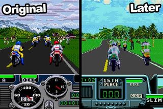
This is an old example, but a good one. With EA looking to impress with graphics in every sequel, it took the then-popular approach of digitising real images and sticking them in the game in place of hand-drawn sprites. This supposed increased realism can also be seen in Mortal Kombat andStreet Fighter: The Movie. But why does it look so horrible? It was the beginning of the end for the series and probably why we don't still have Road Rash updates every year.
The original's biker sprites are perfect. They look cartoony, sure, but that's why they look so good. Why is Road Rash 3 (pictured) so green and silver-looking? It's technically more advanced, but can anyone say it's truly 'better'?

Above: The modernisation of an art style. Or has the game just glitched and frozen?
Sign up to the 12DOVE Newsletter
Weekly digests, tales from the communities you love, and more
Justin was a GamesRadar staffer for 10 years but is now a freelancer, musician and videographer. He's big on retro, Sega and racing games (especially retro Sega racing games) and currently also writes for Play Magazine, Traxion.gg, PC Gamer and TopTenReviews, as well as running his own YouTube channel. Having learned to love all platforms equally after Sega left the hardware industry (sniff), his favourite games include Christmas NiGHTS into Dreams, Zelda BotW, Sea of Thieves, Sega Rally Championship and Treasure Island Dizzy.

This weird WarioWare-like's demo got thousands of positive Steam reviews, and now its Kickstarter's $40,000 goal has been smashed 11 times over

Former CDPR lead says "experimental" new open world vampire RPG The Blood of Dawnwalker will "push the genre forward" a lot like The Witcher 3: "The risk is worth the reward"
Most Popular


