Has Mario Kart lost its style?
And eight other games missing their early magic
Daytona USA
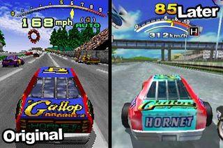
Sometimes a game's colour palette is all that needs to be changed for a game's style to be lost. The original's deep blues, omnipresent black and white track edges and massive landmarks were classic iconography. And then, after a disappointing Saturn conversion, we got Daytona USA: Championship Circuit Edition. And it started going wrong.
The blues were lightened. Greens and oranges started to creep in, all in pastel-shades. Increased smoothing on the edges of the 3D models meant that everything seemed less bold. Like the whole game had been washed till the colours faded and then given to someone who'd never seen the original to colour it back in. The Dreamcast conversion (pictured) played more like the original, sure, but even its colours were like Daytona CCE. Almost as though that was how they always were. But we know better.

Above: Is it too much to ask that we keep the original colour scheme? Where's the Sega blue Hornet gone?
Sign up to the 12DOVE Newsletter
Weekly digests, tales from the communities you love, and more
Justin was a GamesRadar staffer for 10 years but is now a freelancer, musician and videographer. He's big on retro, Sega and racing games (especially retro Sega racing games) and currently also writes for Play Magazine, Traxion.gg, PC Gamer and TopTenReviews, as well as running his own YouTube channel. Having learned to love all platforms equally after Sega left the hardware industry (sniff), his favourite games include Christmas NiGHTS into Dreams, Zelda BotW, Sea of Thieves, Sega Rally Championship and Treasure Island Dizzy.
Most Popular


