Grand Theft Radar: Art vs Game
We stack the series' iconic art against in-game characters to see how well it made the transition
This one's had us puzzled for about the last seven years, because crime-family patriarch Salvatore Leone neverlooked even vaguely like his promo art. For whatever reason, however, the art remains unchanged even during the game's loading screens, leading us to wonder what happened.
The illustrated Salvatore - which we can only assume was an earlier concept-art version - looked more severe and dignified, like a wily and refined authority figure who was not to be messed with. The in-game Sal, meanwhile, looks a little like Don Corleone of The Godfather, or possibly a gym teacher. That's not necessarily a bad thing, but the latter Don's rough-and-tumble appearance stands in sharp contrast with the more reserved way he was presumably envisioned.
Thankfully, by the time Liberty City Stories rolled around, Salvatore's artwork was updated in an appreciably badass fashion:
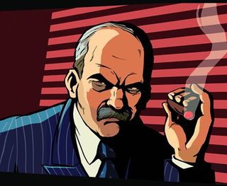
Above: Yeah, Salvatore's about to go all Powers Boothe on your punk ass, just you wait

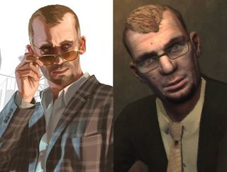
If GTA IV's Russian mobster Dimitri were to paint a picture of himself and post it on MySpace in an attempt to trick women into dating him, it would look exactly like the image at left. The "real" Dimitri is ugly as hell, with an unflattering half-goatee, thinner hairline and unsightly moles spattered across a haggard, ungainly face. The Dimitri at left, meanwhile - as seen in the game's ad campaign - looks cool and confident, equally at ease in a GQ photo spread or in the basement of a porn shop, screeching in his high-pitched wail while shooting some poor bastard in the knee.

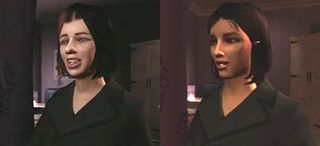
This isn't actually an art-to-game comparison, but we thought it'd be interesting to point out how much Niko's first girlfriend changed between the release of GTA IV's third trailer and the actual game. Her earlier face, on the left, was more realistic to the point of actually being asymmetrical, which unfortunately leads us into some hardcoreuncanny valleyshit. Still, though, if we stare at it for a moment, the face on the left kind of grows on us; she's less conventionally pretty, but she looks more like someone we'd actually meet in real life.
The face on the right, however, isn't going to make any infants shriek in terror and despair, so we understand why Rockstar made the switch.
Sign up to the 12DOVE Newsletter
Weekly digests, tales from the communities you love, and more

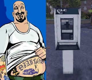
Hmmm. You know, we can't quite put our finger on it, but there's something amiss between these two images. If we really scrutinize them, we can see that the in-game El Burro has fewer tattoos and more hair than his illustrated counterpart, and...
You know what? To hell with it. El Burro's only appearance in GTA III was as a damn payphone. Zero out of 10 for misleading us with that awesome fat-bastard art.
May 16, 2008
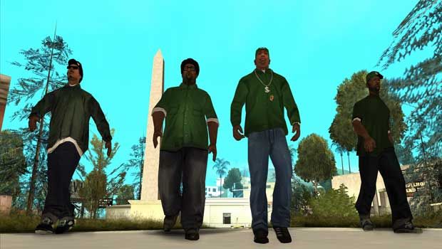


Former Xbox boss says GTA: San Andreas and its infamously NSFW Hot Coffee minigame "signified a maturing of the industry" and put games "on par with movies and music"

A GTA streamer is trying to beat every single 3D entry without dying, and in 33 hours he's made it as far as San Andreas but keeps getting caught in Vice City purgatory

