Get rid of mini-maps, and set your PS4 gaming worlds free
Let me level with you: I’m a bit dizzy. I have no sense of direction, and could get lost in a neon-lit, braille- encrusted, circular corridor. You’d think I’d be grateful for mini-maps, right? Wrong. I’m sick of the things. They’re either a bewildering muddle of markers (looking at you, Final Fantasy XIV) or bland, utilitarian tools that distract from my experience.
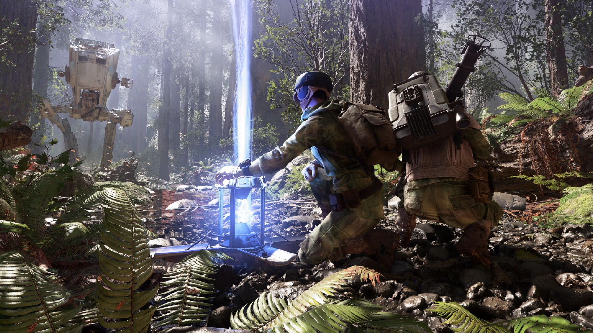
Star Wars Battlefront’s mini-map is as functional and sterile as a Cillit Banged Stormtrooper. It does its job admirably, but keeping a constant eye on those ominous, uninspired red sectors dilutes the magic of really feeling like you’re actually in Star Wars. Destiny, despite excellent map design, is the same (though Ghosts are a decent way of integrating accessing objectives into the world). And it’s not just shooters dragging us around by the hand.
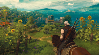
Nothing shatters the RPG illusion like following mini-map paths to objectives like a good little puppy, stepping over chances to organically discover things. Seeing a breathtaking landmark for the first time via a marker on that odious little circle? Devastating. Yes, you can often turn mini-maps off: a welcome option in exploration-rich games such as The Witcher 3, but it’s no real solution. Some direction in massive, interconnected worlds is essential.
Enter Saints Row: The Third (through the wall with an octopus cannon, probably). Dotted paths be damned: markers were integrated into the environment. The city felt recognisable; certain gang vehicles indicated different turf; arrows lit up the roads of Steelport as you drove. The open-world title let you take in and navigate the neon madness instead of keeping you surgically attached to the mini-map.

But there was still a mini-map, wasn’t there? And it’s too easy to fall back on the coquettish, miniature mission icons giving you that “Come hither” wink. If we want well-designed environments, to feel that addictive fizz of discovery in videogames, we’ve got to go cold turkey. No HUD. No mini-maps. Nothing.
Up for it? Then the rarest, frostiest bird you’ll find right now is Jonathan Blow’s maze-based mind-boggler, The Witness. It’s ironic – and utterly brilliant – that in a game about labyrinths, I’ve not felt lost once. It’s the lack of anything resembling a HUD that makes unpicking the island so absorbing. I know exactly where to go and what to do, if I just pay attention to my surroundings.
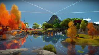
From the get-go, I learn that following the island’s many wires leads to panels to solve. Once I complete enough, lasers indicate a far-off goal, in both a geographical and gameplay-related sense. And when I’m wandering through the island looking for more, clearly colour-delineated regions help me navigate easily without shoving a floating “YOU ARE HERE” prompt in my face. I can focus.
Sign up to the 12DOVE Newsletter
Weekly digests, tales from the communities you love, and more
A mini-map would cause me to be hasty, linear and overlook secrets. That’s why I was bricking it about indie space exploration sim, No Man’s Sky: it was set to include a mini-map, but fortunately Hello Games’ studio replaced it with more subtle cues and markers laid over the environment. Having the navigation skills of a mentally deficient Roomba, I’ll still need those little prods in the right direction. But if future games don’t similarly recalibrate their approach to mini- maps, I’ll direct them to the bin.
This article originally appeared in Official PlayStation Magazine. For more great PlayStation coverage, you can subscribe here.
Jen Simpkins is the former Editor of Edge magazine, and is a multi-award-winning creative writer. In her most recent industry role, Jen lent her immense talents to Media Molecule, serving as editorial manager and helping to hype up the indie devs using Dreams as a platform to create magical new experiences.
Most Popular


