Gears of War: Ultimate Edition comparison screens go from grimy to gorgeous




I got a BA in journalism from Central Michigan University - though the best education I received there was from CM Life, its student-run newspaper. Long before that, I started pursuing my degree in video games by bugging my older brother to let me play Zelda on the Super Nintendo. I've previously been a news intern for GameSpot, a news writer for CVG, and now I'm a staff writer here at GamesRadar.
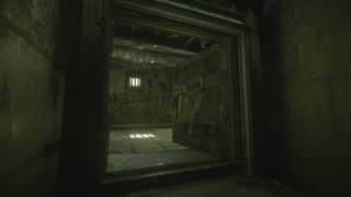
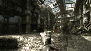
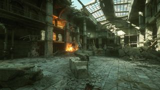
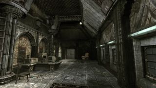
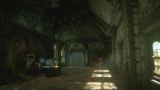
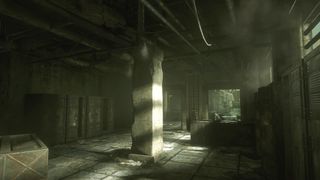
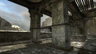
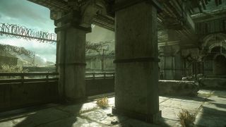
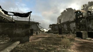
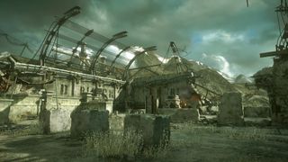
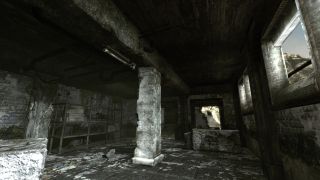
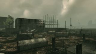
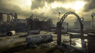
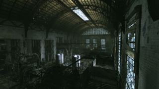
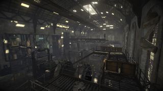
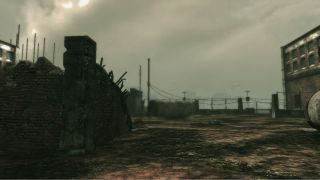
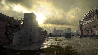
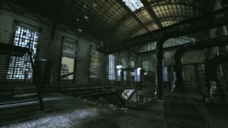
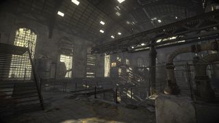
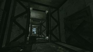
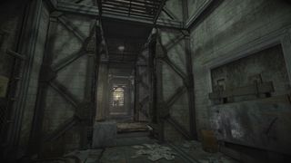
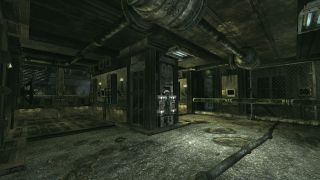
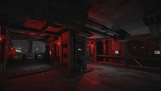
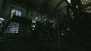
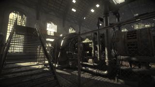
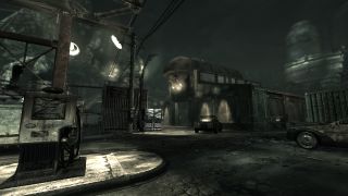
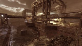
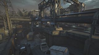
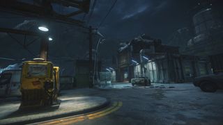
HD remakes always have nostalgia-polished memories of their source material to compete with, and Gears of War: Ultimate Edition is the latest to try to outshine our recollections. But if you've found yourself thinking "what's the big difference?" this gallery of side-by-side environmental comparisons should answer that question quite thoroughly.
If you look in the right places, you can definitely get some of that "destroyed beauty" art direction from the original Gears of War, but otherwise it's a bit heavy on the fog, mud, and rebar. Even if they're still the same basic areas, little touches like improved lighting and foliage help Gears of War: Ultimate Edition's environments feel more like parts of an ailing world than a discrete series of post-apocalyptic maps.
Aside from visual improvements, Gears of War: Ultimate Edition also makes some subtle gameplay changes to bring the game in line with later games, both in single player and multiplayer. You can even catch its new cinematic intro before it hits Xbox One on August 25.
Seen something newsworthy? Tell us!
