GamesRadar's box art battle
Raking a designer's eye over covers past and present in our first (and likely only) visual battle

Scientific studies have shown that 82% of all geek arguments derive from pitting two entities against each other in fictional battle.* Xbox vs PlayStation. Mac vs. PC. Mario vs. Sonic. Lara vs. Samus. GamesRadar is no exception as we’ve done battles for both our most hated and loved characters. Nothing fuels us more than arguing amongst ourselves over unanswerable, completely hypothetical situations, so it only makes sense that the next logical step would be to pit some of our favorite box art against each other in a truly geeky fashion. That is, in the design geek fashion.
That’s right, I don’t care about your warm and fuzzy feelings of nostalgia over certain games. I don’t care if a game’s cover betrayed its utter lack of decent gameplay. I don’t even care if your absolutely brilliant game with a mediocre cover didn’t make it onto this list. I played both Mass Effects and loved them immensely but I would never include either of their predictable covers on any best of list.
Fictional battle aside, guidelines were laid to, you know, add structure:
1. Everything is based on the cover alone. Games featured have never been played and, other than a fleeting glance at Wikipedia entries or what has been overheard, nothing is known about them.
2. Entries were compiled from top 5 lists submitted by editors in the US and UK, so you’ll see repeats from our GamesRadar’s favorite box art article.
3. After crying during a particularly brutal critique in design school, full disclosure requires that I state that this article may or may not be a direct response to that horrible, horrible ordeal.
*And by scientific study I mean stuff I keep hearing in the office at least once a week.
Sign up to the 12DOVE Newsletter
Weekly digests, tales from the communities you love, and more
ROUND 1
Secret of Mana vs Michael Jackson%26rsquo;s Moonwalker
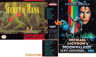
If there’s one thing designers love to hate it’s violators. Bubble bursts and blasts screaming “New!” or “Improved!” or the one-two contradictory punch of “New and Improved!” on everything from book covers to laundry detergent are the bane of any designer’s existence. Secret of Mana doesn’t give us just one violator, but a black text box with six of them. Might as well punch me in the face with a Comic Sans exclamation point and then bury me underneath a tombstone made of Styrofoam. Meanwhile, long live the King of Pop and motherfucking rainbows.
Winner: Michael Jackson’s Moonwalker
Jet Set Willy vs Gabriel Knight: The Beast Within
Dear Jet Set Willy,
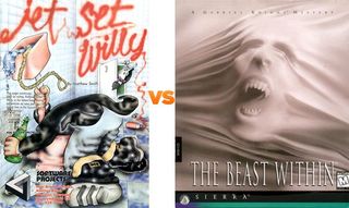
Why is there a glow around the foreground character’s coat tail? Why is the title set on one plane of perspective when the wall it’s supposed to be placed on is obviously on another? Why does the illustration look like it’s been regurgitated through a pre-schooler’s remedial art class? Who the hell set type over two of the busiest areas of the illustration? Why does the anatomy of the main character---asl;dkfa;sdlkfjas;dfklj...
Winner: Gabriel Knight: The Beast Within
Red Steel vs Out of this World

Oh, Out of this World, I really want to like you. I want to jump in your sweeping vista of an illustration and raise my arms like Rose on The Titanic with you. But, your typography! Your overly condensed face coupled with cramped letter spacing screams, “I’m tighter than a pair of jeans just out of the dryer during Thanksgiving!”
Winner: Red Steel
Shadow of the Beast vs Left 4 Dead 2
Squint your eyes and look at that Shadow of the Beast cover. Go ahead, I’ll wait.
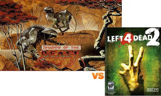
Did you notice that the type for Beast practically disappears? Now, custom type is almost always appreciated (unless it looks like utter shit) and Shadow of the Beast’s appropriately conveys the sort of Death Metal-meets-Labyrinth feeling you would expect from a game with its title. However, setting your type in the same color palette as the majority of your cover means you can’t read the thing unless you’re uncomfortably close. And, really, testing fate by getting too close to the Shadow of the Beast isn’t recommended.
Winner: Left 4 Dead 2
Red Dead Revolver vs Awesome
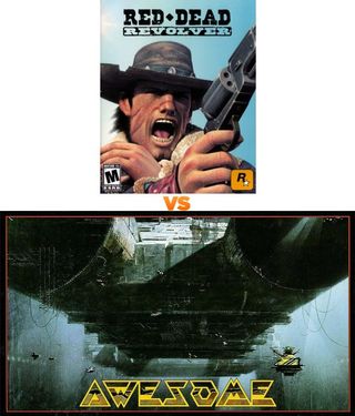
Lone character staring off into the distance shooting at an unnamed target off-camera while screaming obscenities? Do I have to reference our8 Most Hated Box Art Clichésor can you all figure this one out yourselves?
Winner: Awesome
EveryExtendExtra vs Elder Scrolls IV: Oblivion
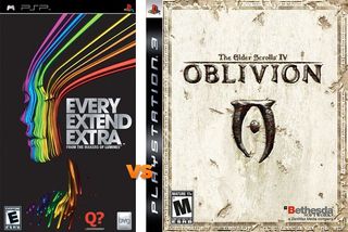
Oblivion? BORING. Next!
Winner: EveryExtendExtra
Ico vs. Grand Theft Auto: Vice City
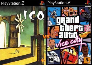
Ico. Windmill thing. Couple running. Ico. Windmill thing. Couple running. Wash, rinse, repeat. See what’s happening there? My eyes go from each of those three elements, never stopping to ponder any due to their simple natures and bouncing around the cover like an off-kilter tennis match. Give me a solid focal point, and maybe something to pop that drab color palette, or give me death!
Winner: Grand Theft Auto: Vice City
Yars%26rsquo; Revenge vs. SpongeBob%26rsquo;s Truth or Square
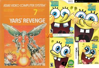
I rather like SpongeBob Squarepants. I think he’s funny guy and rather likable sea creature. And, although this collection of covers for his game draws you into to his arguably funny face in several ways, there’s nothing there to keep me interested. Where’s the mystery, SpongeBob? Where’s the intrigue? Kid’s menu at the local diner inspired colors and your gaping maw may imply that there’s fun and excitement to be had within the confines of your case, but to me it just lets out an underwater bubble-bursting yawn.
Winner: Yars’ Revenge
That’s right, I don’t care about your warm and fuzzy feelings of nostalgia over certain games. I don’t care if a game’s cover betrayed its utter lack of decent gameplay. I don’t even care if your absolutely brilliant game with a mediocre cover didn’t make it onto this list. I played both Mass Effects and loved them immensely but I would never include either of their predictable covers on any best of list.
Fictional battle aside, guidelines were laid to, you know, add structure:
1. Everything is based on the cover alone. Games featured have never been played and, other than a fleeting glance at Wikipedia entries or what has been overheard, nothing is known about them.
2. Entries were compiled from top 5 lists submitted by editors in the US and UK, so you’ll see repeats from our GamesRadar’s favorite box art article.
3. After crying during a particularly brutal critique in design school, full disclosure requires that I state that this article may or may not be a direct response to that horrible, horrible ordeal.
*And by scientific study I mean stuff I keep hearing in the office at least once a week.
ROUND 1
Secret of Mana vs Michael Jackson%26rsquo;s Moonwalker

If there’s one thing designers love to hate it’s violators. Bubble bursts and blasts screaming “New!” or “Improved!” or the one-two contradictory punch of “New and Improved!” on everything from book covers to laundry detergent are the bane of any designer’s existence. Secret of Mana doesn’t give us just one violator, but a black text box with six of them. Might as well punch me in the face with a Comic Sans exclamation point and then bury me underneath a tombstone made of Styrofoam. Meanwhile, long live the King of Pop and motherfucking rainbows.
Winner: Michael Jackson’s Moonwalker
Jet Set Willy vs Gabriel Knight: The Beast Within

Dear Jet Set Willy,
Why is there a glow around the foreground character’s coat tail? Why is the title set on one plane of perspective when the wall it’s supposed to be placed on is obviously on another? Why does the illustration look like it’s been regurgitated through a pre-schooler’s remedial art class? Who the hell set type over two of the busiest areas of the illustration? Why does the anatomy of the main character---asl;dkfa;sdlkfjas;dfklj...
Winner: Gabriel Knight: The Beast Within
Red Steel vs Out of this World

Oh, Out of this World, I really want to like you. I want to jump in your sweeping vista of an illustration and raise my arms like Rose on The Titanic with you. But, your typography! Your overly condensed face coupled with cramped letter spacing screams, “I’m tighter than a pair of jeans just out of the dryer during Thanksgiving!”
Winner: Red Steel
Shadow of the Beast vs Left 4 Dead 2

Squint your eyes and look at that Shadow of the Beast cover. Go ahead, I’ll wait.
Did you notice that the type for Beast practically disappears? Now, custom type is almost always appreciated (unless it looks like utter shit) and Shadow of the Beast’s appropriately conveys the sort of Death Metal-meets-Labyrinth feeling you would expect from a game with its title. However, setting your type in the same color palette as the majority of your cover means you can’t read the thing unless you’re uncomfortably close. And, really, testing fate by getting too close to the Shadow of the Beast isn’t recommended.
Winner: Left 4 Dead 2
Red Dead Revolver vs Awesome

Lone character staring off into the distance shooting at an unnamed target off-camera while screaming obscenities? Do I have to reference our8 Most Hated Box Art Clichésor can you all figure this one out yourselves?
Winner: Awesome
EveryExtendExtra vs Elder Scrolls IV: Oblivion

Oblivion? BORING. Next!
Winner: EveryExtendExtra
Ico vs. Grand Theft Auto: Vice City

Ico. Windmill thing. Couple running. Ico. Windmill thing. Couple running. Wash, rinse, repeat. See what’s happening there? My eyes go from each of those three elements, never stopping to ponder any due to their simple natures and bouncing around the cover like an off-kilter tennis match. Give me a solid focal point, and maybe something to pop that drab color palette, or give me death!
Winner: Grand Theft Auto: Vice City
Yars%26rsquo; Revenge vs. SpongeBob%26rsquo;s Truth or Square

I rather like SpongeBob Squarepants. I think he’s funny guy and rather likable sea creature. And, although this collection of covers for his game draws you into to his arguably funny face in several ways, there’s nothing there to keep me interested. Where’s the mystery, SpongeBob? Where’s the intrigue? Kid’s menu at the local diner inspired colors and your gaping maw may imply that there’s fun and excitement to be had within the confines of your case, but to me it just lets out an underwater bubble-bursting yawn.
Winner: Yars’ Revenge
