
Marvel Rivals is a fun game, but there's a problem. It's a problem you can't even see – which in itself is sort of the problem. For all the (pretty understandable) comments levied at the game for its impersonation of Overwatch, this is one thing Overwatch inarguably did better: body shapes and character silhouettes.
It might not seem important at first glance, but those physiques are one of the most essential factors in any hero shooter, and Marvel Rivals' discipline in this area isn't just slipshod: it's getting worse with every update.
Clear and present danger

It's time to stop calling Marvel Rivals an Overwatch 2 killer now that its features have already surpassed it
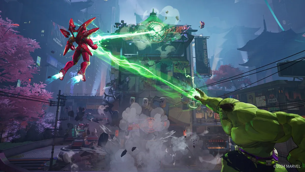
Like many multiplayer shooters and certainly most hero shooters, the battlefield of Marvel Rivals tends to be busy. Lunar boomerangs ricochet off tacky New Age jewellery while skull-pattern murderers sling pink smoke bombs, neon webbing spills over the arena, and we've barely started. Arrows are in flight, hulks are hulking out, and a burgundy soccer mom is floating above all of this and threatening to blow herself up if her demands are not met. In normal circumstances this situation should be mentally overwhelming, but it doesn't have to be. Not when characters have clear silhouettes.
This is a trick almost as old as multiplayer itself. Even more important than the colors a character wears, their outline is what your brain notices first, and comprehension immediately follows. Without that attempt to meet you halfway the game risks getting immediately frustrating, as you can't process what you're looking at fast enough to make an informed choice about how to murder it.
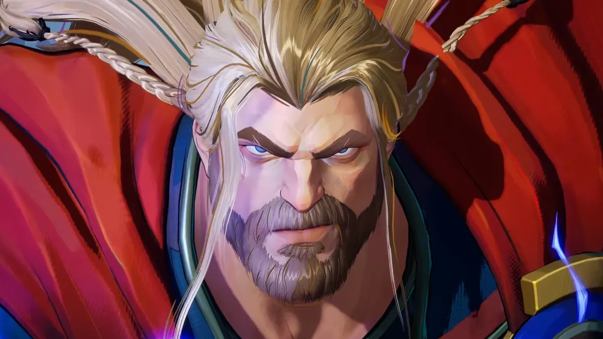
In some respects Marvel Rivals is good at the silhouette game. For example, Hulk, Venom and Thor are all large tanks, but still have very distinct shapes. Hulk has a small head, making him pointy at the top. Venom is hunched with little legs, making him into an upside-down triangle. Thor is basically a rectangle, with a fluttering cape to further draw the eye. All great, no notes.
But as you get further into the roster of Marvel Rivals characters, things start to get tricky. Winter Soldier and Punisher are both middling-sized men in dark clothes holding guns in front of them, and now it's getting harder to tell at a distance. Likewise, Wolverine and Black Panther have similar movements and builds that make their rough shapes indistinct, not helped by both of them moving in fast pounces that make them difficult to track with the eye. Still, Logan's ugly jacket being coloured like a tropical fish does help mark them apart.
But clarity takes a hit again once you reach the bulk of the women in Marvel Rivals. After all, the men come in all shapes and sizes, from the lithe and acrobatic Spider-Man to the regal bearing of Magneto. But if you told me that Scarlet Witch, Black Widow, Mantis, Magik, Psylocke and Luna Snow were all built off the same wireframe model, I'd absolutely believe you. And Dagger and the new Marvel Rivals Invisible Woman are the real offenders: both hourglass figures in white jumpsuits with long, blonde hair, slinging small, glassy projectiles that heal allies and hurt foes. Most would struggle to separate them in a police line-up, let alone in the frenetic chaos of a dozen demigods trying to kill each other.
The shape of Things to come

It's hard to argue that this isn't a failing of the visual design. These characters aren't meant to be blurring together through some camouflage mechanic, this isn't supposed to be part of the meta. It's just unclear visual language.
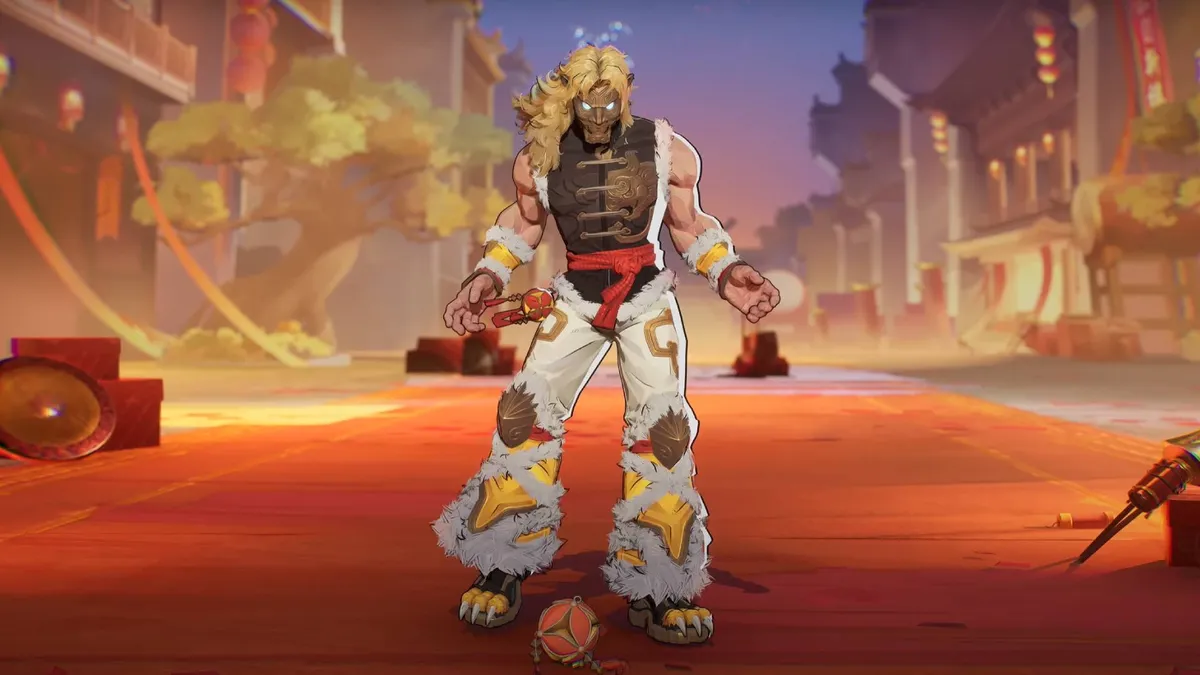
Oh, and it gets worse when you factor in all those paid skins. Remember how Wolverine's varsity jacket helped separate him from the rest of the cast? Well, there's also several paid alternatives that give him all sorts of hues, and now I can't trust anything. Meanwhile, Star-Lord's "Lion's Mane" outfit looks so different to his regular clothes that it makes it hard to tell if it's even Peter Quill underneath that glam rock wig, ruining both the color theming and the silhouette in a single strike. Oh, and both Iron Fist and Black Widow now have similar costumes that muddle the issue further, so now I can't tell the flying space rogue, martial arts master and sniper apart. If anybody out there had actually played Black Widow, it would be a catastrophe.
Overwatch wasn't completely perfect in this regard, but in its heyday it was pretty solid at keeping its cast visually distinct, even with the wildcard factor that is paid cosmetics. Cartoonish visuals always help here. Team Fortress 2 was even more skilled at this (especially in the pre-Hat era), which is doubly impressive considering that the reds and blues had to be… well, red and blue, a limitation that Valve's artists effortlessly worked around.
I'm not really sure how Marvel Rivals fixes this problem retroactively without a lot of refunds, but they can at least keep it in mind going forward. Embracing more body types, especially for the women in the cast, won't just be good for representation (though it would also be that), it's good for optical clarity. Staying creative with costumes and armor will also help, like with Magneto's unique hood ornament, and making sure that future skins don't blur their silhouettes will do a world of good. Use whatever colors you want, NetEase – but for fun's sake, please color within the lines.
Follow up your time in Marvel Rivals with more of the best superhero games


