Exploring the resurgence of the low-fi 3D visual style of the PS1 era
Chatting with the developers bringing back the early 3D-style of the original PlayStation to try and unlock its untapped potential
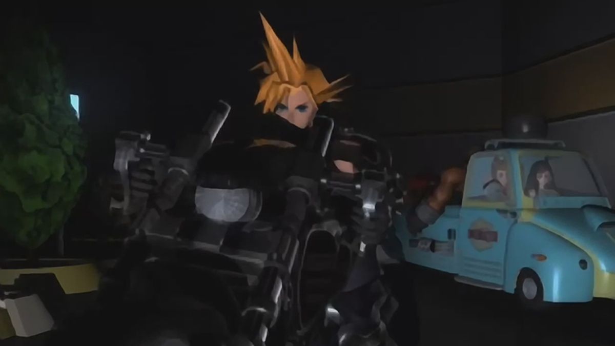
The idea of new games emulating the style of titles from bygone eras is far from rare in the modern gaming landscape. Pixel-art platformers from Fez to Shovel Knight, SNES-inspired Metroidvanias like Axiom Verge and Owlboy, and many more besides, have established the indie-driven revival of the 16-bit era as a mainstream aesthetic that sits happily alongside the 3D photorealism that tends to be favoured by the big studios. We know it is possible for styles associated with the past to make a triumphant return. Why is it, then, that the iconic polygonal style associated with the original PlayStation hasn't yet enjoyed a similar moment?
The revival of the low-fi 3D aesthetic associated with that console has been far more low-key. Rather than gracing Game of the Year lists and winning high-profile awards as 16-bit-inspired titles frequently have, you tend to find games with PlayStation-style aesthetics circulating as small experimental projects on indie distribution platform itch.io, only the odd title poking its head above the parapet to gain some kind of wider recognition.
We spoke to some of the creators behind these games about their reasons for returning to PlayStation visuals, the potential power of the aesthetic and the reasons why it has yet to be fully embraced by the mainstream.
Nostalgia and lo-fi

For more in-depth features exploring classic games and consoles delivered right to your door or device, subscribe to Retro Gamer today in print or digital.
When it comes to timing, the nostalgia that helped fuel the 2D 16-bit revival should be right for the PlayStation – just as developers that grew up on the SNES and Mega Drive went on to make games inspired by those systems, the generation who witnessed the mind-blowing shift to 3D that the PlayStation pioneered are old enough to be making their own games. "PlayStation-era is what Melos and I grew up playing," says Marina Kittaka, referring to her Anodyne 2 co-developer Melos Han-Tani. "So there is an element of not only nostalgia, but a fundamental 'speaking the language' of what are now considered lo-fi 3D games. Our generation growing up also coincides with more and more 3D tools that are approachable to small developers," Kittaka concludes.
Toni Kortelhatim, better known as his YouTube moniker, 98Demake, also started his journey into the world of PlayStation-style graphics through nostalgia on his YouTube channel, creating versions of modern games like GTA V and The Last Of Us as if they had been made in 1998. Kortelhatim decided to run with this style to create his surreal horror title OK/NORMAL, going so far as to stick to the limitations of the original PlayStation to keep the game authentic. "The whole point going in was to create a sort of a 'lost media' game," Kortelhatim explains. "I felt the PlayStation look just made sense, since there were a massive amount of really obscure games released for the original PlayStation," he says, citing the likes of LSD: Dream Emulator, Kurushi and Kula World as inspirations. OK/NORMAL's deliberate use of warped textures, jagged edges and CRT blurriness to invoke an uncomfortable sense of the surreal showcases one of the major strengths of the PlayStation's visual style.
Go back to the games of that era and there is often something unintentionally haunting about those early 3D worlds. Their flat surfaces and rudimentary textures, fading into the darkness or murk of low draw distance, feel uncomfortably sparse. The contrast that the modern wonders of 3D gaming now offer only enhance this sense of uncanny, which perhaps gives us a clue as to why games that use this visual style haven't yet broken into the mainstream in the same way that pixel-art games have. There is something alienating about them. They make people uncomfortable.
The latent horror of PlayStation
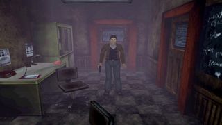
Indeed, it is perhaps telling that the horror genre is unusually prevalent among the modern titles that are returning to the PlayStation aesthetic. Alongside Kortelhatim's OK/NORMAL, there is Haunted PS1 Demo Disc 2020, a collection of indie horror games presented in the form of a fake PlayStation demo, set to get a sequel in 2021. There is also the Silent Hill-inspired Concluse (due a sequel in 2021 as well) and the haunting Paratopic, arguably one of the better-known 3D retro titles.
Sign up to the 12DOVE Newsletter
Weekly digests, tales from the communities you love, and more
"I think there's something inherently scary about the PlayStation look," says Kortelhatim on the aesthetics applicability to horror. "Everything's pixelated. Everything's sort of wobbling due to the low precision vertex snapping. The textures are warped due to affine texture mapping. Usually the draw distance is very short – everything in distance is either covered in a fog, or darkness. Combine those things, and it makes for some real nightmare fuel. You see a monster or whatever emerging from the distant fog. Due to the distance, the monster is just a blob of red and skin-coloured pixels. Your mind starts racing 'what the hell is that thing?'. Even when it's closer, your mind needs to fill in the missing gaps, and whatever you create in your mind in those moments is scarier than anything a developer could create to scare you."
I think there's something inherently scary about the PlayStation look.
Toni Kortelhatim, demaker
Jessica Harvey, one of the trio that created Paratopic, tells us that the atmospheric potential of PlayStation-like 3D visuals was also something that drew her to the style, though references what was actually a DOS game as one of the key influences. "Bethesda's FPS, Terminator: Future Shock, was perhaps the only direct influence, if only because the limitations of the tech so strongly fed back into the game and manifested a visceral sense of atmosphere and mood," Harvey tells us. "Janky, jagged bombed-out buildings, a night that by merit of a tiny draw distance consumed everything around and left you stood in a pitch black void, the composition of a limited texture palette. This showed me what could be done, beyond simply mining for nostalgia."
As to the question of why horror is such a prevalent part of the underground PlayStation revival, Harvey suggests we need to look beyond the realm of video games. "Why do horror films often use a grainy lens, or, going more art-house, straight up black and white? Why are haunted VHS tapes and TV signals such powerful tropes? All of these are deeply imperfect renditions of technology. They provide us with a lack of clarity, they draw out both the material and metaphysical shadows, they are possessed by an instability that has us question whether the realities they contain are collapsed in on themselves.
The analogue, the corroded technology... it all has these signal failings, these glitches that open up cracks into a void beyond the reality they transmit. You can try to simply replicate that in video games – use a grainy post-processing or whatever – but how do you truly embody it? The Nineties was this," Harvey continues. "Embryonic visual techniques, jankiness from under-explored design and implementation solutions, the twitching of the lens of imprecise 3D. The PlayStation era is our grainy black and white film stock, albeit somewhat more beautiful."
The untapped potential
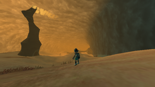
While Jessica elegantly captures how and why replicating early 3D jank, low-fi visuals and the occasional inelegance of the nascent form is so powerful when it comes to the terrain of horror, she is also quick to highlight that this isn't the only way PlayStation-style visuals can be used, offering Anodyne 2: Return To Dust as an example. That game, a fascinating blend of genre, tone, and style, also draws explicitly from the late Nineties era of 3D, but presents us with something far less oppressive than the other titles we've discussed so far.
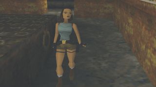
"Panzer Dragoon Saga is one that I kept referencing for Anodyne 2," says Kittaka on Anodyne 2's inspirations. "I had a YouTube longplay of that game open in a tab for months. I also enjoyed watching chunks of The Playstation Project by Virtual Gaming Library on YouTube. It has five-second clips from every NTSC-U Playstation game [and I] couldn't help but feel visually inspired by literally every game. There was a really exciting and beautiful energy to that transitional period as 3D was finding its legs."
Han-Tani argues that precisely because it was a transitional period, there's plenty of unexplored potential left in the aesthetic. "The late Nineties to mid-Noughties have an interesting mix of hardware limitations and artists trying out new things in 3D before conventions took hold. It's an experimental period with tons of variation, and in the AAA game industry's rush towards photorealism, they left behind many loose ends and unexplored pathways to interesting 3D styles, mainly viewing that era as 'ugly' and 'transitional'," he argues. "Most people generally overlook the era and aren't interested in analysing what it has to offer spatially and thematically. The Nineties had a developed style of what was 'good' visually in 2D, and a lot of indies now use that as a benchmark and reference point, while 3D ended up getting refined into photorealism or expensive workflows."
Han-Tani suggests that there are some other factors that may account for the relative lack of games exploring Nineties-style 3D visuals. "Skill-wise, it takes work to think about what you want to expand upon and what you want to leave behind because there's so many interesting old 3D games. Why bother doing that if you can use photorealism or flat colours and call it a day? Regarding game design, 3D (with free camera rotation) is tricky to design for because of having to keep track of what the player can see as well as keeping in mind art restrictions and the game mechanics. You need to have at least a passing interest in architecture or landscapes to design effectively in 3D because of all the navigating a player will do, too. So there's more to figure out as you go [when] designing a 3D game."
Play without limits
The other key factor, he argues, is a financial one. "There hasn't been a 'killer' game that's used the PlayStation art style effectively in 3D, so there's no gold rush. It's proven that 2D nostalgia sells, which is why we get Metroidvania after Metroidvania, but it's yet to be seen if that's true for Nineties and Noughties 3D." Kortelhatim doubts that we will ever see this 'killer' game.
"Pixel art is kind of timeless," he says. "Every pixel-art game, especially from the 16-bit era, is still very much untouched by times as far as the graphics go. It's much easier for the eyes, so it's easier to push to the mainstream. Not everyone 'gets' the PlayStation look, nor has fond memories of it. It can be rudimentary and awkward, hence I don't think it'll ever reach the kind of popularity that pixel art has."
Regardless of whether time will prove Kortelhatim right or wrong, mainstream success should not be the arbiter of whether art has value. The games being produced in the niche but growing trend of retro 3D prove that there is something worthwhile to be drawn from the aesthetic and the developers we spoke to all saw plenty of potential open to be explored. "I think it's a great style, since it's really versatile with endless opportunities," Kortelhatim says. "It's fairly easy to create something aesthetically pleasing, even for beginners. As a solo developer, I don't have the resources to create extended worlds in a photorealistic manner. With the PlayStation style, you can go nuts."
Where do we go with that? This is my main interest in the aesthetic. Multitudes of creative space to explore both emotively and with respect to sociopolitical commentary.
Jessica Harvey, Paratropic creator
Harvey too acknowledges that there are practical implications for small developers using low-fidelity visuals, but argues that there are artistic reasons to explore the style too, referencing its "impressionistic" qualities. "We have potential for the most gorgeous broad brush strokes. The literal qualities of high-end visuals shut us off from a lot of what we can do with chunky polys and gutter resolutions. Those hints and suggestions and wisps of form."
Even within the genre of horror, Harvey suggests there's more to be done. "We have latent hauntology to play with," she says. "That the era's tech and design was so embryonic, that we were in a transnational stage before things coalesced, we find ourselves in a realm filled with potentials – things that could have been. The domain of then unanswered questions and undiscovered solutions, of alternatives that never came to pass. To be haunted by these lost futures is something that, as far as the medium goes, only the dawn of 3D era can offer with such dynamism and mass relatability. Where do we go with that? This is my main interest in the aesthetic. Multitudes of creative space to explore both emotively and with respect to sociopolitical commentary."
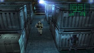
Harvey also disagrees that the harshness of the characteristically angular style precludes it from ever making a breakthrough to a larger audience. "I don't believe that this impacts the abstract 'appeal' of the aesthetic," she says. "That the mid-Nineties era was a collective memory to us makes it immanently relatable. It's up to us as creatives whether we choose to subvert or complement that relatability. Next to this, as an intersecting line, we do have the more family-friendly connotations of the N64 and its visuals' distinctive traits to toy with."
There's something that feels fitting about the relative obscurity of the underground revival of PlayStation aesthetics. These games' tendency for strangeness and experimentalism feels perfectly congruent with many of the obscure curios that actually came out on the system in the Nineties. Their ability to tease out powerful responses from the quirkiness of its distinct polygonal style, to enhance the sense of innate mystery and unease that often accompanies it, is something that feels at home hiding from the attention of widespread recognition, perhaps all the more powerful because of an outsider status that makes it feel raw, unsterilised and aggressive.
If it is to stay that way, so be it. We're perfectly happy to celebrate what creators are already doing by returning to this forgotten vision of 3D. But let's not place any limits on where it might go. It's a trend that's slowly becoming more visible. PlayStation-style visuals may yet be back to a degree we never anticipated.
This article was originally published in issue 117 of Retro Gamer magazine.
Paul Walker-Emig was once a video games journalist, before he moved into PR. During his freelance career, Paul wrote for GamesRadar, The Guardian, Retro Gamer, Wireframe, Kotaku, VICE, VG247, OXM, and more. He runs the Utopian Horizons podcast, which covers a different utopia, dystopia, utopian thinker, or movement each episode. He also runs the podcast getObject, which is a video game website and podcast based around collectible items.

"30 years of history reside in our tape backups": PlayStation's building a game preservation mineshaft vault with 200 million files going back to a 1994 build of PS1 JRPG Arc the Lad

The other big Soulslike out this week has some Bloodborne and Dark Souls 3 in its combat, dev says, but "we would rather call AI Limit an action RPG"
