It's On Like... Him: How Donkey Kong's design has evolved over three decades
A kong-fluence of Donkey designs
Though Mario and Zelda have long since supplanted him in terms of sheer popularity, Nintendo would be nowhere without the early success of Donkey Kong and his titular arcade debut. The game turned heads (and raked in quarters) all around the world with its novel concept and aggressive cartooniness. The massive success made the stubborn ape a constant in Nintendos pantheon of franchises from then on.
The past three decades saw coin-op peers like Q*bert and Mappy fade from relevance, but Donkey Kong persists in the recent Donkey Kong: Tropical Freeze and upcoming appearances in Mario Kart 8 and Super Smash Bros. in 2014. A lot can change in 30 years, though, and for Donkey Kong, the passing of time has seen a surprising number of variations on the timeless notion of "big, fat, hairy ape." The persistent simians journey began back in 1981...
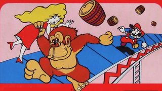
Donkey Kong (1981)
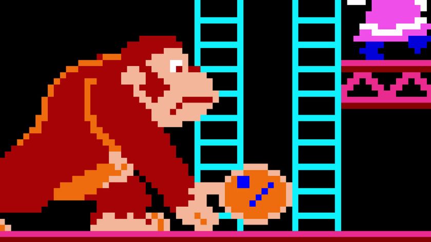
Like a lot of cabinet art from the era, Donkey Kong's promised the chance to play with colorful characters for a paltry 25 cents--but compared to the primitive graphics of the day, this wasn't another case of false advertising. The trio of characters within the game actually bore a striking resemblance to the figures pictured on the side, even if Donkey Kong looks a lot more affable here than he does with that pixellated grimace plastered to his face.
DK seems a bit more rooted in reality, and after seeing him wearing a tie for so long, its weird to see him without it. His nudity is much more noticeable now. By comparison, Mario looks a bit more cautious and less confident in his "Jumpman" days--though in his pre-Super form he could die by falling just a few feet, so it's understandable.
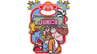
Donkey Kong Jr. (1982)
With Donkey Kong's sequel, Nintendo shook things up by giving the hero role to DK's previously unknown son, casting Mario as the villain. And with this change came a striking transformation to Nintendo's cabinet art; while the original game provided a pretty straightforward depiction of the actual action, Donkey Kong Jr. went for a much more stylized approach with thick lines, strangely appealing color choices, and facial expressions ripped right from the pages of Japanese manga.
Perhaps the vibrant look was meant to further appeal to kids that were already pulled in by the more childlike protagonist. The bright colors explained the plot of freeing your papa, then unleashing bitter ape retribution on his captor, but there was a little more to it than that. Framing the art with a smiling ape border softens DKs once villainous demeanor, making Nintendos newfound mascot more likeable in the process.
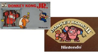
Game & Watch Donkey Jr./Donkey Kong II (1982/1983)
From the start, Nintendo wasn't shy about cashing in on their arcade sensation. Here we have not one, but two Game & Watch variants of Donkey Kong Jr., both of which feature the same cutesy art as the original DK follow-up. Donkey Kong would later go on to be muscled out of the Donkey Kong Country trilogy, so it's interesting to see just how little of an active role he played in the many versions of the original's sequel.
Game & Watch Donkey Kong Jr. also offers one of the most dickish portrayals of Mario to date, while Donkey Kong II evokes imagery of King Kong's failed American tour, including the broken chains. Pretty brazen, especially considering Universal's lawsuit concerning DK's similarities to King Kong wouldn't be decided in Nintendo's favor until 1984.
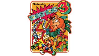
Donkey Kong 3 (1983)
The bizarre black sheep of the original Donkey Kong trilogy, Donkey Kong 3 sees DK return to the role of the bad guy, only now hes given up on finding interspecies love and is illegally squat in a greenhouse. Donkey Kong still menaces players from the top of the screen, but the means of defeating him have changed drastically. Stanley the Bugman (looking very much like a younger, clean-shaven Mario with a dye job) is tasked with blasting DK in the butt with clouds of pesticide.
DKs demeanor is likely the most evil in his long history, harboring deadly insects and changing up his hairstyle a bit. The gameplay was a strange, Galaga-style shooter that would eventually be remembered as one of Nintendo's oddest one-offs, and DK would thankfully drop his spiky-headed punk look for future games.
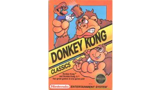
Donkey Kong Classics (1988)
Donkey Kong Classics cover delivered some distinctly non-Japanese versions of the Donkey Kong crew, who end up looking a lot like their ill-conceived cartoon versions (even if Mario's cartoon wouldn't come to TV sets for another year). More importantly, though, the artist behind this box art doesn't seem to understand the intent of either game.
Any Donkey Kong veteran can tell you Mario can't actually use the hammer to smash DK's brains in--even getting that close is courting death. And why Donkey Kong Jr. would be delighted by this act is even more questionable. Honestly, that pained, sorrowful look on DK's face makes it hard to imagine Mario as anything but the villain of both games. Was Nintendo trying to tell us something?
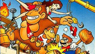
Donkey Kong (1994)
1994 was a huge year for Donkey Kong, though the Game Boy reboot and its confident title could never stand a chance against the Super Nintendo's similar attempts to make DK relevant for the go-go '90s. Even so, Donkey Kong GB was first to the scene, and this portable game finally gave DK a piece of apparel to cover up his shameful animal nakedness: the now-standard monogrammed red tie.
While Mario once again takes the role of the hero, this cover art pushes him to the background. Mario looks like a blustery, violent jerk next to Donkey Kong's genial goofiness and semi-responsible fatherhood. Its meant to be a reference to the arcade originals art, but DK comes off a lot better this time (even if hes still a kidnapper).
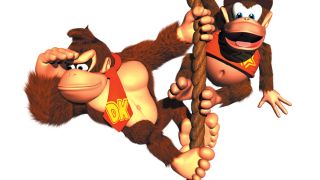
Donkey Kong Country (1994)
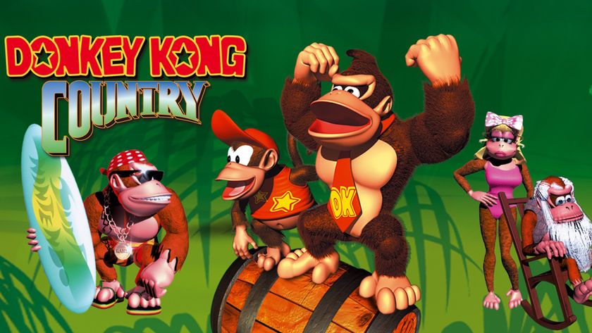
In the face of escalating console technology, Nintendo stuck to its 16-bit guns and, with the help of UK developer Rare, reinvented Donkey Kong for the MTV generation. Donkey Kong Country has a visual flair that says, "Hey! We made this game with computers!" The flashy look meshed well with the tie-centric redesign of DKs Game Boy title from earlier in the year.
Given the CGI rendering standards of 1994, Donkey Kong could honestly look a lot worse, but even with this design being tied to certain technical constraints, it's the one Nintendo's basically stuck with ever since. Its no doubt thanks to the tremendous success of Donkey Kong Country and its many sequel, though 2 and 3 greatly diminish his role, making him the kidnapping victim for a change. Still, as time goes by, it's becoming increasingly bizarre to see this product of mid-90s technology dropped into games with real-time visuals that handily outclass Rare's pre-rendered relics.
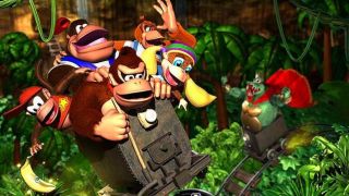
Donkey Kong 64 (1999)
Donkey Kongs new look went pretty much unchanged when he began appearing more and more in the many Mario spin-offs. Meanwhile, Rare took a brief break from the family of apes to make some other titles for Nintendos next-gen machine, the N64. Rare returned to the jungle with Donkey Kong 64, a divisive game that made some alterations to DK that arent obvious in the cover art.
Kong still looks pretty goofy, though he looks much better when compared to his new pals Lanky and Tiny. DK64 also marked the first time Kong ever needed a gun, as he added the Coconut Shooter to his arsenal of barrels. But the biggest addition to Kongs style was likely the unforgettably bad DK Rap from the start of the game. If you know the words, you can join in too.
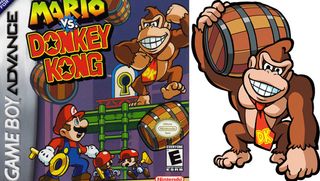
Mario vs. Donkey Kong (2004)
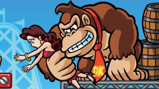
Nintendo waited a whole decade to follow up on the 1994 Donkey Kong reboot, and the cover art of Mario vs. Donkey Kong features one of DKs most conceptually strange designs to date. Here, Donkey Kong is a 2D approximation of a 3D render of a 2D character. And if you couldn't follow that, it means that this hand-drawn DK keeps the menacing, sunken eyes and beak-like muzzle of his 1994 Rare redesign.
To make things even more confusing, the art within Mario vs. Donkey Kong consists of pre-rendered 2D sprites, so it's strange that Nintendo would even go with box art like this to begin with. And the look was maintained across several sequels and downloadable side games. This odd bit of design shuffling is fitting for a game developed in America based on Japans interpretation of a British reboot to the original Donkey Kong.
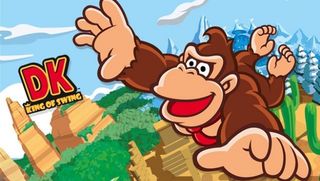
DK: King of Swing (2005)
Over the years, Nintendo has barely budged from Rares mid-90s redesign that defined Donkey Kong for a new generation, but the little-known DK: King of Swing was somehow granted a little more leeway than other post-2000 ape adventures. This Game Boy Advance oddity tried to marry DK's pre-rendered look with that of the old arcade art, and succeeded for the most part. And while this trend wouldn't last, Nintendo was confident enough in their longtime character to brand this game's title with the initials "DK" rather than spelling it out for prospective buyers. The game was developed by Paon, one of Nintendos lesser known Japanese dev partners, which may explain the change in look. Paon made several more Donkey Kong titles, starting with a King of Swing sequel, Jungle Climbers. However, those later games stuck very close to Countrys established look, which may indicate that Nintendo viewing the King of Swing look as a mistake.
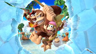
Donkey Kong Country: Tropical Freeze (2014)
Donkey Kong Country returned in Donkey Kong Country Returns, a game that very closely adhered to the style Rare solidified in 1994. That design choice continues with the Wii U follow-up, Tropical Freeze. DK's first official HD game drops the gorilla into a very Dreamworks-y world that remains linked to Rare's handiwork--even if that developer hasn't been affiliated with the series since the dark days of Donkey Kong 64.
Still, the current developers at Retro Studios do what they can when saddled with Donkey Kong's somewhat dated redesign. He may keep some of the attributes implemented to keep him expressive under the constraints of decades-old pre-rendered CGU, but DK still manages to look a lot warmer and fuzzier than he did in his former lifeless, plastic incarnations. Even though 20 years have passed since the SNES original, Donkey Kong doesnt show any sign of abandoning the design that made just as big of a splash as his arcade debut.
Watch out for rolling barrels
That brings all of you today, when DKs look is pretty much set. What do you think of it being the design for the last two decades? Do you miss his old arcade look? Let us know in the comments!
And if you're looking for more, check out the history of Donkey Kong and the top 7 most disturbing things about the Mushroom Kingdom.
Most Popular


