In defence of grey and brown in video games
You don't always NEED colour. Honestly
The observation doesn’t just apply to Gears of War. While the modern military shooter is often maligned as the most black-and-white-TV friendly genre of all, let’s not forget that Call of Duty 4—the game that certainly inspired this-gen’s biggest trend—used a desaturated palette for a reason.
CoD4 is a very different game to its descendents. A brutal, uncompromising, morally ambiguous tale of the unglamorous horror of military action, it’s a very deliberate attempt to highlight the matter-of-fact grimness suffered and inflicted by both sides. It’s a game that kicks off with your ‘heroes’ murdering a bunch of guards in their sleep. It peaks with your character’s slow, lingering death by radiation poisoning.
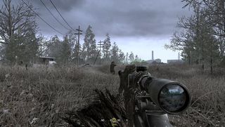
The stand-out mission is a downbeat, methodically-paced stealth crawl through tall grass and irradiated wasteland in order to make one very significant kill via the very personal medium of sniping. The Technicolor treatment would kill CoD 4 dead. Yes, the gameplay could remain as it is, but the emotional resonance of that gameplay? No. The game just would not be the same overall work. Think about its follow-ups in contrast.
The later CoD games (whether Modern Warfare or Black Ops) became increasingly vibrant, trading in CoD 4’s blasted concrete minimalism for snowfields, favellas, jungle and bombast. As a result, the games slowly lost their sense of amoral realism and became increasingly possessed by the spirit of the summer blockbuster. With extra colour and extra gloss came great design extravagances which, while spectacular in a heavily stage-managed Hollywood kind of way, lost a great deal of the gritty intimacy that made CoD 4 such a striking experience. We've gone from uncomfortable document of dramatised real-world conflict to luminous action-figure heroics.
Hell, even a game as visually glorious as BioShock Infinite knows the value of subdued visuals. The first two-thirds of the game are awash with every colour the human mind is currently capable of perceiving. But during the third act, as poop most furiously interfaces with whirling blade, things get noticeably darker. Skies become bleaker, buildings become greyer. The game’s chromatic bandwidth becomes a great deal narrower indeed. Okay, BioShock Infinite never exactly becomes Killzone 2 in the clouds, but the fact is that the rule of visual punctuation is being adhered to. If the third act’s relentless, ever-scaling combat is the vocabulary that explains the desperation of the situation, then the visual atmosphere is the grammar that sets the whole thing off.
The first Bioshock is famed for the poetic sense of tragedy evoked by its setting. Every one of the player’s actions in and against Rapture is given extra weight by the decaying, faded opulence around him. And the simple fact is that BioShock wouldn’t be half as poetic an experience if that opulence wasn’t exactly as faded as it is.

And this is hardly a new thing. The concept of Pathetic Fallacy (or the attribution of human emotions or sentiments to inanimate objects) has been around in art since the mid-1800s. And it’s been in use for a lot longer than it has been formalised. It’s just a core part of the way humans create narrative, and creating narrative is a core part of the way humans interpret the world.
Sign up to the 12DOVE Newsletter
Weekly digests, tales from the communities you love, and more
All of which semi-high-fallutin’ freewheeling brings us back to a single, simple point. Grim and gritty visuals in a video game are not inherently a bad thing. If they’re used simply because everyone else is doing it, or as lazy shorthand for “This game is serious and mature”, then of course they have no reason to assault your eyeballs. But if they’re being used to add texture, tone and narrative heft to an already well-constructed mix of gameplay and story, then in that case grey and brown are pretty damn indispensable.
You know that kid at parties who talks too much? Drink in hand, way too enthusiastic, ponderously well-educated in topics no one in their right mind should know about? Loud? Well, that kid’s occasionally us. GR Editorials is a semi-regular feature where we share our informed insights on the news at hand. Sharp, funny, and finger-on-the-pulse, it’s the information you need to know even when you don’t know you need it.

