Why Dracula's castle is the real star of Castlevania
There’s a classic moment in Bram Stoker’s Dracula where a solicitor named Jonathan Harker climbs down from a carriage in the Carpathian Mountains and beholds “a vast ruined castle, from whose tall black windows came no ray of light, and whose broken battlements showed a jagged line against the sky”. This portentous arrival should give a familiar chill to fans of Konami’s Castlevania games, since they often deposit the player before a daunting gate, beyond which sinister spires rise up against the moon. The franchise permits itself generous liberties with its source material, filling it with perky young anime characters and Universal Horror monsters, but the castle’s foreboding sentience is a constant, even as protagonists, terrains and gameplay mechanics vary around it.
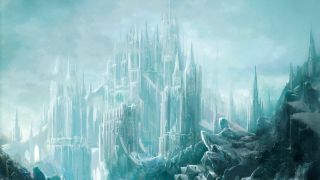
While the heroic Belmont clan and its proxies have traversed a variety of fortresses during their quarter-century of adventuring, these structures have all been unified in their expression of a castle’s qualities. The game’s fiction even suggests such permutations of Dracula’s Castle are driven by its supernatural aura, and so they are all in fact the same spookily morphing fortress.
At first, the concept was mostly a cosmetic one. A Castlevania castle contained heart-holding candelabras and breakable walls, blood-red curtains and elegant chandeliers, libraries and clock towers – all manner of Gothic window dressing for crisscrossing webs of corridors, stairs, and platforms. But as the series evolved into the more open action/RPG template, this visual theme took on a metaphysical dimension.
Beginning with Symphony of the Night, a castle was much more than just candles and stones. It was a vast maze that embodied an esoteric view of the individual’s journey through consciousness. While many would tread the main paths, only a few adepts would ascend to the highest tiers of completion percentage. And, as in the novel House Of Leaves, a castle was somehow bigger on the inside than the outside. Intestinally winding passageways rendered small rooms immense, and hidden realms lurked beyond the visible edges of the map, tugging the remote limits towards infinity. A castle was a microcosm – the world in a box. By Portrait of Ruin, this abstraction was entrenched enough that players could visit deserts and towns without feeling as though they had escaped the castle’s walls.

The concept, however, developed on a flat plane, and this has thwarted most attempts to modernise Castlevania with 3D gameplay; the introduction of the Z axis usually upsets the delicate systems balanced along the X and Y. But with 2010’s Lords of Shadow, MercurySteam figured out how to make a modern God of War-style action game really feel like Castlevania. The company did it by learning from both positive and negative examples of the franchise’s history, with a keen eye for the most essential icons and mechanics from the 2D classics.
“The knowledge that the past 3D Castlevania titles hadn’t worked was always present,” says Konami’s Dave Cox, the producer of Lords of Shadow. “One reason we were selected to produce the game was that we had recognisably ‘Castlevania’ elements working in our 3D engine, and we were able to demonstrate an aesthetic design that captured the atmosphere the series was famous for. What is interesting is that we were able to look at specific levels, like the gardens from the N64 title, and create a stage that mimicked them, but took it to a whole new level by using the technology we had to play with. It did, however, make us very conscious that every camera, every stage, had to be absolutely perfect in order to avoid unfavourable comparisons.”
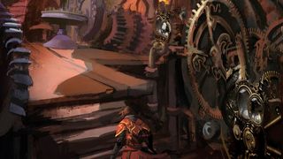
Lords 0f Shadow blends Gothic and 11th century European architecture into a fantasy world evocative of the films of Guillermo Del Toro. The rugged vistas, snowy wastes and lush swamps that you battle, leap and climb through on the way to the ultimate castle were inspired by landscape images from Spain and France. “In studying the classics,” says Cox, “we quickly realised we could create a world rather than just a castle, because even in the 8bit landscapes there were mountains, forests, and lakes. But there are a lot of nods to the series in terms of level design – the clock tower, for instance – and we would have been mad to ignore them.”
Sign up to the 12DOVE Newsletter
Weekly digests, tales from the communities you love, and more
At the same time, the team jettisoned more cartoonish aspects that wouldn’t have translated well into a more realistic setting. “The hearts had to go,” says Cox, “but the general layout and candlelit element reinforced Lords 0f Shadow’s link to the past and added to its overall Gothic look.”
More importantly, Cox’s team found ways to integrate the backtracking that defines the series. The game is split into levels via a map screen, which seems blasphemous at first. But the necessity of revisiting prior levels with new abilities remains, so that the player’s progress is not linear but circular – a widening gyre. There are many secrets to exhume from nooks and crannies, and multiple paths in each level. All inexorably lead to the ultimate castle, which has much more gravity than the game’s bête noire, Dracula. “The castle was viewed as a specific character in many respects,” says Cox. “That was one of the reasons we wanted the player to take some time to get there, so it felt like meeting an important person within the story.”
Read more from Edge here. Or take advantage of our subscription offers for print and digital editions.
Edge magazine was launched in 1993 with a mission to dig deep into the inner workings of the international videogame industry, quickly building a reputation for next-level analysis, features, interviews and reviews that holds fast nearly 30 years on.

Assassin's Creed Shadows was originally envisioned without Yasuke, but Ubisoft wanted the full feudal fantasy: "We were sort of making a stealth tank, and it didn't quite work"
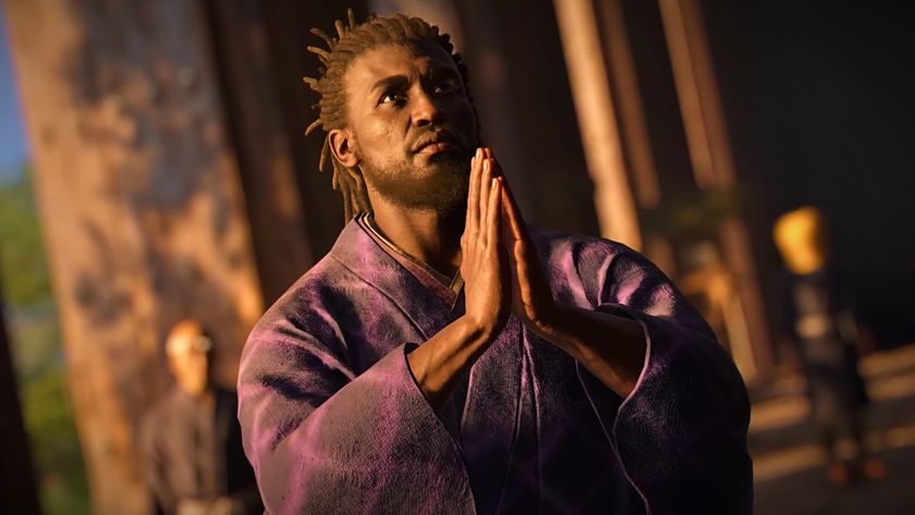
Assassin's Creed Shadows lead says dual protagonists are "a cool thing" the new action RPG "does better than what we've done in the past"


