Cover art that over sold the experience
The box looked awesome, didn't it? Oh dear...
November 30, 2007
Back in the days before the internet existed to help you decide which games were worth your hard-earned cash/not-at-all-earned allowance, gamers often had to resort to judging a game's merits from its box art. That meant the cover had to be the most enticing piece of advertising ever so that imaginative young minds could see themselves taking their place beside Han Solo or taking home the bikini girl on the front of Barbarian. But the experience seldom lived up to that promise.
So we've trawled the archives to bring you the finest examples of box art that oversold the experience. Take a look, see them all, then have a laugh/cry over what we used to spend our time and money on. And how foolish we were to get sucked in by this sort of thing:
Spider-Man (Atari 2600, 1982)
Box art suggests:Spider-Man takes on the Green Goblin, slinging webs that can be sliced by a foe's attack while climbing up a skyscraper, dicing with death during this perilous ascent.
The reality: A mess of squares and colours. And a Spider-Man sprite with (apparently) no neck. Try not to laugh at it, it was probably good at the time.
Sign up to the 12DOVE Newsletter
Weekly digests, tales from the communities you love, and more
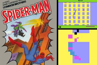
Above: Spider-Man's had his head cut off by a new foe - primitive technology. The fiend!
Justin was a GamesRadar staffer for 10 years but is now a freelancer, musician and videographer. He's big on retro, Sega and racing games (especially retro Sega racing games) and currently also writes for Play Magazine, Traxion.gg, PC Gamer and TopTenReviews, as well as running his own YouTube channel. Having learned to love all platforms equally after Sega left the hardware industry (sniff), his favourite games include Christmas NiGHTS into Dreams, Zelda BotW, Sea of Thieves, Sega Rally Championship and Treasure Island Dizzy.

